With this launch, Gmail users will be able to send to, and receive from, email addresses that contain accented or non-Latin characters. This includes both the domain name (to the right of the @ symbol) and/or the local-part (to the left of the @ symbol), as in 武@メール.グーグル.
Google Accounts will continue to contain only non-accented Latin characters (ASCII), so users will not be able to create an account such as Борис@gmail.com.
Release track:
Rapid release and Scheduled release
For more information:
Enterprise Blog Post
Note: all launches are applicable to all Google Apps editions unless otherwise noted
whatsnew.googleapps.com Get these product update alerts by email Subscribe to the RSS feed of these updates
Posted by Alicia Shires, Classroom Technology Specialist, Washington and Lee University
Editor’s note: Today’s guest blogger is Alicia Shires, Classroom Technology Specialist at Washington and Lee University in Lexington, Virginia. At Washington and Lee University, we pride ourselves on our clear communications to everyone on campus—and if we have to cancel or change classes or events, we want everyone to find out as soon as possible. Our 13 digital signage screens, positioned in key places across campus like the Commons building and several dorms, alert staff and students to the events at the University, along with updates on our sports teams and local weather. When we installed Google Chromeboxes to replace the crash-prone Windows machines running the screens, it became much easier to bring news to the campus while it’s fresh.
The personal computers we were using to run display screens had several problems, with unreliability at the top of the list. They were slow to update, and would often crash, leaving the screens completely offline. That meant a delay in delivering information to students and staff until we could reboot the machines remotely. The machines were also slow. When we uploaded information to be displayed, it could take 30 minutes before viewers saw it.
These delays could become a big deal if we wanted to deliver time-sensitive information to screens, like weather-related campus closings or emergency situations. Without fast notifications, students and professors could waste time traveling to classes or events that weren’t happening.We knew we needed better hardware to solve the problems of speed and instability.
Rise Vision, the developer of the free, open-source platform we use to create and manage our display content, suggested we replace the PCs with managed Chromeboxes. We discovered that because Chromeboxes run Chrome OS, they update automatically, so updates don’t interfere with the displays. We can operate Chromeboxes in Kiosk mode so we can run the digital signage software at full-screen, which makes our displays look better. Management is largely hands off. I don’t have to touch the boxes and the reboots are fast and automatic.
Each Chromebox is several hundred dollars less than one of the PCs we were using before, so that’s a big plus for us. They’re extremely reliable and super-fast—when I upload new content from my office, it appears almost immediately on the campus display screens. It’s hard to believe I’m not working directly on the Chromeboxes themselves. They’re also powerful enough to run rich media like HD 1080P videos without choppy playback.
Perhaps the best thing about using Chromeboxes for our screens is that we’ve finally been able to kick our emergency notification system into high gear. If we go through another difficult winter, we can quickly push out emergency notices about schools closings, weather delays, and event cancellations. Operating our screens with fast, reliable Chromeboxes is helping us keep everyone on campus not just well-informed, but safe and sound.
ddd
Video call links in Calendar events for all Apps customers
Last week we announced the roll-out of Hangouts video calls for up to 15 participants to everyone on Google Apps. This applies to people with and without access to Google+, with either Google Talk or Google Hangouts chat enabled. Starting today, Google…
ddd
Fifteen ways to change the world: the 2014 Google Science Fair Global Finalists
Kenneth Shinozuka, from New York City, wants to help people with Alzheimer’s Disease, like his grandfather. Kenneth developed a small, wearable sensor to be worn on his grandfather’s foot. When pressure is applied to the sensor, it alerts his family via a mobile app, which allows them to monitor when his grandfather is on the move. By monitoring this behavior, Kenneth hopes to understand the causes of wandering brought on by Alzheimer’s, and to ultimately find a way to mitigate or prevent it.
Samuel Burrow, from the U.K., wants to improve the environment by reducing pollution. Taking inspiration from the chemical used in sunscreen, Samuel created a special coating that reduces waste chemicals in the air when subjected to ambient light. And Cynthia Sin Nga Lam, from Australia, thinks everyone deserves access to clean water and created an eco-friendly and economical device to do just that.
These are just a few examples of the 15 incredible projects we’ve named as the global finalists for 2014 Google Science Fair. This is our fourth time hosting the competition as a way to encourage the next generation of scientists and engineers. From Russia to Australia, India to Canada, this year’s finalists (ages 13-18) are already well on their way to greatness. See all 15 projects on the Google Science Fair website.
Special recognition also goes to Kenneth, who has also been awarded the Scientific American Science In Action Award. The prize celebrates a project that addresses a health, resource or environmental challenge, and comes with a year’s mentoring from Scientific American and a $50,000 grant toward the project.
What’s next for our young scientists? Well, next month, they’ll be California-bound to compete at Google HQ for the three Age Category Awards (ages 13-14, 15-16, 17-18) and of course, the overall Google Science Fair Grand Prize Award. The competition will end in style with an awards ceremony, which will be live streamed on the Science Fair YouTube channel and on our website. Tune in to be one of the first to find out this year’s winners!
But first, you get to have your say! We need you to pick your favorite project for the 2014 Voter’s Choice Award. Show your support for the finalists and cast a vote on the Google Science Fair website beginning September 1. Every year, we’re blown away by the projects and ideas these young people come up with, and you will be too.
Posted by Clare Conway, on behalf of the Google Science Fair team
People working with tables in Google Docs will now be able add styling to the borders of individual cells or groups of cells within the table. New controls will allow the application of color, width, and line styles to cell borders in a selection. When…
Yesterday, we announced a revamped Google Web Designer, brimming with new features that make it even easier for creative designers and developers to build robust HTML5 creative.
Today, we’d like to introduce you to Marius Veltman, a rich media expert from Holland and a life-long creative technologist. We first met Marius last year when he tested out the alpha version of Google Web Designer and gave us a list of improvements for the product.
For this launch, Marius gave us a peek into his world as an artist and designer and helped us push the limits of HTML5 with a “Google Web Designer Thought Experiment.” We asked him to create an awesome HTML5 ad unit, using only Google Web Designer, that takes advantage of different device form factors and successfully conveys a brand’s message.
We selected the Google Cultural Institute as the brand and used the Street View imagery from their Great Barrier Reef World Wonders Collection as the assets. We then set out on an adventure through Holland to document Marius’s creative process as he worked to develop the ad.
Watch as Marius’s sketches come to life through the medium of HTML5 and the help of Google Web Designer. Marius’s ideas develop in parallel to his own story as a designer. Then, check out the actual ad unit and learn more about his process.
Posted by Becky Chappell, Product Marketing, Google Web Designer
A combination of offering users the best experience and efficiently monetizing your content is important for the long-term success of your website. With that in mind, here’s some tips to help you to achieve both of these goals:
Content: Is your site content relevant to your users? Ask yourself if the content on your site is well-researched and well-structured. Will it capture and engage your users’ attention?
Ad types: When choosing an ad type for your site, consider if it improves the user experience on your site. It’s important to be mindful of designs that are prohibited by our AdSense program policies, such as pop-ups and pop-unders, floating or static ads, or any other type of ad that could make it difficult for users to access your content. Where possible, test potential designs with focus groups or an AdSense experiment.
Ad placement: Advertising on your site should provide additional value to your users. Ads should be visible without limiting your site audience’s ability to interact with the rest of your content. For instance, if ads are visible above the fold on your site, make sure they’re not making it difficult for users to view your content. We may be less likely to display pages with obstructive above the fold advertising in our search results.
Multi-screen: Don’t forget to think about the impact of your design and ad placement on the accessibility of content across platforms. Our research indicates that users are increasingly relying on multiple digital touch-points throughout the day.
In addition to the four tips above, check out the Webmaster Quality Help Center for website quality guidelines that have been created specifically for AdSense publishers. You’ll also find insights and tools to help you understand and improve your site on the Google Webmasters website.
Posted by Shinichi Abe, Enterprise Managing Director, Japan
Japanese companies are facing major challenges for long-term success. The rapid graying of society is shrinking the workforce, leaving only 62% of the population in the working age. Inflexible workplace practices prevent many women from returning to their careers after childbirth. The Japan Productivity Center ranks Japan lowest of the Group of Seven most advanced nations in productivity, despite some of the world’s longest work hours.
As pressure mounts on Japanese businesses to find new ways to be productive and to attract and retain top talent, we asked Deloitte to take a look at how mobile and digital tools might be able to help. According to their new report, Japan’s Mobile Potential, access to mobile devices for work and more flexible IT policies could help unlock almost 2 trillion yen for the Japanese economy and keep some of Japan’s most skilled people in the workforce. There are a number of additional findings from the report which may be useful for businesses including:
Japanese businesses are missing out on a massive mobile opportunity
Deloitte found that despite having one highest rates of smartphone use in the world — 75% of people between 18 and 49 own a personal smartphone — less than 9% use their smartphone for work. Of the same group, 20% of people own a tablet computer at home, but only 3% of these people have access to a tablet for their work tasks.
People want to work more flexibly with digital and mobile tools
71% of people said that they would be more productive if they had access to digital tools like smartphones, laptops and tablets for work, as it would enable them to work from home or while commuting.
Workplace IT has some catching up to do
Many people say that their home IT is better than what they’re given at work. They rate their home technology as more user friendly (51%), more up to date (45%) and said that their internet was faster (43%). Almost half of the respondents said that they are frustrated with their workplace IT, as their computers and internet speeds are too slow and their devices are outdated.
Employees with flexible workplace IT policies are more productive
Businesses that allow their employees to work from home or work remotely with digital tools said they are more productive. And none of the respondents with flexible workplace IT policies said they work overtime, while 31% of those without this approach said they regularly work overtime.
Mobile devices and flexible IT policies could unlock two trillion yen for the Japanese economy
Deloitte found that the Japanese economy could generate 2 trillion yen if businesses provided digital tools like smartphones, laptops and tablets to people who want to work, but don’t have direct access to the tools they need to work from home or remotely. When you consider that they did not calculate the economic impact of giving people who are working access to digital tools and flexible workplace policies, this figure could be much higher.
You can learn more about Japan’s mobile potential from Deloitte’s report, and to find out how Google can help your company work flexibly with mobile tools visit the Google Enterprise website.
From Google Glass to Project Loon, Adwords to Docs, our interns have the opportunity to work on some of Google’s most cutting edge and innovative projects. To show you just how much of an impact interns make and to highlight their unique experiences, we’re bringing you a special blog series: Google Intern Insights.
For today’s post, meet Elmar Peters, a Hardware Engineering intern from the Netherlands. Elmar will graduate in summer 2015 with a Bachelors of Science in Electrical Engineering from the University of Twente. While Elmar is excited by his internship working with both Google Glass and the self-driving car teams within Google [x], he also uses his time in California to see as many new sights as possible. An avid traveler, Elmar has enjoyed a trip to Yosemite and a hike along Redwood Creek in Humboldt.
What inspired you to apply for this internship, and what made Google appealing to you as a potential intern?
I’ve been following Google for quite a while–the informal working environment and innovative products really interested me. I became really interested in Google and decided to apply for an internship when I heard about Google Glass and the self-driving car.
What team are you working on at Google? Can you provide us with a high-level description of your summer project?
I’m an Electrical Engineering intern on the Google Glass team. I’m prototyping several aspects of the Glass hardware design. Besides my work at Glass, I’m also working on a 20% project for the self-driving car team. Sometimes, when you’d like to help work on a project or team, or have an idea of something you’d like to try, Google will allow you to spend 20% of your time working on that along with your normal role.
What’s the best part about working with your manager? What about your team?
I like the amount of responsibility my manager and my team gives me. At Google I’m working on real projects that are crucial for Google Glass. The fact that they give me all of this responsibility as an intern is really special. We all know Googlers and interns love the food and the other benefits. Outside of some of the well-known perks, what’s your favorite part about working at Google?
I really like the cool projects at Google and the way Google innovates. If you have a new idea, people will encourage you to work on it.
That being said though, what’s the best gFit class?
It might not be a gFit class, but I really like swimming in one of the “endless pools” on campus.
What does “being Googley” mean to you?
To me, being Googley means being super friendly and doing other people a favor when you can. People at Google are always ready to help you out when you are stuck on something. The friendly atmosphere at Google is one of the best things about working here.
Dream Google office to visit?
I would really like to visit the google offices in Tokyo sometime. The pictures I’ve seen look really stylish!
Outside of being a Google intern, what are some fun things you do outside the classroom/office throughout the year?
I like to travel–I’ve visited 22 countries so far. I’m originally from the Netherlands so my internship in Mountain View is like a work and holiday. While I’m interning here in California I go on weekend trips really often. After my internship, I will also stay in the US for a while to travel and to go to Burning Man!
If you could give one piece of advice to potential student applicants, what would it be?
I always worked on a lot of side projects during my study. This really helped me gain some practical experience that turned out to be really useful in the work I’m doing now. So I would advise every student to work on a side project that they are passionate about during their studies!
Want to learn more about internships at Google? Check out our Student Careers Site. Additionally, follow Google Students on Google+ and use the hashtag #googleinterns to keep up with Intern Insights this summer.
Posted by Sidnie Davis, Intern Programs Team
ddd
New shipping configuration tool available in Google Merchant Center
Imagine a shopper has searched for a product on Google Shopping and found the perfect offer at the perfect total price inclusive of shipping. They reach checkout on the merchant’s site only to realize that the final price differs from what they’ve seen on Google due to inaccurate shipping costs. Our users consistently tell us this is a primary source of frustration.
To help you display more accurate total prices to shoppers, we’ve made the configuration of shipping rates in Merchant Center more powerful and easier to use with a new shipping configuration tool.
This tool can help you configure accurate shipping rates for products by providing:
Shipping rules: Select from an expanded list of shipping methods, including customizable methods based on a hierarchical set of rules.
Multiple shipping methods: Differentiate between various shipping methods, such as ground versus express, for the same country, so Google can display the lowest possible price to the user.
Customization based on location: Configure rates based on shipping destination using countries, states, or cities.
Simplified exclusion options: Indicate when products do not ship to certain regions.
Reusable shared library: Create a repository of shipping methods you can reuse across various custom configurations.
In addition to the new tool in Merchant Center, we have also added a new shipping attribute to assign a shipping label to specific products. You can configure shipping rates based on this label. For example, you could apply a label like “perishable” or “bulky” to a group of products requiring special shipping rates or a label specific for promotional items. After adding this attribute to a group of items, you may manage or configure the custom rate in shipping settings in Merchant Center.
We’ve migrated your current shipping settings to this new tool. They do not require any update. We encourage you to check out the new features to review whether they can help you simplify or improve your shipping rate configuration on Google Shopping. Both current and newly created shipping methods will be subject to review with our existing shipping policy.
Join us for a Hangout on Air on September 16th as we walk through the tool and cover best practices for setting up shipping rates in Merchant Center. Sign up for the event.
Posted by Angelika Rohrer and Sven Herschel, Google Shopping Team.
Posted by Pedro Chaparro Monferrer, Software Engineer, Gmail
Cross-posted on the Official Google Blog
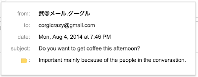
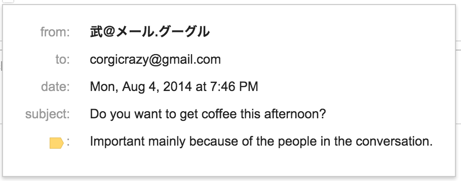
Whether your email address is firstname.lastname@ or something more expressive like corgicrazy@, an email address says something about who you are. But from the start, email addresses have always required you to use non-accented Latin characters when signing up. Less than half of the world’s population has a mother tongue that uses the Latin alphabet. And even fewer people use only the letters A-Z. So if your name (or that of your favorite pet) contains accented characters (like “José Ramón”) or is written in another script like Chinese or Devanagari, your email address options are limited.
But all that could change. In 2012, an organization called the Internet Engineering Task Force (IETF) created a new email standard that supports addresses with non-Latin and accented Latin characters (e.g. 武@メール.グーグル). In order for this standard to become a reality, every email provider and every website that asks you for your email address must adopt it. That’s obviously a tough hill to climb. The technology is there, but someone has to take the first step.
Today we’re ready to be that someone. Starting now, Gmail (and shortly, Calendar) will recognize addresses that contain accented or non-Latin characters. This means Gmail users can send emails to, and receive emails from, people who have these characters in their email addresses. Of course, this is just a first step and there’s still a ways to go. In the future, we want to make it possible for you to use them to create Gmail accounts.
Last month, we announced the addition of 13 new languages in Gmail. Language should never be a barrier when it comes to connecting with others and with this step forward, truly global email is now even closer to becoming a reality.
Posted by Pedro Chaparro Monferrer, Software Engineer
Cross-posted on the Official Google Blog
Whether your email address is firstname.lastname@ or something more expressive like corgicrazy@, an email address says something about who you are. But from the start, email addresses have always required you to use non-accented Latin characters when signing up. Less than half of the world’s population has a mother tongue that uses the Latin alphabet. And even fewer people use only the letters A-Z. So if your name (or that of your favorite pet) contains accented characters (like “José Ramón”) or is written in another script like Chinese or Devanagari, your email address options are limited.
But all that could change. In 2012, an organization called the Internet Engineering Task Force (IETF) created a new email standard that supports addresses with non-Latin and accented Latin characters (e.g. 武@メール.グーグル). In order for this standard to become a reality, every email provider and every website that asks you for your email address must adopt it. That’s obviously a tough hill to climb. The technology is there, but someone has to take the first step.
Today we’re ready to be that someone. Starting now, Gmail (and shortly, Calendar) will recognize addresses that contain accented or non-Latin characters. This means Gmail users can send emails to, and receive emails from, people who have these characters in their email addresses. Of course, this is just a first step and there’s still a ways to go. In the future, we want to make it possible for you to use them to create Gmail accounts.
Last month, we announced the addition of 13 new languages in Gmail. Language should never be a barrier when it comes to connecting with others and with this step forward, truly global email is now even closer to becoming a reality.
Posted by Pedro Chaparro Monferrer, Software Engineer
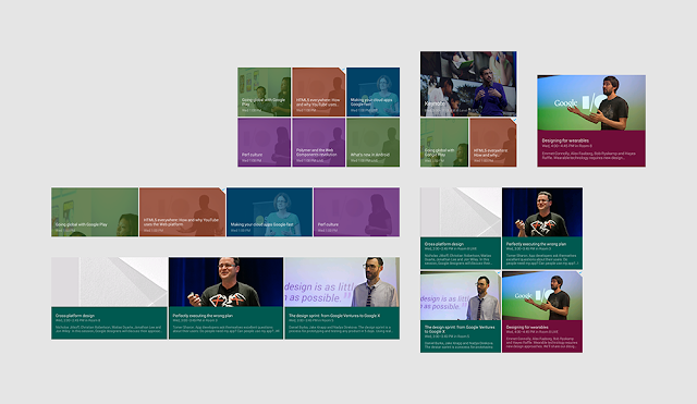
By Roman Nurik, lead designer for the Google I/O Android App
Every year for Google I/O, we publish an Android app for the conference that serves two purposes. First, it serves as a companion for conference attendees and those tuning in from home, with a personalized schedule, a browsing interface for talks, and more. Second, and arguably more importantly, it serves as a reference demo for Android design and development best practices.
Last week, we announced that the Google I/O 2014 app source code is now available, so you can go check out how we implemented some of the features and design details you got to play with during the conference. In this post, I’ll share a glimpse into some of our design thinking for this year’s app.
On the design front, this year’s I/O app uses the new material design approach and features of the Android L Developer Preview to present content in a rational, consistent, adaptive and beautiful way. Let’s take a look at some of the design decisions and outcomes that informed the design of the app.
Surfaces and shadows
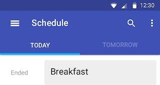
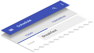
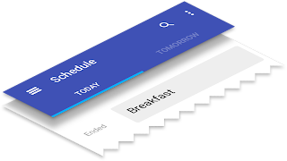
In material design, surfaces and shadows play an important role in conveying the structure of your app. The material design spec outlines a set of layout principles that helps guide decisions like when and where shadows should appear. As an example, here are some of the iterations we went through for the schedule screen:
First iteration
Second iteration
Third iteration
The first iteration was problematic for a number of reasons. First, the single shadow below the app bar conveyed that there were two “sheets” of paper: one for the app bar and another for the tabs and screen contents. The bottom sheet was too complex: the “ink” that represents the contents of a sheet should be pretty simple; here ink was doing too much work, and the result was visual noise. An alternative could be to make the tabs a third sheet, sitting between the app bar and content, but too much layering can also be distracting.
The second and third iterations were stronger, creating a clear separation between chrome and content, and letting the ink focus on painting text, icons, and accent strips.
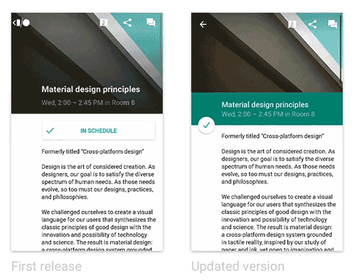
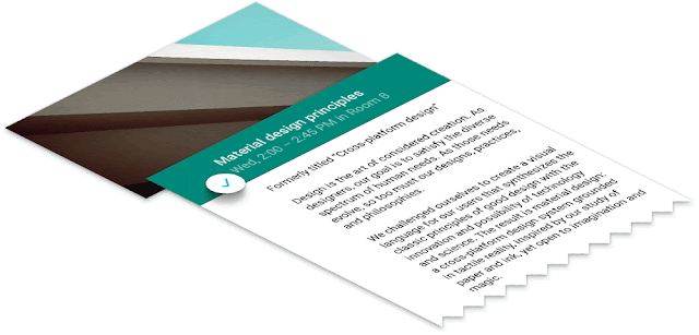
Another area where the concept of “surfaces” played a role was in our details page. In our first release, as you scroll the details screen, the top banner fades from the session image to the session color, and the photo scrolls at half the speed beneath the session title, producing a parallax effect. Our concern was that this design bent the physics of material design too far. It’s as if the text was sliding along a piece of paper whose transparency changed throughout the animation.
A better approach, which we introduced in the app update on June 25th, was to introduce a new, shorter surface on which the title text was printed. This surface has a consistent color and opacity. Before scrolling, it’s adjacent to the sheet containing the body text, forming a seam. As you scroll, this surface (and the floating action button attached to it) rises above the body text sheet, allowing the body text to scroll beneath it.
This aligns much better with the physics in the world of material design, and the end result is a more coherent visual, interaction and motion story for users. (See the code: Fragment, Layout XML)
Color
A key principle of material design is also that interfaces should be “bold, graphic, intentional” and that the foundational elements of print-based design should guide visual treatments. Let’s take a look at two such elements: color and margins.
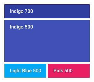
In material design, UI element color palettes generally consist of one primary and one accent color. Large color fields (like the app bar background) take on the main 500 shade of the primary color, while smaller areas like the status bar use a darker shade, e.g. 700.
The accent color is used more subtly throughout the app, to call attention to key elements. The resulting juxtaposition of a tamer primary color and a brighter accent, gives apps a bold, colorful look without overwhelming the app’s actual content.
In the I/O app, we chose two accents, used in various situations. Most accents were Pink 500, while the more conservative Light Blue 500 was a better fit for the Add to Schedule button, which was often adjacent to session colors. (See the code: XML color definitions, Theme XML)
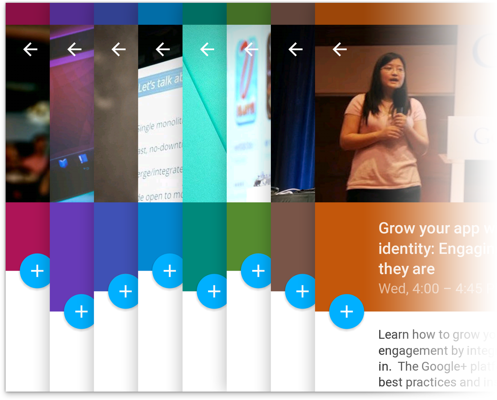
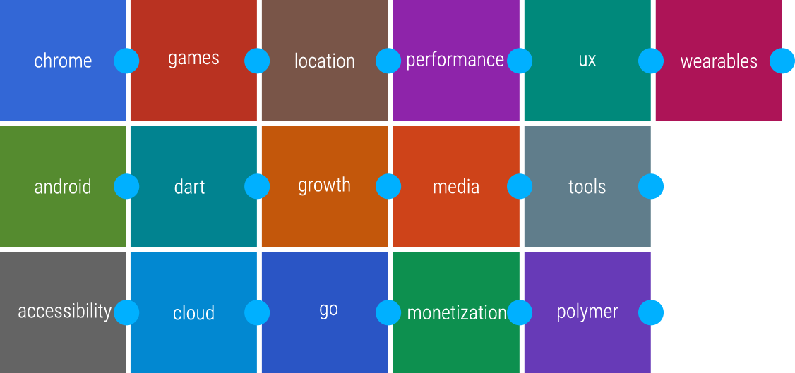
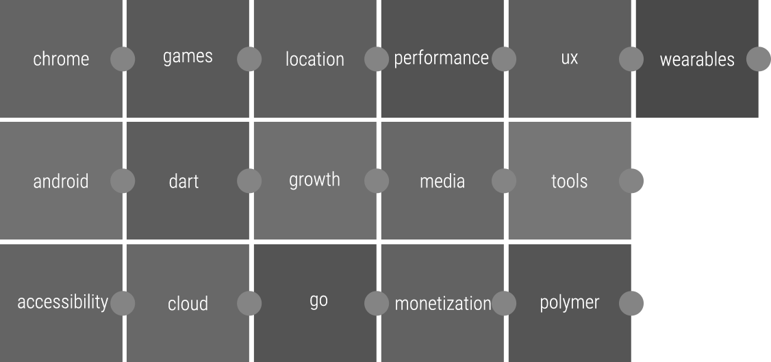
And speaking of session colors, we color each session’s detail screen based on the session’s primary topic. We used the base material design color palette with minor tweaks to ensure consistent brightness and optimal contrast with the floating action button and session images.
Below is an excerpt from our final session color palette exploration file.
Session colors, with floating action button juxtaposed to evaluate contrast
Desaturated session colors, to evaluate brightness consistency across the palette
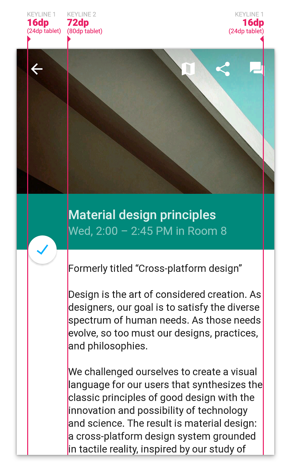
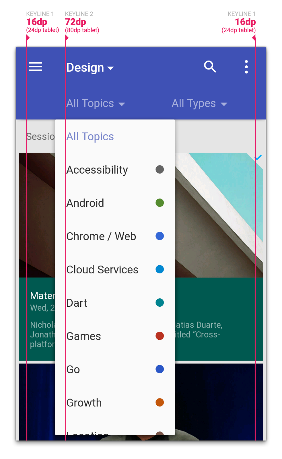
Margins
Another important “traditional print design” element that we thought about was margins, and more specifically keylines. While we’d already been accustomed to using a 4dp grid for vertical sizing (buttons and simple list items were 48dp, the standard action bar was 56dp, etc.), guidance on keylines was new in material design. Particularly, aligning titles and other textual items to keyline 2 (72dp on phones and 80dp on tablets) immediately instilled a clean, print-like rhythm to our screens, and allowed for very fast scanning of information on a screen. Gestalt principles, for the win!
Grids
Another key principle in material design is “one adaptive design”:
A single underlying design system organizes interactions and space. Each device reflects a different view of the same underlying system. Each view is tailored to the size and interaction appropriate for that device. Colors, iconography, hierarchy, and spatial relationships remain constant.
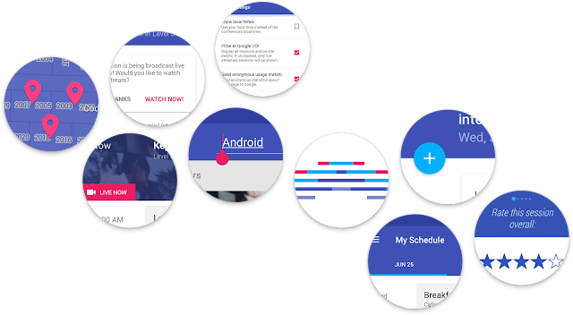
Now, many of the screens in the I/O app represent collections of sessions. For presenting collections, material design offers a number of containers: cards, lists, and grids. We originally thought to use cards to represent session items, but since we’re mostly showing homogenous content, we deemed cards inappropriate for our use case. The shadows and rounded edges of the cards would add too much visual clutter, and wouldn’t aid in visually grouping content. An adaptive grid was a better choice here; we could vary the number of columns on screen size (see the code), and we were free to integrate text and images in places where we needed to conserve space.
Delightful details
Two of the little details we spent a lot of time perfecting in the app, especially with the L Developer Preview, were touch ripples and the Add to Schedule floating action button.
We used both the clipped and unclipped ripple styles throughout the app, and made sure to customize the ripple color to ensure the ripples were visible (but still subtle) regardless of the background. (See the code: Light ripples, Dark ripples)
But one of our favorite details in the app is the floating action button that toggles whether a session shows up in your personalized schedule or not:
We used a number of new API methods in the L preview (along with a fallback implementation) to ensure this felt right:
View.setOutline and setClipToOutline for circle-clipping and dynamic shadow rendering.
android:stateListAnimator to lift the button toward your finger on press (increase the drop shadow)
RippleDrawable for ink touch feedback on press
ViewAnimationUtils.createCircularReveal for the blue/white background state reveal
AnimatedStateListDrawable to define the frame animations for changes to icon states (from checked to unchecked)
The end result is a delightful and whimsical UI element that we’re really proud of, and hope that you can draw inspiration from or simply drop into your own apps.
What’s next?
And speaking of dropping code into your own apps, remember that all the source behind the app, including L Developer Preview features and fallback code paths, is now available, so go check it out to see how we implemented these designs.
We hope this post has given you some ideas for how you can use material design to build beautiful Android apps that make the most of the platform. Stay tuned for more posts related to this year’s I/O app open source release over the coming weeks to get even more great ideas for ways to deliver the best experience to your users.
Almost one year ago, we launched Google Web Designer, a free, easy-to-use, professional-grade HTML5 authoring tool. Over that year, we’ve seen increased adoption of HTML5 and Google Web Designer across the industry.
Fast facts, one year in:
In the first half of 2014, DoubleClick Rich Media ad impressions from HTML5 grew 140% compared to the second half of 2013.
Ads built with Google Web Designer have garnered 2.5B impressions since the launch of the product.
Over 20% of Google Web Designer’s user base are returning users and 72% are located outside the United States.
We partnered with the IAB to launch the “Make Mobile Work” Initiative, which has reached thousands of people through press outreach, an industry open letter, and quarterly webinar series.
Advertisers are seeing performance improvements as a result of adopting HTML5. For example,TalkTalkdecreased their eCPA by 12% and reduced their backup image rate by 13% by adding HTML5 to their campaign.
So what’s launching in Google Web Designer?
Today’s launch provides more granular control and creative flexibility to creative developers and designers, and allows them to easily build more interactive and animated HTML5 content and get it published quickly.
Revamped Events and Components allow designers to make any element interactive, and customize the types of interactivity within their creative.
The updated timeline provides more granular control for designers to easily build animated content.
Tighter integrations with Google Drive, DoubleClick Studio, DoubleClick Campaign Manager and AdWords let users collaborate on their works-in-progress and publish finished units more quickly. This integration marks the first time that AdWords will support HTML5 ads.
Simplifying cross-screen advertising
In addition to Google Web Designer, we are continuing to develop tools to make it easier for advertisers and agencies to build successful cross-screen advertising campaigns.
We recently launched several features in DoubleClick to help you execute and measure your campaigns across screens, including in-app remarketing and conversion tracking in DoubleClick Campaign Manager. We also launched MRAID 2.0 support in DoubleClick Studio and we have certified 69 large publishers and networks for in-app formats, meaning developers can build mobile in-app ads with the confidence that they’ll be accepted across more publishers and networks.
Through its integration with Google Web Designer, AdWords now supports HTML5 ad creatives. In addition, Flash ads that are uploaded to Adwords will automatically be converted into HTML5 ads and can be uploaded via AdWords Editor and other 3rd party tools coming soon. Over the next few months, we’ll also be releasing tools and services that will resize ads to some of the most popular mobile sizes, without requiring any additional work on the part of the agencies.
Want to learn more?
Creative Agencies:
Visit our revamped website and download the product for free.
Register for our Google Web Designer overview webinar on Wednesday Aug. 13th. Our lead Product Manager and Creative Technical Consultant will walk through the new Google Web Designer features and demo some cool creative executions.
Media Agencies:
Register for our third webinar in the Make Mobile Work Series, focused on best practices for mobile targeting, on Tuesday, Aug. 12th. Google will be presenting alongside speakers from Millennial and Facebook.
Posted by Sean Kranzberg and Tony Mowatt, Engineering Manager and Lead Product Manager for Google Web Designer


.jpg)


.png)