In the past few years we’ve seen GeoJSON explode as a method to share geographic data and developers are using GeoJSON to create amazing visualizations. As a consequence, however, we’re seeing less interest in non-customizable layers directly provided by API providers.
So, starting today, we will begin sunsetting the Google Maps JavaScript API v3 Panoramio Library and Weather Library. Per the terms of our deprecation policy, the Panoramio, weather, and cloud layers served by these libraries will continue to function until one year from today and will be removed on June 4, 2015.
We’d also like to remind developers that the Flash Maps API’s deprecation period ends on September 2, 2014. The Flash Maps API will shut down on that date, so if you’re still using the API, it’s time to start planning your migration.
If you have any questions about these announcements, our friendly developer relations team is always happy to help. Please tag questions with ‘google-maps-api-3’ on StackOverflow and we’ll respond shortly.
Posted by Ken Hoetmer, Product Manager, Google Maps APIs
ddd
Manage your organization faster with insights from the new redesigned Admin Reports
We’re introducing a new redesigned Reports section to the Admin console to make it easier for admins to manage Google Apps and gain insights that help their entire organization run more efficiently.
The new reporting section will offer domain highlights, user-level reporting, custom filtering/sorting on data and new audit streams (Login Audit).
To use it, go to your Admin console and click on theReportsicon. If you would like to access the old reports section, click on the settings icon (gear icon) in the top right and select “Revert to the old reports page.”
Posted by Yakup Dogan, Assistant General Manager for Alternative Distribution Channels, Yapı Kredi
Editor’s note: Today’s guest blogger is Yakup Dogan, Assistant General Manager in charge of Alternative Distribution Channels at Yapı Kredi, one of the largest retail banks and the largest credit card issuing bank in Turkey. View their case study to learn more and see what other organizations that have gone Google have to say.
For me, one of the best things about working at Yapi Kredi is the genuine desire to make the banking experience as simple and enjoyable as possible for our customers. With this in mind, my team and I recently undertook a major re-design project to help improve the customer experience for the three million unique monthly visitors to our website.
And it was a big re-design. We literally got rid of everything on the site apart from a search bar. No confusing menus. No clutter. Visitors to the site can type what they need into the search bar and get directed straight to the answer. It is easy to use and we have had fantastic feedback from our customers. Not only has the number of daily site searches increased by 1000%, but users are spending an extra 30 seconds on average on the site.
Most importantly of all, the shift to the new site has made a genuine business impact. We’ve seen a 134% increase in loan applications since we re-designed the site and I attribute this to how easy it is to navigate around and use the site.
It’s safe to say we couldn’t have done any of this without the GSA. It offered advanced relevancy, ease of use, familiarity and lower TCO. Data security is very important to us and the GSA’s ability to integrate all of the domain’s security features was crucial.
Despite the enormous growth in use of the site, thanks to the GSA the number of admin staff I need to allocate to search remains the same. And because the volume of searches is now so much higher, we can better understand what customers need and are looking for the most. This, combined with web analytics, opens up a high level of insight into our customer’s expectations, frustrations and needs.
This enhanced visibility also enables us to better target our promotion of products to the right people at the right time during their visit, and increase sales. I firmly believe we’ve set a new standard for a simple, effective website experience in the financial sector.
Posted by Anthony Vallone on behalf of the GTAC Committee
If you’re looking for a place to discuss the latest innovations in test automation, then charge your tablets and pack your gumboots – the eighth GTAC (Google Test Automation Conference) will be held on October 28-29, 2014 at Google Kirkland! The Kirkland office is part of the Seattle/Kirkland campus in beautiful Washington state. This campus forms our third largest engineering office in the USA.
GTAC is a periodic conference hosted by Google, bringing together engineers from industry and academia to discuss advances in test automation and the test engineering computer science field. It’s a great opportunity to present, learn, and challenge modern testing technologies and strategies.
You can browse the presentation abstracts, slides, and videos from last year on the GTAC 2013 page.
Stay tuned to this blog and the GTAC website for application information and opportunities to present at GTAC. Subscribing to this blog is the best way to get notified. We’re looking forward to seeing you there!
Ten days ago, voting opened for Google’s first Bay Area Impact Challenge, and now the tally is in. On the ballot? Ten amazing nonprofit proposals to make a difference in our community.
Between May 22 and June 2, nearly 200,000 votes poured in (191,504 to be exact)—adjusted for population, that makes it the highest voter turnout we’ve had in a Challenge to date. Now we’re unveiling the winners. Each will receive $500,000 in funding and support from Google:
Hack the Hood will address digital equity by training low-income youth to build websites for local small businesses, actively supporting them to launch their own tech careers.
Center for Employment Opportunities will develop a tech platform to prepare formerly incarcerated people for employment in a digital world.
The Health Trust will create new distribution channels for people to get affordable produce, expanding options for street vendors, corner stores, and farmers’ markets for underserved areas.
Bring me a book will give kids access to digital books, in multiple languages, while creating a supportive online community for parents and caregivers.
Hack the Hood celebrates their win with community advisor Reverend Cecil Williams
But everyone wins in this competition: The six remaining finalists will each receive $250,000, and we also gave an additional 15 nonprofits around the Bay Area $100,000 each.
Finally, all 25 Google Impact Challenge nonprofits will receive one year of accelerator support at our first-ever impact lab, a co-working space launched in partnership with Impact Hub SF, a shared workspace for entrepreneurs committed to positive social and environmental change.
Nonprofits will have access to networking events, meeting space, and development workshops in the Impact Hub SF, as well as membership to all U.S. Hub locations. We also plan to host community events for the Bay Area nonprofit community throughout the year—so check out our website or follow us on Google+ to stay in the loop.
Now the work really begins, and we’re excited to continue to build on our ongoing efforts to give back to the community.
Posted by Jacquelline Fuller, Director of Google.org
Posted by Rishi Dhand, Product Manager, Google Apps
Google Apps helps millions of businesses, schools and governments get work done with easy to use apps that are built for the cloud. Working in the cloud not only makes it easier to get things done, but also allows new insights into how your organization is using Google Apps. Starting today, we’re introducing a new Reports section to the Admin console to make it easier for admins to manage Google Apps and also gain insights that help their entire organization run more efficiently.
See a snapshot of all activity
The Highlights page, located in the new Reports section, gives you a quick overview of all the activity across your domain. You can see how many Hangouts, Docs, Sheets and Slides your organization created, who is close to reaching their Drive and Gmail storage quota and how many files have been shared outside the company. You can also export any report to Google Sheets to slice and dice your data for further analysis.
Drill down to user level Reports
The Apps Usage Activity page shows data on how individual users are working with Gmail, Drive, storage and other apps. Choose what information you want to see and move the columns around to customize your view.
Filters
Use filters to quickly find who owns a specific file, people with a high number of uploads and shares, and granular data such as all the people who have between 1000 and 2000 documents.
Security
The Security page is another customizable user report that provides security related information like 2-step verification enrollment, how many files are shared externally, the number of external apps that are installed and other important information like account status and Gmail IMAP usage. Like the Apps Usage Activity report, Admins can customize column names and apply sorting and filters on the columns.
Login Audit
Monitor any security concerns by reviewing the specific IP addresses and dates of all logins and any failed or suspicious logins on the Login Audit page. Admins can use this report to track suspicious activity and take corrective action like resetting passwords.
To use the new Reports page, go to your Admin console and click on the Reports icon or the View Reports link on the right side panel. Mobile data will be added soon, in the meantime you can revert to the old Reports if needed. We have many additions planned for the future so stay tuned.
Video is how brands tell stories, how they surprise us, make us laugh or make us cry. No other medium brings together sight, sound and motion, and now with digital, interaction. As I’ve said forawhile, our goal is to make digital work for brands. To do that, we have to make online video work for brands and their publisher partners, a topic I’ll be addressing this morning at our annual DoubleClick customer event.
Introducing Google Partner Select, A Programmatic Premium Video Marketplace
Publishers are investing like never before in compelling, high quality video experiences. Brand marketers are eager to buy against this content — in fact eMarketer projects video ad spending to grow from $4 billion last year to nearly $6 billion in 2014. One big hurdle to growth remains, though: much of this content is hard to access.
Our brands and agencies want to buy this premium content programmatically, but have difficulty finding the high quality inventory they want. Our publisher partners also want to take advantage of the ease and efficiency of programmatic to connect with top brands, but with transparency and control over how that happens. In order to grow the marketplace for everyone, we need to invest in the systems that will make it easier for brands and premium publishers to transact at scale.
As a step towards that goal, today we are introducing Google Partner Select, bringing together the best of brand with the best of programmatic. This new premium programmatic marketplace will connect a select set of publishers investing in top-quality video with the brands that want to buy against it.
What we’re most pleased about is the reaction to Partner Select that we’re getting from clients:
“As a longtime Google partner, we are excited about what this marketplace has to offer. Video is the fuel for effective brand marketing and having more top quality video content available programmatically is going to open up all sorts of new possibilities for brand clients,” said Josh Jacobs, Global CEO, Accuen & President, Platforms and Partnerships, Omnicom Media Group. “That’s what Google is looking to accomplish with this marketplace and we look forward to working with them as it evolves.”
“Video has become central to our strategy, and being able to sell premium video programmatically to top brand partners is a requirement in this dynamic marketplace,” said J.R. McCabe SVP, Video, Time Inc. “We are looking forward to working with Google to enable this technology and to develop this premium marketplace.”
Partner Select helping marketers and publishers also requires having the right buying technologies in place. Along with Google Partner Select, we’re introducing a way for marketers and publishers to execute direct, reservation-based sales through the DoubleClick platform. This new option is meant to help streamline what today can be a cumbersome process, involving days of back-and-forth negotiations, dozens of phone calls and sometimes, yes, a fax machine. We hope brands and publishers will be able to spend less time on logistics and more time building partnerships and winning creative and content.
I’m inspired every day by the rich experiences that brands and publishers are creating. Together with our partners, we can make digital a medium where brands, agencies and publishers can flourish.
To hear more of our thoughts on this, join us for our livestream here.
– Posted by, Neal Mohan, Vice President of Display and Video Advertising Products, Google
Creating new ad units for your site can take time, especially when deciding on their look and style. Save time on this process with the new, simplified My ads tab in your AdSense account. From today, it’s quicker and easier to create new ad units, giving you more time to concentrate on optimizing your ad space.
In addition to simplifying the ad unit creation process, we’ve also refreshed the user interface for this page, making it more intuitive and easier to navigate. When choosing from the various options for your new ad units, we’ll help you in your final decision by highlighting the potential impact of your choices. Once you’ve decided on the best ad style, you can quickly implement this across your entire site rather than having to apply changes on an ad unit level.
Finally, to help enhance the look of ads on your site, we’ve made some changes to the default color palette for our text ads. The URL link will now display in a light gray replacing the green color previously associated with it.
It’s important to note that these new features will not cause any changes to the way your existing ads appear on your site. For more information on the ad unit creation process, visit our Help Center. We hope the new My ads page will help make the ad unit creation process a quicker and more impactful experience for you. Share your feedback and suggestions over on our Google+ page.
Posted by Emma Burrows – AdSense Software Engineer Was this blog post useful? Share your feedback with us.
Video is how brands tell stories, how they surprise us, make us laugh or make us cry. No other medium brings together sight, sound and motion, and now with digital, interaction. As I’ve said forawhile, our goal is to make digital work for brands. To do that, we have to make online video work for brands and their publisher partners, a topic I’ll be addressing this morning at our annual DoubleClick customer event.
Introducing Google Partner Select, A Programmatic Premium Video Marketplace
Publishers are investing like never before in compelling, high quality video experiences. Brand marketers are eager to buy against this content — in fact eMarketer projects video ad spending to grow from $4 billion last year to nearly $6 billion in 2014. One big hurdle to growth remains, though: much of this content is hard to access.
Our brands and agencies want to buy this premium content programmatically, but have difficulty finding the high quality inventory they want. Our publisher partners also want to take advantage of the ease and efficiency of programmatic to connect with top brands, but with transparency and control over how that happens. In order to grow the marketplace for everyone, we need to invest in the systems that will make it easier for brands and premium publishers to transact at scale.
As a step towards that goal, today we are introducing Google Partner Select, bringing together the best of brand with the best of programmatic. This new premium programmatic marketplace will connect a select set of publishers investing in top-quality video with the brands that want to buy against it.
What we’re most pleased about is the reaction to Partner Select that we’re getting from clients:
“As a longtime Google partner, we are excited about what this marketplace has to offer. Video is the fuel for effective brand marketing and having more top quality video content available programmatically is going to open up all sorts of new possibilities for brand clients,” said Josh Jacobs, Global CEO, Accuen & President, Platforms and Partnerships, Omnicom Media Group. “That’s what Google is looking to accomplish with this marketplace and we look forward to working with them as it evolves.”
“Video has become central to our strategy, and being able to sell premium video programmatically to top brand partners is a requirement in this dynamic marketplace,” said J.R. McCabe SVP, Video, Time Inc. “We are looking forward to working with Google to enable this technology and to develop this premium marketplace.”
Partner Select helping marketers and publishers also requires having the right buying technologies in place. Along with Google Partners Select, we’re introducing a way for marketers and publishers to execute direct, reservation-based sales through the DoubleClick platform. This new option is meant to help streamline what today can be a cumbersome process, involving days of back-and-forth negotiations, dozens of phone calls and sometimes, yes, a fax machine. We hope brands and publishers will be able to spend less time on logistics and more time building partnerships and winning creative and content.
I’m inspired every day by the rich experiences that brands and publishers are creating. Together with our partners, we can make digital a medium where brands, agencies and publishers can flourish.
To hear more of our thoughts on this, join us for our livestream here.
– Posted by, Neal Mohan, Vice President of Display and Video Advertising Products, Google
Posted by Sixtine Fabre, Associate Program Manager, Google Cultural Institute
On June 6, 1944, the largest air, naval and military operation in history took place on the coast of Normandy. To commemorate the 70th anniversary of D-Day, we’ve partnered with a number of cultural institutions and veterans from the U.S., U.K. and France to help share the stories of the Normandy Landings through theCultural Instituteand aGoogle+ Hangout on Airtoday.
Technology allows us to bring together information from around the world to showcase different perspectives on one moment in time. This is possible thanks to partners includingThe National Archives,The George C. Marshall Research Foundation,The Imperial War Museum, andBletchley Park codebreaker center.
This collection provides an in-depth look into the Normandy Landings with 470 new documents and images ranging from photos ofimportant preparations,meetings of leaders, andsoldiers in actionto documents likeFDR’s D-Day Prayerand atop secret progress reportfrom General Eisenhower to General Marshall. These pieces have been curated into digital exhibits that present a timeline of events for those who want to be guided through the content. For visitors who have a specific photo or document in mind, the search function allows users to find specific archival material.
Not only will we honor this history through archival content, but you’ll also have the chance to hear the stories of veterans who made the mission possible. Today, we’re hosting aGoogle+ Hangout on Airfrom the Caen War Memorial with American, French and British D-Day veterans. The conversation will be hosted by French journalist Gilles Bouleau and Caen Memorial historian Christophe Prime will take part as well. TheHangoutwill begin at 12:00 p.m. EST.
Whether it’s through the Cultural Institute or Hangouts on Air, we hope you’ll take the chance to learn more about D-Day and remember this important piece of our history.
US Amphibious Force Training for Invasion, The George C. Marshall Foundation
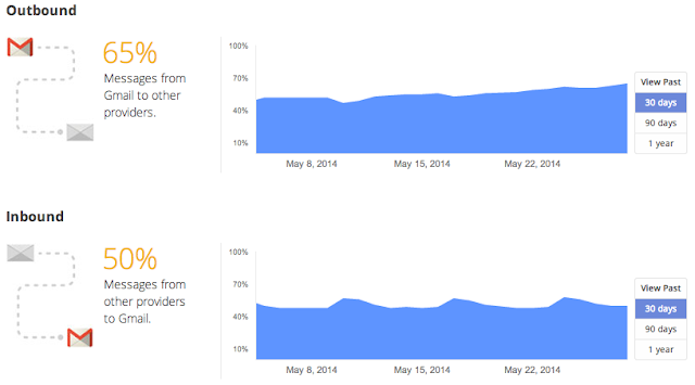
When you mail a letter to your friend, you hope she’ll be the only person who reads it. But a lot could happen to that letter on its way from you to her, and prying eyes might try to take a look. That’s why we send important messages in sealed envelopes, rather than on postcards.
Email works in a similar way. Emails that are encrypted as they’re routed from sender to receiver are like sealed envelopes, and less vulnerable to snooping—whether by bad actors or through government surveillance—than postcards.
But some email is more secure than others. So to help you better understand whether your emails are protected by encryption, we’re launching a new section in the Transparency Report.
Gmail has always supported encryption in transit by using Transport Layer Security (TLS), and will automatically encrypt your incoming and outgoing emails if it can. The important thing is that both sides of an email exchange need to support encryption for it to work; Gmail can’t do it alone.
Our data show that approximately 40 to 50 percent of emails sent between Gmail and other email providers aren’t encrypted. Many providers have turned on encryption, and others have said they’re going to, which is great news. As they do, more and more emails will be shielded from snooping.
For people looking for even stronger email security, end-to-end encryption is a good option—but it’s been hard to use. So today we’re making available the source code for End-to-End, a Chrome extension. It’s currently in testing, and once it’s ready for general use it will make this technology easier for those who choose to use it.
We encourage you to find tips about choosing strong passwords and adding another layer of protection to your account in our Safety Center. And check out Reset the Net, a broad coalition of organizations, companies and individuals coming together this week to promote stronger security practices on the web; we’re happy to be a participant in that effort.
Posted by Brandon Long, Tech Lead, Gmail Delivery Team
posted by Stephan Somogyi, Product Manager, Security and Privacy
Your security online has always been a top priority for us, and we’re constantly working to make sure your data is safe. For example, Gmail supported HTTPS when it first launched and now always uses an encrypted connection when you check or send email in your browser. We warn people in Gmail and Chrome when we have reason to believe they’re being targeted by bad actors. We also alert you to malware and phishing when we find it.
Today, we’re adding to that list the alpha version of a new tool. It’s called End-to-End and it’s a Chrome extension intended for users who need additional security beyond what we already provide.
“End-to-end” encryption means data leaving your browser will be encrypted until the message’s intended recipient decrypts it, and that similarly encrypted messages sent to you will remain that way until you decrypt them in your browser.
While end-to-end encryption tools like PGP and GnuPG have been around for a long time, they require a great deal of technical know-how and manual effort to use. To help make this kind of encryption a bit easier, we’re releasing code for a new Chrome extension that uses OpenPGP, an open standard supported by many existing encryption tools.
However, you won’t find the End-to-End extension in the Chrome Web Store quite yet; we’re just sharing the code today so that the community can test and evaluate it, helping us make sure that it’s as secure as it needs to be before people start relying on it. (And we mean it: our Vulnerability Reward Program offers financial awards for finding security bugs in Google code, including End-to-End.)
Once we feel that the extension is ready for primetime, we’ll make it available in the Chrome Web Store, and anyone will be able to use it to send and receive end-to-end encrypted emails through their existing web-based email provider.
We recognize that this sort of encryption will probably only be used for very sensitive messages or by those who need added protection. But we hope that the End-to-End extension will make it quicker and easier for people to get that extra layer of security should they need it.
You can find more technical details describing how we’ve architected and implemented End-to-End here.
By Roman Nurik and Timothy Jordan, Design and Developer Advocates on Android Wear
A few weeks ago, Timothy and I were chatting about designing apps for wearables to validate some of the content we’re planning for Google I/O 20141. We talked a lot about how these devices require scrutiny to preserve user attention while exposing some unique new surface areas for developers. We also discussed user context and how the apps we make should be opportunistic, presenting themselves in contexts where they’re useful; it’s more important than ever to think of apps on wearable devices not as icons on a grid but rather as functional overlays on the operating system itself.
But while I’d designed a number of touch UIs for Android in the past and Timothy had a ton of experience with Glass, neither of us had really gone through the exercise of actually designing an app for Android Wear. So we set out to put our ideas in practice and see what designing for this new platform is like.
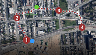
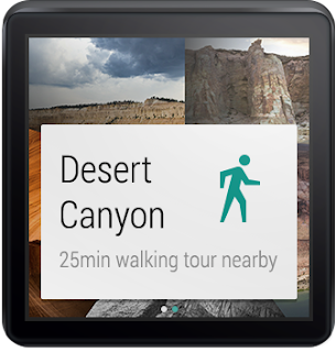
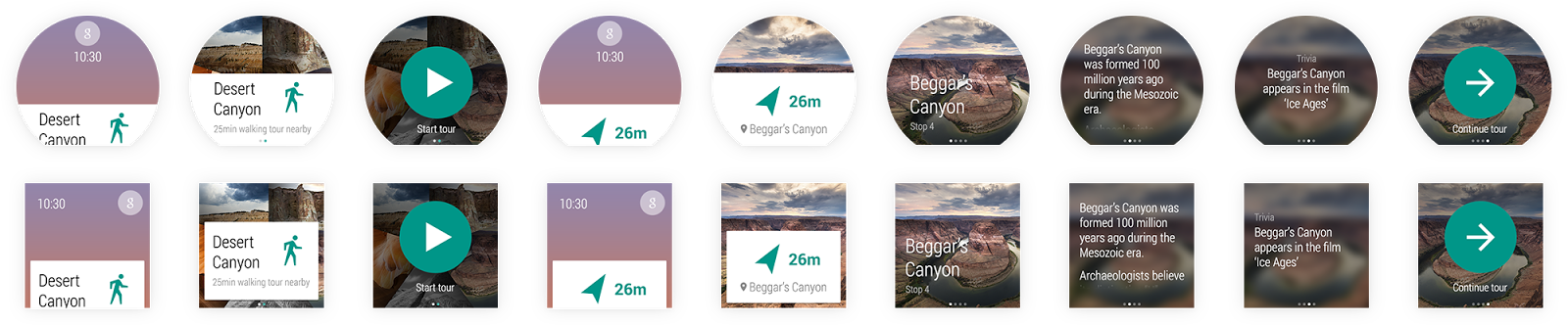
Before we got started, we needed an idea. Last year, I participated in an informal Glass design sprint in NYC run by Nadya Direkova, and my sprint team came up with a walking tour app. The idea was you’d choose from a set of nearby tours, walk between the stops, and at each stop on the tour, learn about the destination.
My rough mocks of a walking tour app from a Glass design sprint.
While the design sprint ended at rough mocks, the idea stuck around in my mind, and came up again during this exercise. It seemed like a perfect example of a contextually aware app that could enhance your Android Wear experience.
Designing a walking tour app for Android Wear
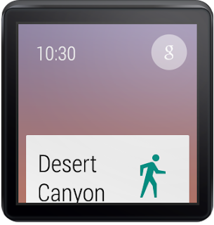
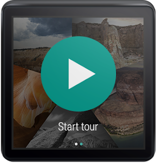
We started fleshing out the idea by thinking through the app’s entry points: how will users “launch” this app? While exposing a “start XYZ walking tours app” voice command is pretty standard, it’d be interesting to also suggest nearby walking tours as you go about your day by presenting notifications in the user’s context stream. These notifications would be “low priority,” so you’d only see them after addressing the more important stuff like text messages from friends. And with today’s geofencing and location functionality in Google Play services, this type of contextual awareness is possible in a battery-friendly way.
At this point we were pretty excited and decided to begin mocking up the UI. Rather than starting from scratch, we used Taylor Ling’s excellent Android Wear 0.1 design template as a baseline, which includes templates for both square and round devices. We started with square since we were most familiar with rectangle UI design:
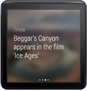
Idea: You get a notification in the context stream when a walking tour is available nearby.
I’ve got to admit, it was pretty thrilling designing in such a constrained environment. 140×140 dp (280×280 px @ XHDPI) isn’t a lot of space to work with, so you need to make some tough choices about when and how to present information. But these are exactly the types of problems that make design really, really fun. You end up spending more time thinking and less time actually pushing pixels around in Photoshop or Sketch.
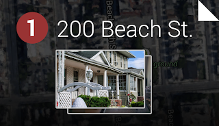
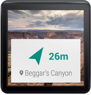
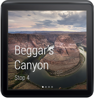
We pretty quickly fleshed out the rest of the app for square devices. They included just a handful of additional screens: a dynamic notification showing the distance to your next stop, and a 4-page detail screen when you arrive at the tour stop, where you can spend a few moments reading about where you’re standing.
A notification guiding you to your next stop, and a multi-page stop detail screen for learning about the stop when you get there.
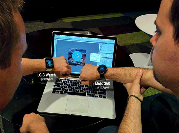
Seeing our design in real life
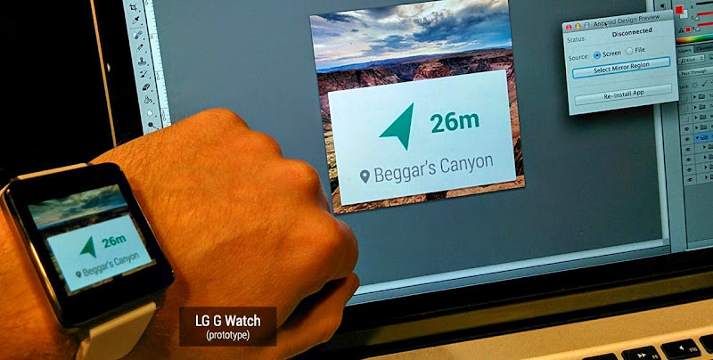
Here’s the thing—there’s only so much you can do in Photoshop. To truly understand a platform as a designer, you really need to use (and ideally live with) a real device, and see your work on that device. Only then can you fully evaluate the complexity of your flows, the size of your touch targets, or the legibility of your text.
Luckily, Timothy and I both had test devices—I sported an LG G Watch prototype and Timothy carried a Moto 360 prototype. We then needed a way to quickly send screens to our devices so we could iterate on the design. A few years ago I’d published the Android Design Preview tool that lets you mirror a part of your screen to a connected Android device. Much to our delight, the tool worked great with Android Wear! After seeing our mocks show up on my LG G Watch, we made a few small tweaks and felt much more confident that the overall idea “felt right” on the wrist.
Android Design Preview mirrors a part of your computer screen to an Android device. It’s especially awesome seeing your UI running on an LG G Watch prototype.
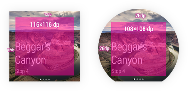
Designing for round devices
We’d never designed round UIs before, so we weren’t sure what this new adventure would be like. Quite frankly, it ended up being unbelievably easy: tweaking all 8 of our screen mocks for round took under an hour. When you’re only showing the most important 2 or 3 pieces of information on screen at a time, that’s only 2 or 3 pieces of information you need to optimize for round devices. All in all, there were only a few types of minor tweaks we made:
Scaled up backgrounds to 160×160 dp (320×320 px @ XHDPI)
Bumped up content margins from 12dp on square to 26dp on round; this means content was 116×116 dp on square and only a little smaller at 108×108 dp on round
Pushed down circular actions like “Continue tour” to better vertically center with the watch frame
Center-aligned certain short snippets of text on round devices as opposed to left-aligning on square
Dropped the side padding for context stream cards (the platform automatically does this for notifications, so there isn’t any actual work to do here)
These weren’t completely different layouts—rather, the same layout with slightly tweaked metrics.
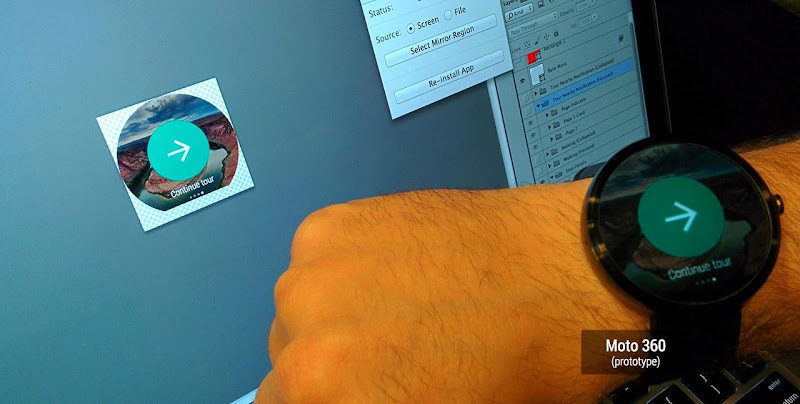
It’s hard to articulate the excitement we felt when we mirrored the mocks to Timothy’s Moto 360 prototype with Android Design Preview. To put it lightly, our minds were blown.
There’s something special and awe-inspiring about seeing one of your UIs running on a round screen..
And that was it—with round and square mocks complete, and mirrored on our devices, we’d gotten our first glimpse at designing apps for this exciting new platform. Below are our completed mocks for the tour discovery and engagement flows, not a grid of app icons in sight. You can download the full PSDs here.
An eye-opening experience
Designing for Android Wear is pretty different from designing for the desktop, phones or tablets. Just like with Glass, you really need to think carefully about the information and actions you present to the user, and even more so about the contexts in which your app will come to the surface.
As a designer, that’s the fun part—working with constraints involving scarce resources like device size and user attention means it’s more important than ever to think deeply about your ideas and iterate on them early and often. The actual pixel-pushing part of the process is far, far easier.
So there we were, putting our ideas into practice, on real actual device prototypes that we could’ve only dreamed about only a few years ago. It was the most fun I’ve had designing UIs in a long time. Remember that feeling when you first dreamed up an app, mocked or even coded it up, and ran it on your Android phone? It was that same feeling all over again, but amplified, because you were actually wearing your app. I can’t wait for you all to experience it!
1 Have we mentioned #io14 will have tons of great content around both design and wearable computing? Make sure to tune in June 25th and 26th!
We’ve heard from both publishers and advertisers that new, larger ad formats provide a great canvas for rich creatives and perform well on many sites. Today, we’re pleased to share two new ad sizes – 970 x 250 Billboard and the 300 x 1050 Portrait – that will help you reach more advertisers while also enhancing user experience and engagement on your site.
As with most of our ad sizes, both of these ad units can accommodate standard text ads in addition to image ads. Additionally, they can show similar-sized image ads when doing so will maximize the performance of your ad unit. In this case, a 300 x 250 ad would serve in the 970 x 250 ad unit and a 160 x 600 would serve in the 300 x 1050 ad unit.
As both of these new sizes are large ad units, you can place a maximum of one per page. As always, remember to keep a balance between your content and ads and ensure your ad placements comply with our AdSense program policies.
We’re always looking for your feedback and suggestions to help us provide you with the ad sizes you need to stay flexible to your advertiser and user needs. Stay tuned for more updates coming soon and share your feedback in the comment section below.
Posted by Alexey Petrov, AdSense Product Specialist Was this blog post useful? Share your feedback with us.
ddd
Hangouts enrich apps everywhere with video meetings
Posted by Stephen Cho, Head of Google Apps and Hangouts Technology Partnerships
Today, technology allows us to work across devices, at all hours, around the world. But, sometimes working face-to-face is most effective.
That’s why we recently launched a Hangout start button that can be embedded in any app or website. Whether you’re a sales rep working in a CRM app or an engineer in a project management tool, it only takes one click to launch a Hangout and your team will automatically be invited. You can even improve customer service with the ability to quickly launch into a video Hangout with a client to resolve an issue.
With this new Hangouts button, apps everywhere will let colleagues, partners, and customers meet face-to-face anytime, anywhere, and work more effectively together with just one click. A number of our early partners have already enriched their applications with Hangouts:
Collaboration and Project Management: Team members collaborating on a project are now able to easily start a video Hangout from Smartsheet. Developers on a project team can enjoy the same experience with Insightly.
Shared Documents: Lucidchart enables team members working on a complex diagram to view and video chat while collaborating on the diagram
Sales and Marketing: Sales reps working in Salesforce.com can automatically kick off a Hangout with their account team through Esna; in myERP, a sales rep can start a video meeting with any customer prospect
Customer Support: Zendesk helps support agents start a Hangout to consult with other agents and internal staff, while Freshdesk lets a customer service agent Hangout with a customer to quickly resolve support issues
Social: Zoho Connect’s social app facilitates both 1:1 and group Hangouts initiated by anyone in a given group
Human Resources: With Zoho Recruit, an interviewer can automatically kick off a Hangout with a candidate
And this is only the beginning. We invite developers to get started here to make it easier for users to work face-to-face.


.png)