Change the way you see your site with Browser Size
January 19th, 2010 | Published in Google Website Optimizer
This is a guest post from Jesse Nichols. Jesse is part of the Google Analytics team and is one of our Analytics gurus. Here, he shares a new tool in Google Labs that can help you see how visitors see your site.
The easiest websites to optimize are the horrible ones. In fact, the hardest part about optimizing a site that has a million and one problems is deciding which ones to go after first. However, where do you begin if you have a beautiful, clean, profitable website? If there are no clear issues - if the calls to action are visible and the page uncluttered and the buttons big and shiny - then what can be done short of remaking the entire site (an idea as scary as it is unnecessary)?
Sometimes, all you need is a change in perspective. We, the web savvy, see the Internet through big, clear monitors and 11 point font. We look at our site and we can’t understand why anyone wouldn’t be able to perform whatever task the site is designed to do. Well, to that end, Google Labs has created Browser Size. This nifty little tool allows you to see how much of your webpage is immediately visible to your visitor depending on the size of their monitor and resolution settings.
The concept of “the fold” of a webpage (as in “above the fold”, i.e., what can be seen upon landing on a webpage without any scrolling) is not a solid line that snips the bottom off every page, but rather a subjective experience. The notion of having important links, buttons and messages above the fold is taken for granted as a good policy, so what if you found out that 20% of your visitors couldn’t immediately see what you thought they could?
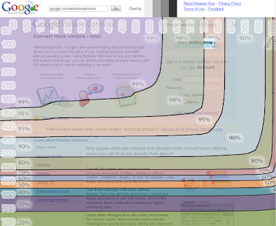
Plug your site into Browser Size and you’ll get that perspective. Each band of color represents approximately how many visitors will see that section immediately upon landing (the seemingly shaky lines are actually a true representation of the visible area excluding the title bar, toolbars, etc). If you have important information or buttons in the 70% range, that means 30% of your visitors are forced to scroll to see that information and convert.
Take a look at this example from the Website Optimizer homepage:

Click to see full-size
As you can see, most people can see our primary call to action, the “Start testing now” button. However, some of our educational content like Benefits and Testing 101 sections is below the fold for 50% of viewers.
Think the numbers are different for your site? Browser Size bases its data on a sample of visitors to Google.com, but you can check out your screen resolutions report in your web analytics tool to see the most common visitor screen resolutions for your own site. For most sites the list of dimensions is quite long, and the ones we in the industry tend to use – 1024x768, 1280x800, 1280x1024 - typically only represent about 50% of the visitors at best.
So get back to the optimization grindstone, squeeze another percentage point or two into your conversion rate, and give all of your visitors the experience they deserve. You can start using Browser Size at http://browsersize.googlelabs.com
Thanks again to Jesse for sharing this post with us.