Details, details, details: A conversation with the International Masonry Institute
September 7th, 2014 | Published in Google SketchUp
The International Masonry Institute (IMI) is a partnership between the International Union of Bricklayers and Allied Craftworkers (BAC) and their contractors, promoting quality masonry construction. The IMI offers quality training and professional education for masonry contractors, and free technical assistance to the design and construction communities. We spoke with Scott Conwell, IMI’s Director of Industry Development and Technical Service, about the 3D Warehouse collection of masonry details that he has created and shared for SketchUp modelers everywhere.
It looks like you know your way around SketchUp. What was your first reaction to SketchUp?
I was amazed at how simple the interface was, and I loved how I could make value judgements in 3D very quickly. I only had one goal when learning SketchUp Pro: to draw masonry details. I quickly learned that SketchUp was the perfect tool for that. The type of views that SketchUp is capable of generating were ideal to show exactly what I wanted to show in my drawings. The scale of our masonry details is very appropriate for a SketchUp model. In other words, I can put as much detail as I need into my model -- wall ties, sealant joint at flashing overlaps -- and it all appears very clear in the final drawing.
What was the catalyst for deciding to put IMI’s detail models on the 3D Warehouse, and give them away for free?
There are lots of manufacturer details out there that have pretty good details; however, they are to the exclusion of other components. Masonry is a system. For example, you may find good brick drawings, but there’s more to a wall than bricks. We want to show the whole masonry system, and represent all components from a constructibility standpoint. These are reviewed and developed with input from master craftworkers that really care and are passionate about their craft; their hand is obvious in these models.
As far as providing them on the 3D Warehouse for anyone to download; well, there’s no reason not to. Our goal is to educate architects and designers about masonry, and also to highlight the skills of the trained union bricklayers and contractors.
The IMI technical team decides how to show certain components that best fit the particular detail, and thinks about how to compose the notes so they can be adapted for general use. These SketchUp models are an embodiment of ideas, and we wanted to put these ideas out there. If someone sees them, we hope they might rethink the importance of how the masonry components are put together, and who is skilled and qualified to build with these materials.
How do these details compare to traditional architectural details? Why is 3D important here?
We are not just providing a detail, we’re teaching someone how to design so an assembly can be constructed. The unique ability to modify and customize these details is powerful. For example, anyone can go into these models and copy/paste various components for use in another type of assembly.
Additionally, you have the assurance that these can be built. Unfortunately, there are plenty of 2D details out there on manufacturers’ web sites and in their literature that are not constructible! In the IMI details, you can really see how each component relates to the other in three dimensions. Until you see it in 3D, you don’t really have a good idea of what’s happening. These are not just functional; this format shows how they can be efficient to construct.

|
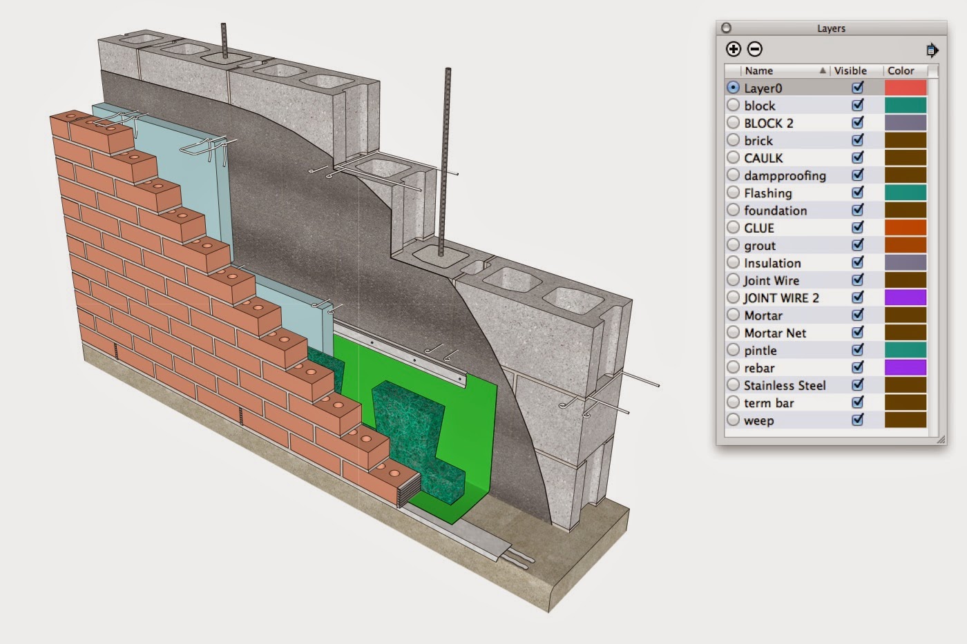
| An example of a base of wall detail with the Layers window open. Note that you can turn layers on and off to get a better look at how these assemblies come together. |
Who might be interested in these 3D models?
The details started out as being primarily for architects and engineers. However, we’re finding that they’re being used as teaching tools in many colleges and universities, and also in IMTEF’s (International Masonry Training and Education Foundation) apprenticeship training centers where the bricklayers, tile setters, and other masonry craftworkers are trained. We want to advocate good design and good construction practices, and each detail is created with that in mind.
Did any 3D Warehouse content aid you in creating these details?
In terms of finding useful ancillary components to go into my models; I have downloaded quite a few items that have saved me countless hours of modeling! A chair rail and crown molding come to mind, and I’ve also found some great textures embedded in the models people have uploaded. That’s where I got my plywood texture you’ll find on the sheathing of some of our masonry veneer details, as well as on some of the ceramic tile details. If I have the choice to draw something from scratch or search for it on the 3D Warehouse, I’m going to the Warehouse. Over the years I’ve painstakingly drawn many brick, block, stone components, special shapes, wall ties, anchors, you name it -- and now that they’re uploaded to the 3D Warehouse, I hope other SketchUp users find them, download them, and benefit from them.
Are there any techniques you use that you’d like to share?
In terms of style, I made the decision early on to go with an all white background, no horizon, no shadows, hard lines with no extensions, and the use of textures judiciously. This is to keep the focus on the model and the information it’s conveying, rather than a sketchy or photorealistic style. These are not meant to be photorealistic; they are details to communicate constructibility. By its very nature, masonry is a modular, repetitive element, so it only makes sense to draw a brick or a block once and then copy it. Therefore, mastery of groups and components is necessary.

|
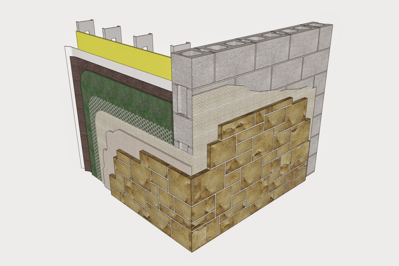
| IMI's Adhered Veneer - Stone Veneer detail makes good use of textures. |
I always approach my models with one or two primary views in mind, so I peel back the wall’s materials strategically to optimize how the information is shown in the desired view. Sometimes a single model will generate more than one masonry detail. For example, a window jamb, window head, and window sill detail would all be generated from a single model of that window in a masonry wall -- so I make pretty good use of Scenes in SketchUp.
Do you have any advice for other SketchUp users that might want to follow your lead?
Well, I have a 15-year old son who has been using SketchUp since he was about 9. I always encouraged him to practice, and he’s actually getting very good at it. He built a model of an airplane that I was totally impressed with! His own logo on the wings, and all! I encouraged him to view the tutorials online, and I think that’s where he picked up a lot of tips.
Always respect the scale and draw things actual size. Don’t try to show too much information in your model. Keep in mind the desired view, and show just the right amount of information appropriate for that view. Have fun with textures; you’re not limited to the default textures in the Materials Browser. Try a Google Image search and download some fun ones!
Ed. note: There are a variety of other places you can explore to find textures. You can borrow textures from other models found on the 3D Warehouse (as Scott previously mentioned), use a subscription service like FormFonts, or use photos -- your own photos can be a great way to introduce the right texture/material into your SketchUp model.
Finally, have fun using SketchUp. It’s rewarding to learn new techniques and see your skills improve, and to get more efficient with your workflow. The most fun of all is the feeling of accomplishment when you’ve modeled something well, when it looks good, and it’s able to successfully graphically communicate your ideas. SketchUp makes that easy.
Posted by Josh Reilly, SketchUp Team