Big Pictures with Big Messages
July 26th, 2012 | Published in Google Research
Google’s Eighth Annual Computer Science Faculty Summit opened today in Mountain View with a fascinating talk by Fernanda Viégas and Martin Wattenberg, leaders of the data visualization group at our Cambridge office. They provided insight into their design process in visualizing big data, by highlighting Google+ Ripples and a map of the wind they created.
To preface his explanation of the design process, Martin shared that his team “wants visualization to be ‘G-rated,’ showing the full detail of the data - there’s no need to simplify it, if complexity is done right.” Martin discussed how their wind map started as a personal art project, but has gained interest particularly among groups that are interested in information on the wind (sailors, surfers, firefighters). The map displays surface wind data from the US National Digital Forecast Database and updates hourly. You can zoom around the United States looking for where the winds are fastest - often around lakes or just offshore - or check out the gallery to see snapshots of the wind from days past.

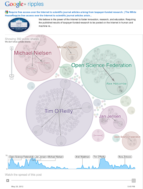
Fernanda discussed the development of Google+ Ripples, a visualization that shows how news spreads on Google+. The visualization shows spheres of influence and different patterns of spread. For example, someone might post a video to their Google+ page and if it goes viral, we’ll see several circles in the visualization. This depicts the influence of different individuals sharing content, both in terms of the number of their followers and the re-shares of the video, and has revealed that individuals are at times more influential than organizations in the social media domain.

Martin and Fernanda closed with two important lessons in data visualization: first, don’t “dumb down” the data. If complexity is handled correctly and in interesting ways, our users find the details appealing and find their own ways to interact with and expand upon the data. Second, users like to see their personal world in a visualization. Being able to see the spread of a Google+ post, or zoom in to see the wind around one’s town is what makes a visualization personal and compelling-- we call this the “I can see my house from here” feature.
The Faculty Summit will continue through Friday, July 27 with talks by Googlers and faculty guests as well as breakout sessions on specific topics related to this year’s theme of digital interactions. We will be looking closely at how computation and bits have permeated our everyday experiences via smart phones, wearable computing, social interactions, and education.
We will be posting here throughout the summit with updates and news as it happens.