We like it graphed
October 28th, 2008 | Published in Google Reader
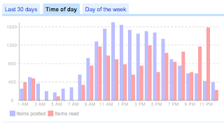
 When we launched the Trends page last year, we wanted to visualize how we consumed data in Google Reader. One of the more interesting sections of the Trends page is the chart that shows items read by time. Spikes in the chart are a cool way of noticing patterns and possibly realizing that the reason we're less productive on Fridays is because of Reader. Some of us on the Reader team are obsessed with keeping our unread counts low so we wondered if we were being driven by the posting schedule of our subscriptions. We thought the chart might be more interesting if we showed when posts were coming into Reader, so we are now graphing published statistics on the same chart. For example, in my set of subscriptions, even though I'm reading the majority of items in the evening, new posts seem to arrive in the middle of the day.
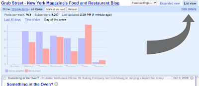
 We also wanted to expose more fine-grained data. While it's useful to know what your overall reading trends are, we thought it might be interesting to also display this data on a subscription by subscription level. If you've ever been curious about when your favorite subscriptions were publishing new posts or when you were reading them, click the "show details" link in the upper right corner of the viewer. It's a good way to peak into your personal habits as well as the posting schedule of your favorite blogs. While you're in there, check out the other details - we also display the last crawl time and any errors encountered during that crawl.