Something looks… different.
September 28th, 2006 | Published in Google Reader
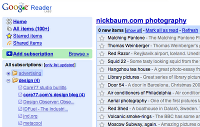
 As of today, Google Reader has a new look — and even more important, a lot of new features that we think you'll like. We've listened to your feedback, done usability research, and examined all the ways that people consume content on the web, from feed readers to email clients. With a clean interface and some JavaScript wizardry, we think we've built an application that accommodates a wide range of reading styles while being fun and easy to use.
So what's new? First, we've added some things you've been asking for, such as unread counts and "mark all as read." Folder-based navigation makes it easier to organize your subscriptions, and the new expanded view lets you quickly scan over several items at once. And we've made sharing much easier - with a single click of the "shared" icon, you can publish an interesting item on your public sharing page for your friends to see. So give the new Reader a try. We hope you like it!
And what about the old interface? Well, things might look different, but we made sure the new interface enabled the reading style of current Reader users. For example, clicking "All items" and choosing "List view" should make the experience feel quite familiar. But since it's possible that we've overlooked your favorite feature from version 1, you still have the option (in "Settings") to switch back to the old interface for the time being. If you do, please let us know why so we can improve the new version to better suit your needs.
One last thing: Chris made a video for the launch. We think it's fun: