Attack of the 20%’ers
November 6th, 2007 | Published in Google Reader
At Google, 20% time is core to our culture and today's Reader release incorporates features developed by two engineers in their 20% time. Those two engineers would be us!
 Steve Lacey: As a blogger I like to include a blogroll on my site so that friends, family and other readers can take a look at what I like to read. It's also a nice way to give a shout out to the authors of the blogs that I like. However, maintaining a blogroll can be a bit of a pain as your subscriptions ebb and flow.
As a heavy user of Google Reader, I figured that the best way to get a blogroll would be to have Reader generate it for me, based on my subscriptions. This didn't seem to hard, so I chatted to the Reader team and then set about implementing a this feature in my 20% time.
Well, now it's ready for prime time! Head over to the "Tags" section on the settings page, make one of the tags you use for subscriptions public, and click on "add a blogroll to your site." For an example, head over to my personal blog, and you can see my blogroll in action over on the right.
20% time is such a wonderful thing. As well as being able to actually implement my own wishlist in another Google product, I get to play around with technologies that I might not use day-to-day. As a backend engineer, mucking around in frontend code can be refreshing...
 Dolapo Falola: One of my favorite Google Reader features is the ability to read feeds on my mobile phone. I'm a New Yorker so I'm out and about quite a bit without a computer. Whether it's sitting on a bus or waiting for a table for brunch, Reader provides a way for me to stay informed on news, or to just kill time whenever I can get a cellular or WiFi signal.
As Steve mentioned, 20% time lets Googlers who aren't necessarily working on Reader contribute features. I've been taking advantage of this opportunity to add small (pun intended) features to Google Reader Mobile. Some of the more interesting features I've added are the ability to see trends data on which feeds are viewed on mobile, as well as the ability to change the number of items displayed at once, or disable reformatting linked web sites for mobile phones. The latter in particular is especially useful for iPhone and other smart phones that are capable of properly displaying sites.
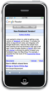
This release also includes some additional changes for iPhone users. While the functionality is the same as previous versions, we've changed the user interface to make it easier to navigate and select often-used links. We've also moved the navigational buttons to the top, since it's easy to return to the top of the page by just tapping on the status bar. Enjoy.
It's also probably worth mentioning that as of last week, I'm no longer a 20%'er but a full-fledged 80%'er on the Reader team — working in my 20% time provided me with the perfect way to test the waters and eventually switch projects.