Our Favorites: Time-Based Maps
September 3rd, 2009 | Published in Google Maps
 Obviously, we love when we see developers using the Maps API to create sophisticated and innovative applications. It makes us feel good that we put time into creating our APIs, and it excites us that there are so many creative developers in the world. But, we don't always wear our heart on our sleeve, and share our love for great uses of the APIs with everyone. So, we're initiating a series of blog posts about our favorite maps, and this is the first in the lot. We'll also use this series as a way to introduce you to other members of our ever expanding team here. You likely already know me, as I'm something of a regular on this blog - getting started 3 years ago with a post showing how to use the then-just-introduced GPolygon (man, that makes me feel old). So, I'll go straight into my favorites.
I was once asked what I thought the next frontier in maps mashups was, and I responded: "time". Why? It's tricky figuring out how to display layers of data on top of a map, but it's even trickier to squeeze in one more dimension and display time-based data, and I admire those developers that take on the challenge. Here are some examples:
 |
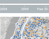
NYC Homicides Map Displays 10 years of homicide data in New York City, including as recent as the last 2 weeks (eerie!). They give users a slider to quickly slide through the years and see how the density changes, and also give them different options for coloring the data. It's a great, simple combination of two different ways of visualizing data. |
| RozTracker Shows the voyage of a woman that's in the middle of rowing across the Pacific. The user can see how many oar strokes she's done, and zoom in to see her tweets, blog posts, and videos from the voyage so far. |
|
 |
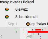
WW2 TimeMap Displays WW2 events using TimeMap, the open-source project combining the SIMILE Timeline with the Google Maps API. It's a rich timeline that's able to show long-running events as well as single-time events, and deals with overlapping events. It means that the developer can open the map up to user contributions, and not worry about the usability of the interface being compromised. |
 |
Manhattan Map Shows what Manhattan looked like hundreds of years ago (a whole lot greener), and gives the user a slider to change the transparency of the 1609 imagery, giving the illusion of the modern-day landscape fading in. The user can also hover over individual city blocks for information on what that block was like back then. |
 |
TimeSpace Clusters the top news stories on the map, and gives the user a time slider to pan through the day's events. The graph underlaid beneath the slider shows how the news density varies during the day, and a search box lets the user filter the news displayed. It's a much more fun way to browse the news, and a good way to encourage readers to be interested in news all over the world. |
As you can see, there are a lot of ways to show time-based data on maps, and each of them suit different needs. The important thing is that developers are pushing the envelope and experimenting with different interfaces, and putting it out there for all of us to enjoy. For more examples like these, check out the "Timeline" label in the Google Maps Mania directory. Tune in next week to hear about more of our favorites! :)