Marker Clustering and Heatmaps: New features in the Google Maps Android API Utility Library
February 12th, 2014 | Published in Google Maps
A new version of the Google Maps Android API Utility Library is now available, which includes some cool new data visualisation features - marker clustering and heatmaps.
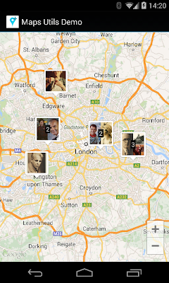
You can also easily customize the appearance of individual and clustered markers.
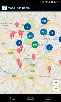
Left: clustered markers with default look
Right: custom rendering for clusters using the
Marker clustering is ideal for visualising a large number of elements on a map whilst minimising clutter. You see a concise summary of your data when zoomed out, and as the markers separate when you zoom in, you don't lose any detail from your data.
For an overview of the heatmaps library, watch the video below:
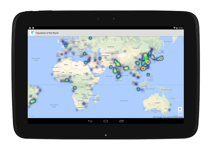
You can use a heatmap to visualise any data set that has a geospatial component. For example, the below heatmap shows the population of cities around the world, with cities as points on the heatmap, weighted by population:
To get started with the Android Maps API Utility Library, view the setup guide - you can also view our guides on how to use the marker clustering and the heatmap features. For a summary of previously existing features in the utility library, view Chris Broadfoot's Maps Shortcuts video. As always, if you have any problems using the Android Maps API or the Utility Library, post to StackOverflow - our support page has the right tags to use.
Marker Clustering
When you have a lot of data to show, it can be hard to keep your app from becoming cluttered and messy. One solution is to group nearby markers into a single marker (cluster marker). When viewed zoomed in, individual markers are shown. However, as the user zooms out, markers group together into a single cluster marker.You can also easily customize the appearance of individual and clustered markers.


Left: clustered markers with default look
Right: custom rendering for clusters using the
IconGenerator utilityMarker clustering is ideal for visualising a large number of elements on a map whilst minimising clutter. You see a concise summary of your data when zoomed out, and as the markers separate when you zoom in, you don't lose any detail from your data.
Heatmaps
Heatmaps are another new visualisation available in the utility library. Heatmaps represent geospatial data on a map by using different colours to represent areas with different concentrations of points - showing overall shape and concentration trends. Heatmaps are also known as "intensity maps".For an overview of the heatmaps library, watch the video below:
You can use a heatmap to visualise any data set that has a geospatial component. For example, the below heatmap shows the population of cities around the world, with cities as points on the heatmap, weighted by population:

To get started with the Android Maps API Utility Library, view the setup guide - you can also view our guides on how to use the marker clustering and the heatmap features. For a summary of previously existing features in the utility library, view Chris Broadfoot's Maps Shortcuts video. As always, if you have any problems using the Android Maps API or the Utility Library, post to StackOverflow - our support page has the right tags to use.