Updates on charts!
September 26th, 2007 | Published in Google Finance
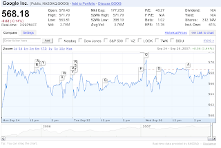
We've gotten a lot of great feedback and suggestions on how to improve our charts. In response, today we're unveiling an updated UI as well as some new tools. The new chart UI makes it easier to compare stocks, indices and even mutual funds. In the "compare" tab, we provide some suggestions on what you might like to compare a stock with, such as industry competitors or general market indices. Or feel free to add your own stock, index or mutual fund.

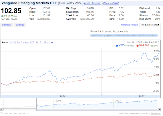
In addition, we have a bunch of new features to help analyze public companies. First, you can now "link to chart" with all of your settings preserved. For example, take a look at this 2-year comparison between Vanguard Emerging Markets ETF (VWO) and S&P 500. Copy and paste the link from the "Link To Chart" tab, then send a link to your friend or include it in your blog.

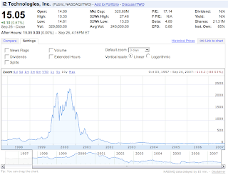
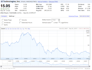
Another feature we've recently added is support for logarithmic scale, which is extremely useful when viewing charts that have large changes in price. Just compare the 10-year chart for i2 Technologies Inc (ITWO). Without logarithmic scale, the current behavior of the stock is hard to see.
Linear chart:

Logarithmic chart:

In the comments section, please let us know what you think of these additions as well as what other chart features you would like to see.