Tracking the real estate meltdown with comparison charts
June 30th, 2007 | Published in Google Finance
Everyone knows that business cycles oscillate from boom to bust every so many years, and real estate is not unique in this regard. Stock prices reflect these trends. Anyone who has looked at a home builder stock in the past couple years is intimately aware of this connection. But what does it mean to say that an industry, as opposed to a stock, is experiencing a downturn? It's not just a matter of saying "real estate stocks are down" -- it's more that they're down, in a roughly correlated manner, over a meaningful common time period.
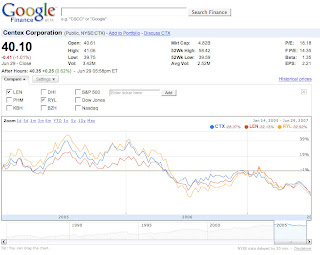
Let me show you what I'm talking about. Here are 3 major homebuilders -- Centex, Lennar, and Ryland -- in the same graph:

Let me take a moment to explain how I generated this chart, so that you can do your own analysis of stock trends in real estate (or any other industry). Go to Google Finance. Type in the first symbol, CTX (Centex). Hit Enter. You should see a chart for Centex. Use the time window below the chart to change the view to January 2005 through June 2007. (You might have to zoom out more than once.) Now, hit the"Compare" button to the upper left of the chart. Check the boxes for LEN (Lennar)and RYL (Ryland). A short moment later, you should see essentially the same chart that I gave you above. You might have slight differences due to different start and end dates.
Notice that you never asked for LEN or RYL. Google Finance just knew that they were related companies. This works very well in most cases. Type in C (Citigroup), for example, and you'll get other large financial companies from "Compare". How do we know which companies are related to which other ones? Ah, but that's the secret sauce!
So back to the vague term "industry downturn". As you can see in the chart above, all of these stocks are down roughly 35% since the start of 2005. And it should be visually clear to you that they rose, then declined, in roughly the same manner, with RYL being the most volatile of the group.
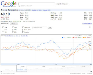
Has this ever happened before? Sure it has. In the last major real estate stock decline, you can see an eerily similar pattern:

Here, January 2005 has been replaced by January 1989, and June 2007 has been replaced by June 1991. Again, CTX was the most volatile of the group, and again the ups and downs of all 3 major players roughly traced one another. The group as a whole appears to have peaked in August 1989 (although to know for sure we need to adjust for market cap). It then seems to have bottomed in October 1990.
In the first chart, you can see that the group appears to have peaked again in July 2005. So, if we learn from history, it should have bottomed in around September 2006. Indeed, this isn't far off from the real bottom, up to that point, which occurred in July 2006. Unfortunately, as we all now know, that wasn't the bottom...
Of course, comparisons such as this do not make a complete investment analysis, but they can often provide suggestions for further research involving other financial metrics.
I don't own any of the stocks I discussed, and while it's not my business to advise you what to buy or sell, I do hope I've shown you a new and cool way of analyzing related businesses.