Visualizing greenhouse gas emissions
July 31st, 2009 | Published in Google Earth
Even for experts and scientists, analysing data on emissions and climate change can seem like a rising sea of numbers. The United Nations Climate Change Secretariat (UNFCCC) in collaboration with several Googlers has created a map that visualizes greenhouse gas (GHG) emissions generated by a number of industrialized countries.
The aim of this map is to give scientists, decision-makers, media and the general public a new way to navigate data collected since 1990. We hope that this can provide a valuable tool for understanding climate change leading into the upcoming negotiation of a new climate change agreement in Copenhagen at the end of this year.
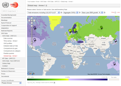
The greenhouse gas map allows you to gradually move from a very high-level view (e.g. the changes in emissions between 1990-2006 in the screenshot above) to a detailed analysis down to country level. You can also visualize any combination of emission categories (e.g. energy, industrial processes etc.), greenhouse gas type (e.g. CO2, CH4, etc.), and year (or the change from base year to 2006), via drop-down menus.
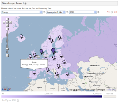
For instance, a visualisation of the aggregate greenhouse gas emissions from energy sources of European countries in 2006 looks like this:
We, along with UNFCCC, hope that the map will underscore the importance of global climate agreements that aim to decrease greenhouse gas emissions. You can read more on the UNFCCC website.
The aim of this map is to give scientists, decision-makers, media and the general public a new way to navigate data collected since 1990. We hope that this can provide a valuable tool for understanding climate change leading into the upcoming negotiation of a new climate change agreement in Copenhagen at the end of this year.

The greenhouse gas map allows you to gradually move from a very high-level view (e.g. the changes in emissions between 1990-2006 in the screenshot above) to a detailed analysis down to country level. You can also visualize any combination of emission categories (e.g. energy, industrial processes etc.), greenhouse gas type (e.g. CO2, CH4, etc.), and year (or the change from base year to 2006), via drop-down menus.
For instance, a visualisation of the aggregate greenhouse gas emissions from energy sources of European countries in 2006 looks like this:

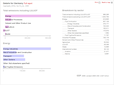
Hovering your mouse over a country marker shows total emission values for that country, and clicking on the country itself brings up a detailed analysis based on the settings for the global map (see example below for Germany).

You can notice some interesting trends from this data. As time goes by, emissions for each sector can go up or down for many reasons - for example, changes in efficiency, or use of different energy sources. One of the sectors, LULUCF ("land use, land-use changes, and forestry"), is not like the others - it can have negative emissions or, as they say, can act as a 'sink'. LULUCF helps to account for the carbon that's stored in trees, plants and soil: greenhouse gases could be released when forests are burned or cut down, or captured when existing forests grow or new forests are set.
We, along with UNFCCC, hope that the map will underscore the importance of global climate agreements that aim to decrease greenhouse gas emissions. You can read more on the UNFCCC website.
Update (8/5/09): Note that Sweden's emissions in the LULUCF sector are overstated in the UNFCCC database underlying the GHG map. The database currently contains the latest submissions of all Annex I countries up to September 2008. Sweden has submitted revised data in February 2009. The database for the GHG map is scheduled to be updated with the revised data in October 2009. All the latest country submissions can be found here. And finally, many thanks to Jonah Jones for help designing the user interface.