Making our new building home
August 16th, 2010 | Published in Google Earth
This past June, our Geo team finally outgrew our space, so it was time to move to a larger building on campus. To make sure our new building really felt like a home away from home, some of us got involved in the design planning and made it our mission to surprise everyone with a unique, inviting and very Googley new place to work.
We gave the new building a quintessentially Geo feel by putting map-themed artwork in the lobby and halls. We also decided to make quirky, fun places like the “Moon room,” complete with the Earth rising on the wall, moon rocks to nap on, crater-laden carpet and twinkling stars above.

Then we added a Liquid Galaxy for Googlers and visitors to explore Google Earth on eight stunning LCD panels. Given that it’s right next to the café, we recommend that you use the Liquid Galaxy before eating, because swooping and zooming around in Google Earth in an immersive panorama can get a little intense.

Despite all of these geographic references, we heard that the new building’s layout had everyone confused! After plastering the walls with building floor plans and “You are here” stickers, we decided on two more creative solutions. First, we designed two “hiking trail” style sign posts for each floor so that folks could quickly find meeting rooms, which we named after famous explorers!

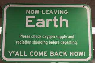
Second, we devised a contest for teams to design “road signs” to hang above their cubes, notifying visitors and lost team members where to find them. Teams had a couple weeks to craft and submit their design for a little friendly competition. While all the signs were being printed and hung, we encouraged everyone in the building to vote for their favorite signs. My personal favorite is the double-sided one created by the Google Earth team.

 Photos courtesy of Brian Kiley.
Now, after seeing all the fun signs hanging throughout the building, teams that didn’t participate in the contest are rallying for a second round of sign design. All in all, the dust has settled, and everyone seems quite happy with our new digs.
We gave the new building a quintessentially Geo feel by putting map-themed artwork in the lobby and halls. We also decided to make quirky, fun places like the “Moon room,” complete with the Earth rising on the wall, moon rocks to nap on, crater-laden carpet and twinkling stars above.
Then we added a Liquid Galaxy for Googlers and visitors to explore Google Earth on eight stunning LCD panels. Given that it’s right next to the café, we recommend that you use the Liquid Galaxy before eating, because swooping and zooming around in Google Earth in an immersive panorama can get a little intense.
Despite all of these geographic references, we heard that the new building’s layout had everyone confused! After plastering the walls with building floor plans and “You are here” stickers, we decided on two more creative solutions. First, we designed two “hiking trail” style sign posts for each floor so that folks could quickly find meeting rooms, which we named after famous explorers!
Second, we devised a contest for teams to design “road signs” to hang above their cubes, notifying visitors and lost team members where to find them. Teams had a couple weeks to craft and submit their design for a little friendly competition. While all the signs were being printed and hung, we encouraged everyone in the building to vote for their favorite signs. My personal favorite is the double-sided one created by the Google Earth team.
Now, after seeing all the fun signs hanging throughout the building, teams that didn’t participate in the contest are rallying for a second round of sign design. All in all, the dust has settled, and everyone seems quite happy with our new digs.