Visualize your data with charts in Google Sites
September 28th, 2011 | Published in Google Docs
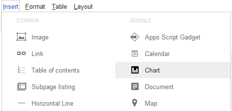
Ever since we launched the chart editor in Google spreadsheets, many of you have asked us to integrate charts into Google Sites as well. Today we are making this possible. Now you can display charts in your Sites by going to Insert Menu and choosing Charts in edit mode.

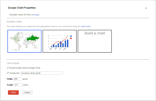
Once you select a spreadsheet, the editor picks existing charts from the spreadsheet to embed into a Site.

You can also create a chart by specifying the sheet and range and customize the chart by changing various properties such as color, axes, labels and more. Choose which chart type best expresses your data or let the chart editor recommend one for you.
You can decide to choose between two modes Live and Snapshot to show the data.

To learn more about how to express your data more visually with Sites, visit the help center. Be sure to let us know what you think in the comments.
You can decide to choose between two modes Live and Snapshot to show the data.
- Live provides you with dynamic charts. Whenever the chart is loaded in the Site, the chart will display the most recent data in the spreadsheet. This is very useful in cases when the spreadsheet data is updated manually or using a script.
- Snapshot means just that. It’s a snapshot at a point in time, so the chart will store and display the exact same data, regardless of whether you make changes to the underlying data sheet.
Changes made to charts in Sites are independent to the specific chart, so the same spreadsheet data can be applied across multiple charts.
To learn more about how to express your data more visually with Sites, visit the help center. Be sure to let us know what you think in the comments.