Experience the new look of Docs and Sites
October 3rd, 2011 | Published in Google Docs
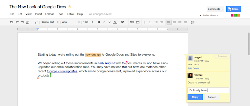
Starting today, we’re rolling out the new design for Google Docs and Sites to everyone.
We began rolling out these improvements in early August with the documents list and have since upgraded our entire collaboration suite. You may have noticed that our new look matches other recent Google visual updates, which aim to bring a consistent, improved experience across our products.
Your content is what’s important, and we aim to highlight it with this new design. You’ll see clean menus and toolbars, prominent action buttons, and colorful presence that pops when you’re editing with others.

To people who opted-in to try the new look — thank you. Based on your feedback, here are some of the improvements we made:
 If you’re not quite ready for the new look, choose Help > Use the classic look (or in the gear menu, for some products). We’ll support the classic look for at least a few more weeks, but encourage you to use the new look, get settled in, and send us any feedback you have.
We hope you enjoy this refreshed experience.
Posted by: Vance Vagell, User Interface Software Engineer
We began rolling out these improvements in early August with the documents list and have since upgraded our entire collaboration suite. You may have noticed that our new look matches other recent Google visual updates, which aim to bring a consistent, improved experience across our products.
Your content is what’s important, and we aim to highlight it with this new design. You’ll see clean menus and toolbars, prominent action buttons, and colorful presence that pops when you’re editing with others.

To people who opted-in to try the new look — thank you. Based on your feedback, here are some of the improvements we made:
- We made it clearer that your document is always saved, by showing “Saving...” right after you make a change and then “All changes saved” once it’s fully saved.
- We added an icon to the Share button so you can tell if your document is shared at a glance.
- If you’re looking for options that were previously under the Share button (e.g. “Email as attachment...”), you can now find these in the File menu.
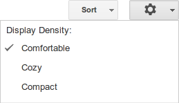
- By default, the documents list automatically fits a comfortable number of documents on your screen (large desktop monitors show more, smaller laptop screens show fewer). We also added density options to give you more control:
 If you’re not quite ready for the new look, choose Help > Use the classic look (or in the gear menu, for some products). We’ll support the classic look for at least a few more weeks, but encourage you to use the new look, get settled in, and send us any feedback you have.
We hope you enjoy this refreshed experience.
Posted by: Vance Vagell, User Interface Software Engineer