Coming soon: Changes to the spreadsheets interface
September 26th, 2008 | Published in Google Docs
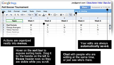
Next week, we'll be introducing a new interface for our spreadsheet application, polishing up the navigation and making it look and feel like our word processing and presentation tools. At the top of the page, a new set of menus is the place to look for all of your favorite spreadsheet features. In the toolbar, we've concentrated the most commonly-used features as shortcuts to make formatting data easier and faster. And the Share menu (look for the big blue button) contains everything you need to invite people to work together, publish to the web and share with the world.
Some of our favorite details are the subtle ones. For example, whenever a form is active, the menu shows a count of your total responses. And now it's even easier to insert a formula, switch between number and date formats, or access help content.
Behind the scenes, the new streamlined interface loads the spreadsheets application even faster.
Everything you know and love about spreadsheets will still be available—just better organized. And the best part of these changes is that we'll have room to add more great new features. Stay tuned.
 (click image to enlarge)
Some of our favorite details are the subtle ones. For example, whenever a form is active, the menu shows a count of your total responses. And now it's even easier to insert a formula, switch between number and date formats, or access help content.
Behind the scenes, the new streamlined interface loads the spreadsheets application even faster.
Everything you know and love about spreadsheets will still be available—just better organized. And the best part of these changes is that we'll have room to add more great new features. Stay tuned.
 (click image to enlarge)