Using information architecture techniques to improve long term conversion rates
March 28th, 2011 | Published in Google Conversions
Information architecture on the web involves organising and presenting information in a way that is easy for the visitor navigate, find and understand. Information architecture is to your website what blueprints are for a building. It forms the basis onto which everything else can be built.
Well constructed, easy-to-use websites lead to greater visitor satisfaction, meaning better conversion rates and more returning customers.
In this first post of the series on information architecture I wanted to take a quick look at some techniques you can use to improve the way your content is categorised, labelled and organised.
Visitors on your site use a variety of navigation aids to find content on your site and we’ll discuss some of these in later articles. For now though lets assume we have a typical hierarchy structure on our website.
Categories and labelling
So how many categories does your website have? Or perhaps a better question: is your categorisation easy to understand or what visitors expect?
Cognitive load theory suggests that people may have difficulty storing more than “7 information chunks” in their working memory at any given time. There have been many research papers written on the topic, but the key take away is that you should gradually introduce your users to new information and not overwhelm them with too much choice especially in the beginning.

This particular cycling website has over 2000 categories listed down the left hand navigation pane (indicated by the red arrow). This makes finding products on their website extremely difficult because it’s extremely hard to recall this many items in your working memory.
What about the three click rule? The three click rule suggests that visitors should be able to find what they want in 3 clicks of the landing page, but the number is not what’s important. What is more important is that each click brings the visitor closer to their goal.
Various studies including this one conducted by Ed Chi at Xerox PARC show that visitors on a website navigate via an information scent. Much like animals stalk their prey based on scent, websites with strong information scents are good at guiding visitors to content. This is because visitors hunt for information based on clues. Once the information scent is lost, visitors will often use the browser back button to return to a page where the information scent is strong again.
The caveat is that if visitors have to repeat this process often, the information scent dries up causing visitors to leave your website altogether. Think of this as your “give up rate” metric.
Often the best clue a visitor has moving through your website in terms of information scent is navigation headings (breadcrumbs), along with the primary and secondary navigation. Which are often based on your underlying category structure.
Take the following category structure of a website. What happens if I’m looking for an MP3 player for my car? Do I look under Car Audio or MP3’s? Or what if I need new brakes for my car, do I look under Brakes or Discs? And clothing for a 2 year old child? Do I look under Children or Baby?
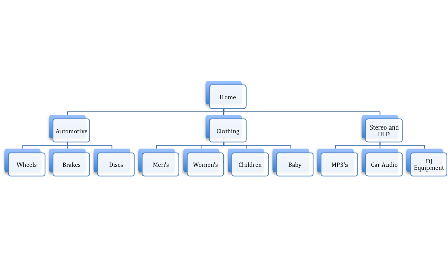
Too many specific categories can be confusing. Especially on smaller sites with less content. They can often lead to the information scent going cold causing the visitor to back pedal through the site and sometimes “give up”.
Guessing that there is a problem, we might decide to simplify our sites navigation and make our categories more broad like so:
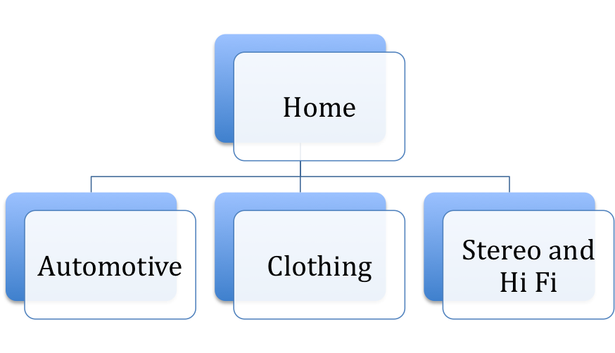
On a large website however with over 100,000 products for sale this might not be enough categories and trying to cram too much content or products into a particular category could end up confusing visitors.
So how do I know if my site is difficult to navigate for visitors?
Google Analytics
You can view your content reports to get an idea of what areas of your site may not be meeting visitor expectations. Starting simple you can look at bounce rate, exit rate and top exit pages.
Top exit pages report may show you where the information scent went bad for visitors to your site. Whilst bounce rate may show that visitors arriving at a specific page had certain expectations that the site didn’t meet.
The Content Drilldown report will show you what sections (depending on your URL structure) of your site are performing like and you may find specific categories on your site are doing worse than others.
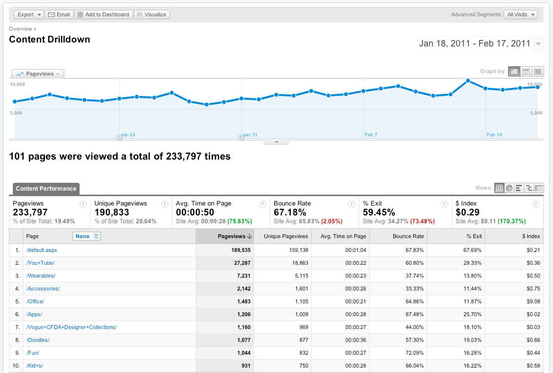
If you suspect certain pages are not meeting visitor expectations or visitors are not finding the pages you expect them to you may want to take a closer look at the navigation summary report.
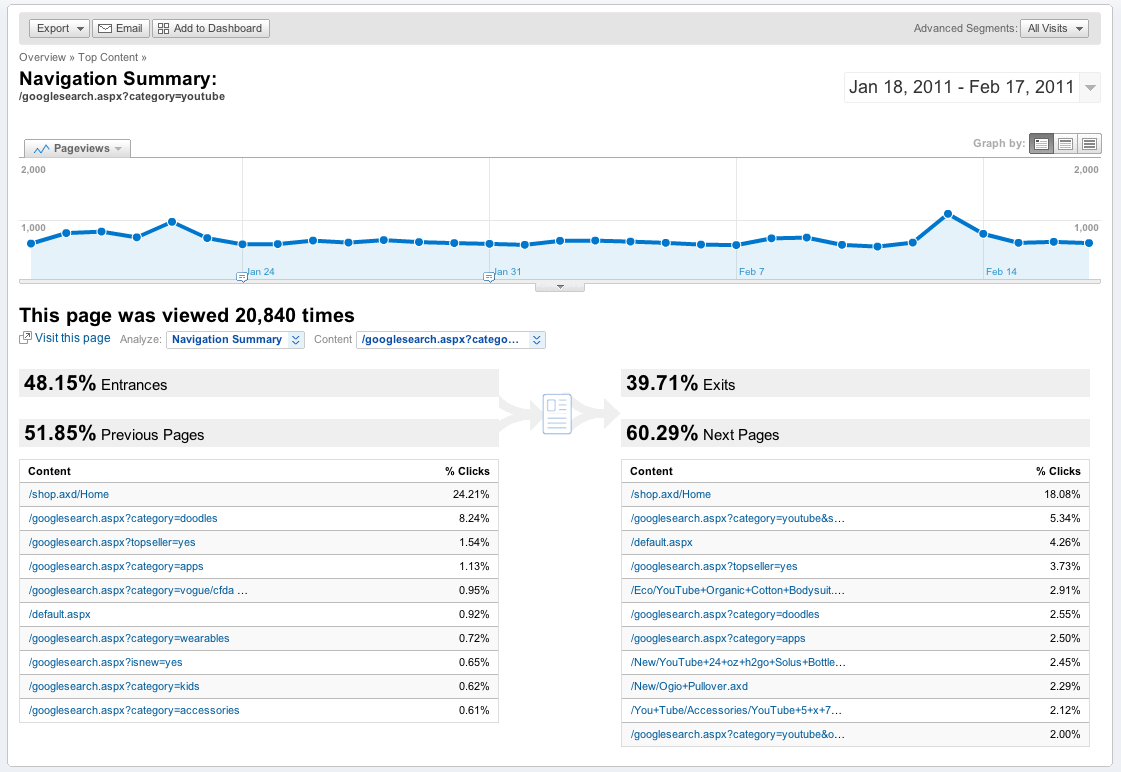
This will show you what pages the visitor was previously on and what pages they most frequently view afterwards. Does this match what you would expect?
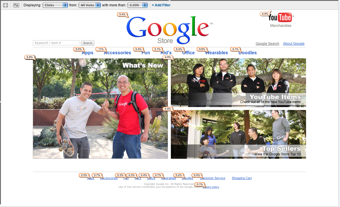
In Page Analytics reports can give you a visual view of which links or sections get the most clicks from a particular page.
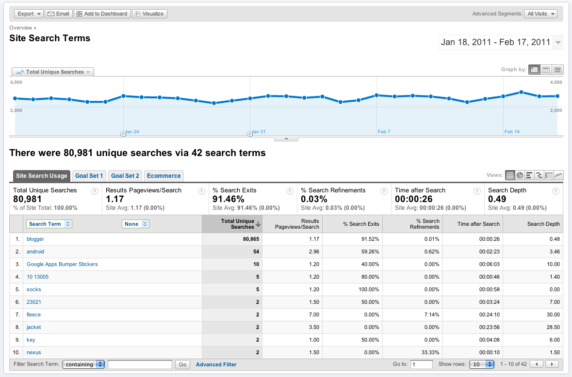
Site Search reports can show you terms with a high % Search Exit rate and % Search Refinement rates. These can be useful for getting an insight into the visitors mind in terms of their vocabulary and intent. In particular take note of terms that produce 0 useful results.
Usability Studies
You may find that Google Analytics can show you what happened, but perhaps not why it happened. To learn more about your visitors sometimes you have to observe them. The best way is user testing and it’s easier than you think, you can start with just 3 or 4 participants.
Just ask Steve Krug: author of Don’t Make Me Think who has provided the User Testing chapters in PDF format on his website for you.
A simple task for your users may be to find a particular product or page on your website without using site search or external search tools like Google. Instead ask them to navigate through your site, take note of the categories they look in and perhaps the number of times they have to backtrack (i.e use the back button) before finding the content or product.
You can conduct this same test before and after your category structure improvements to see if the success rate has improved.
Surveys
Another way of soliciting feedback is via surveys. This is a good opportunity to seek advice on the organisation of your website. Even frequent users of your site may expect to find content in certain sections of your site or spend several minutes finding content they know exists but can’t recall what it’s categorised under.
Not sure what to ask your visitors? How about The Three Greatest Survey Questions Ever?
There are loads of Free Survey Tools you can use to gather feedback.
How can I better categorise my content and find these potential problems?
Card sorting is 1 such technique, the idea is relatively simple, create cards that represent the content of your website then ask a group of participants to arrange that content into the most logical groupings.
Use the findings and analysis to determine the best structure for your website and its content. An interesting finding may be that a particular piece of content belongs in more than 1 category.
When it comes to card sorting you have 2 options:
Open card sort: This is where you do not define the category names, instead you present a group of cards (these cards represent your content) and you ask participants to group them using their own choice of category names.
An open card sort can be useful if you have never done a card sort before because you may find the way visitors on your site categorise content and the vocabulary they use is completely different to your existing websites category structure.
Closed card sort: This is where you have your top level categories already defined and ask your participants to place the content into the categories that they feel is best suited.
This is useful when you are adding more information to your site and have already established a category structure that works well for your audience.
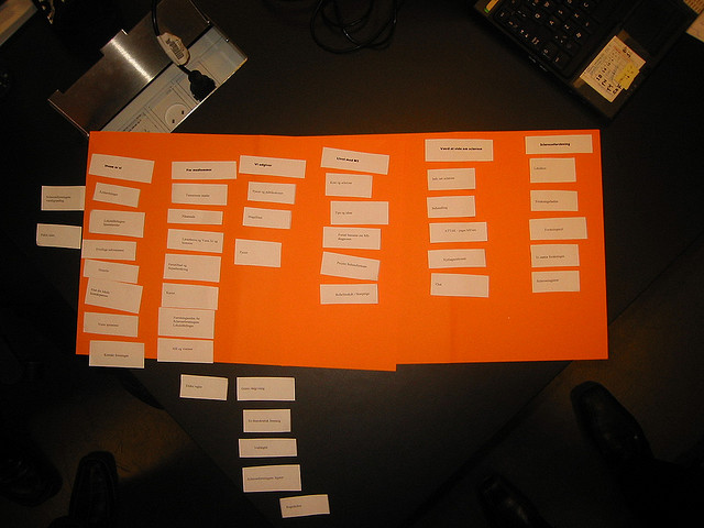
How a card sort looks using a paper based approach. You will want to collect the results and enter them into a spreadsheet at some stage. So you may wish to use a program to help automate this for you.

Xsort is a free card sorting utility for Mac OSX. This view shows a completed card sort where the user has created the category boxes (in blue) and placed the cards (off-white-colour) into categories. Using a PC based program saves you having to collect the results manually. You can also export results to your favorite spreadsheet program for further analysis.
When conducting your card sort exercise take note of the following:
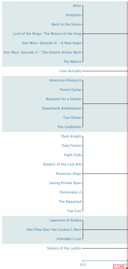
This was an open card sort. So the dendogram (image above) shows the most common groupings.
We can see that certain movies above have been grouped together and from here we may decide that a logical way to group these items is by genre such as Sci Fi, Drama, Action, Nostalgic, Thriller.
Summary:
If you think that card sorting is part science, part art and a bit of reading between the lines, you would be right. There is no absolute 1 way approach. The best results are obtained by doing research. Speaking with a variety of different stake holders such as customers, sales people and support teams and asking the right questions. You also may have to conduct more than 1 card sort refining it as you go to get your final category structure.
No structure will be perfect, your overall aim however is to improve your findability rate so that the majority of visitors to your site can find what they are looking for without too much grief.
So after reading this article hopefully you will:
We’ll explore these different ideas and concepts in the next parts of this series along with other usability aids to help make your website more user friendly, allowing you to convert more visitors into customers.
Well constructed, easy-to-use websites lead to greater visitor satisfaction, meaning better conversion rates and more returning customers.
In this first post of the series on information architecture I wanted to take a quick look at some techniques you can use to improve the way your content is categorised, labelled and organised.
Visitors on your site use a variety of navigation aids to find content on your site and we’ll discuss some of these in later articles. For now though lets assume we have a typical hierarchy structure on our website.
Categories and labelling
So how many categories does your website have? Or perhaps a better question: is your categorisation easy to understand or what visitors expect?
Cognitive load theory suggests that people may have difficulty storing more than “7 information chunks” in their working memory at any given time. There have been many research papers written on the topic, but the key take away is that you should gradually introduce your users to new information and not overwhelm them with too much choice especially in the beginning.
This particular cycling website has over 2000 categories listed down the left hand navigation pane (indicated by the red arrow). This makes finding products on their website extremely difficult because it’s extremely hard to recall this many items in your working memory.
What about the three click rule? The three click rule suggests that visitors should be able to find what they want in 3 clicks of the landing page, but the number is not what’s important. What is more important is that each click brings the visitor closer to their goal.
Various studies including this one conducted by Ed Chi at Xerox PARC show that visitors on a website navigate via an information scent. Much like animals stalk their prey based on scent, websites with strong information scents are good at guiding visitors to content. This is because visitors hunt for information based on clues. Once the information scent is lost, visitors will often use the browser back button to return to a page where the information scent is strong again.
The caveat is that if visitors have to repeat this process often, the information scent dries up causing visitors to leave your website altogether. Think of this as your “give up rate” metric.
Often the best clue a visitor has moving through your website in terms of information scent is navigation headings (breadcrumbs), along with the primary and secondary navigation. Which are often based on your underlying category structure.
Take the following category structure of a website. What happens if I’m looking for an MP3 player for my car? Do I look under Car Audio or MP3’s? Or what if I need new brakes for my car, do I look under Brakes or Discs? And clothing for a 2 year old child? Do I look under Children or Baby?
Too many specific categories can be confusing. Especially on smaller sites with less content. They can often lead to the information scent going cold causing the visitor to back pedal through the site and sometimes “give up”.
Guessing that there is a problem, we might decide to simplify our sites navigation and make our categories more broad like so:
On a large website however with over 100,000 products for sale this might not be enough categories and trying to cram too much content or products into a particular category could end up confusing visitors.
So how do I know if my site is difficult to navigate for visitors?
Google Analytics
You can view your content reports to get an idea of what areas of your site may not be meeting visitor expectations. Starting simple you can look at bounce rate, exit rate and top exit pages.
Top exit pages report may show you where the information scent went bad for visitors to your site. Whilst bounce rate may show that visitors arriving at a specific page had certain expectations that the site didn’t meet.
The Content Drilldown report will show you what sections (depending on your URL structure) of your site are performing like and you may find specific categories on your site are doing worse than others.
If you suspect certain pages are not meeting visitor expectations or visitors are not finding the pages you expect them to you may want to take a closer look at the navigation summary report.
This will show you what pages the visitor was previously on and what pages they most frequently view afterwards. Does this match what you would expect?
In Page Analytics reports can give you a visual view of which links or sections get the most clicks from a particular page.
Site Search reports can show you terms with a high % Search Exit rate and % Search Refinement rates. These can be useful for getting an insight into the visitors mind in terms of their vocabulary and intent. In particular take note of terms that produce 0 useful results.
Usability Studies
You may find that Google Analytics can show you what happened, but perhaps not why it happened. To learn more about your visitors sometimes you have to observe them. The best way is user testing and it’s easier than you think, you can start with just 3 or 4 participants.
Just ask Steve Krug: author of Don’t Make Me Think who has provided the User Testing chapters in PDF format on his website for you.
A simple task for your users may be to find a particular product or page on your website without using site search or external search tools like Google. Instead ask them to navigate through your site, take note of the categories they look in and perhaps the number of times they have to backtrack (i.e use the back button) before finding the content or product.
You can conduct this same test before and after your category structure improvements to see if the success rate has improved.
Surveys
Another way of soliciting feedback is via surveys. This is a good opportunity to seek advice on the organisation of your website. Even frequent users of your site may expect to find content in certain sections of your site or spend several minutes finding content they know exists but can’t recall what it’s categorised under.
Not sure what to ask your visitors? How about The Three Greatest Survey Questions Ever?
There are loads of Free Survey Tools you can use to gather feedback.
How can I better categorise my content and find these potential problems?
Card sorting is 1 such technique, the idea is relatively simple, create cards that represent the content of your website then ask a group of participants to arrange that content into the most logical groupings.
Use the findings and analysis to determine the best structure for your website and its content. An interesting finding may be that a particular piece of content belongs in more than 1 category.
When it comes to card sorting you have 2 options:
Open card sort: This is where you do not define the category names, instead you present a group of cards (these cards represent your content) and you ask participants to group them using their own choice of category names.
An open card sort can be useful if you have never done a card sort before because you may find the way visitors on your site categorise content and the vocabulary they use is completely different to your existing websites category structure.
Closed card sort: This is where you have your top level categories already defined and ask your participants to place the content into the categories that they feel is best suited.
This is useful when you are adding more information to your site and have already established a category structure that works well for your audience.
How a card sort looks using a paper based approach. You will want to collect the results and enter them into a spreadsheet at some stage. So you may wish to use a program to help automate this for you.
Xsort is a free card sorting utility for Mac OSX. This view shows a completed card sort where the user has created the category boxes (in blue) and placed the cards (off-white-colour) into categories. Using a PC based program saves you having to collect the results manually. You can also export results to your favorite spreadsheet program for further analysis.
When conducting your card sort exercise take note of the following:
- How did the majority of people group the content?
- Did people create similar categories or groups of content?
- Did people agree / disagree with suggested categories (in a closed card sort)?
- Was there anything that people couldn’t categorise properly?
- Did participants feel that content belonged in more than 1 category?
This was an open card sort. So the dendogram (image above) shows the most common groupings.
We can see that certain movies above have been grouped together and from here we may decide that a logical way to group these items is by genre such as Sci Fi, Drama, Action, Nostalgic, Thriller.
Summary:
If you think that card sorting is part science, part art and a bit of reading between the lines, you would be right. There is no absolute 1 way approach. The best results are obtained by doing research. Speaking with a variety of different stake holders such as customers, sales people and support teams and asking the right questions. You also may have to conduct more than 1 card sort refining it as you go to get your final category structure.
No structure will be perfect, your overall aim however is to improve your findability rate so that the majority of visitors to your site can find what they are looking for without too much grief.
So after reading this article hopefully you will:
- Understand the importance of a category structure that is easy to navigate
- Know how to use Web Analytics to help identify potential problems
- Be introduced to the concepts of user testing and user surveys - because web analytics can’t tell you everything.
- Understand the benefits of card sorting when creating a traditional hierarchy structure
- Be more confident should you wish to employ outside help from usability experts
We’ll explore these different ideas and concepts in the next parts of this series along with other usability aids to help make your website more user friendly, allowing you to convert more visitors into customers.