DataView Makes Working with Visualizations Even Easier
September 17th, 2008 | Published in Google Code
Visualizations are usually nifty, small pieces of code that make our data come alive. In order to live in peace on the web, they need to be streamlined and compact.
At times, these visualization applications are a product of a creative designer who publishes their work for free for all of us to use. Often these designers do not have the time and resources to deal with data input structures.
Therefore, when integrating with a specific visualization, we often need to format the DataTable just right, so it fits the way the visualization expects to get the data. Say as an example, a first column needs to be of type date, the second a number and the third a text comment. What if our DataTable is not in that exact format? What if we want to create several visualizations over the same data source? To date this required manipulating the DataTable to fit the particular visualization and made the API a bit less flexible.
To make fitting data to the visualization even easier and simpler, and the Visualization API even more flexible, we've borrowed from the well-known SQL concept of Views and created our own DataView. Today, with Google Visualization's DataView you can reorder columns and "hide" a column such that the view includes only the columns you need to visualize. And, the DataView stays fully synchronized with the DataTable at all times, so any change to the underlying DataTable is reflected in the DataView.
Let's see a simple example that demonstrates this.
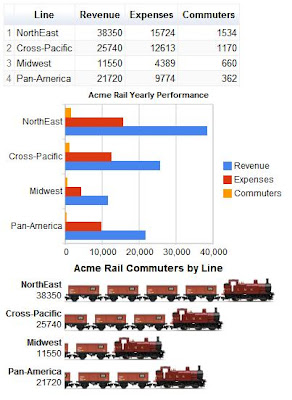
The following code creates three charts from a DataTable. The data displayed is yearly results for the imaginary Acme Rail company. We display a table, a bar chart and a BarsOfStuff chart. The BarsOfStuff chart is used because we are showing data for Acme Rail, and we thought it'd be cool to use the little trains in the chart:

The problem is that BarsOfStuff is a cool chart, but it is very simple. It can only accept a single data series in the format: [Series Title; Series Value].
Notice that right now the chart compares revenue per rail line, but we wanted it to display the number of commuters per line (as the title suggests).
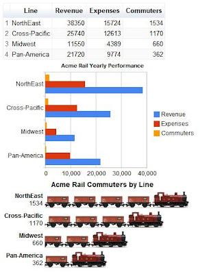
How can we fix this? With DataView it is a simple matter of adding two lines of code and pointing the BarsOfStuff chart to the DataView instead of the DataTable. We add:
        var view = new google.visualization.DataView(data);
        view.setColumns([0,3]);
stuffchart.draw(view, stuffoptions);

Voila! The BarsOfStuff chart now shows the data we wanted it to visualize - commuters per rail line.
Yet another new feature to make developing complex dashboards with Google Visualization even easier is the clone() method, used to clone a DataTable instead of constructing a new copy from scratch.
We're working on making the DataView even more powerful, and of-course, working on other features and additions to the Visualization platform.
For more information on Google Visualization, check out our developer documentation pages.
Happy visualizing!