A fresh look for Google Project Hosting
December 9th, 2010 | Published in Google Code
Simplicity is key to longevity. Since we launched in 2006, even as we’ve added new features, we’ve had very little desire to change our user interface. It’s simple, it’s clean, it’s quick -- and as engineers, we like it.
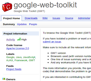
However, the look of other Google products has evolved significantly in the last four years. Rounded corners, for example, are not used as aggressively as they used to be. Therefore, we’ve pushed out a small set of changes that update the style of our pages.

Take a look at the project creation page, project pages, and user profile page and give us your feedback. We look forward to hearing what you think.
By Ali Pasha, Google Project Hosting
However, the look of other Google products has evolved significantly in the last four years. Rounded corners, for example, are not used as aggressively as they used to be. Therefore, we’ve pushed out a small set of changes that update the style of our pages.

Take a look at the project creation page, project pages, and user profile page and give us your feedback. We look forward to hearing what you think.
By Ali Pasha, Google Project Hosting