A fresh take on an icon
March 21st, 2011 | Published in Google Chrome
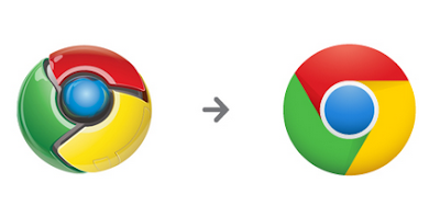
Some of you on Chrome’s early release channels may have noticed our latest tweak to Chrome’s icon:

Since Chrome is all about making your web experience as easy and clutter-free as possible, we refreshed the Chrome icon to better represent these sentiments. A simpler icon embodies the Chrome spirit — to make the web quicker, lighter, and easier for all.
Even before this effort, the new version of the Chrome logo was already being conjured up by Googlers and Chrome fans. Numerous creative reinterpretations have organically moved the icon towards simplicity and abstraction, so it felt right to make the icon structure cleaner and easier to recreate.


Redesigning the icon was very much a group effort. Collectively, we explored many variations, tried the icon in several different contexts, and refined the details as we moved along. It was important to maintain consistency across all media, so we kept print, web, and other possible formats in mind. Once we arrived at a good place, we finished up the icon by resizing, pixel-pushing, and getting everything out the door.
For Chrome users, you’ll see this latest icon reflected in your browsers soon, as we bring the latest features and improvements to the beta and stable channels in the coming weeks!
Posted by Steve Rura, Designer
Since Chrome is all about making your web experience as easy and clutter-free as possible, we refreshed the Chrome icon to better represent these sentiments. A simpler icon embodies the Chrome spirit — to make the web quicker, lighter, and easier for all.
Even before this effort, the new version of the Chrome logo was already being conjured up by Googlers and Chrome fans. Numerous creative reinterpretations have organically moved the icon towards simplicity and abstraction, so it felt right to make the icon structure cleaner and easier to recreate.

The Modern Browser poster by Mike Lemanski, celebrating Chrome’s 2nd birthday

Chrome Magnets by Tyson Kartchner

Chrome Starts Fast video

Chrome Speed Tests video
Redesigning the icon was very much a group effort. Collectively, we explored many variations, tried the icon in several different contexts, and refined the details as we moved along. It was important to maintain consistency across all media, so we kept print, web, and other possible formats in mind. Once we arrived at a good place, we finished up the icon by resizing, pixel-pushing, and getting everything out the door.
For Chrome users, you’ll see this latest icon reflected in your browsers soon, as we bring the latest features and improvements to the beta and stable channels in the coming weeks!
Posted by Steve Rura, Designer