Better button placement for the new year
January 5th, 2007 | Published in Google Checkout
Besides offering buyers a faster and more convenient way to shop online, Google Checkout can also help you lower your costs throughout the new year by processing all of your transactions for free through December 31, 2007. Say you currently pay 2% plus $0.20 per transaction and your average transaction is $50; with Google Checkout you can save an average of $1.20 on every sale you make. To take full advantage of this promotion, let buyers know that they can use Google Checkout by placing a Google Checkout acceptance logo on your homepage and on the landing pages of your AdWords ads.
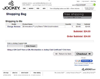
Here are some tips for optimizing button placement -- and for boosting your Google Checkout conversions all through 2007:
- Choose a Google Checkout button that's the same size as your existing checkout button. Display these buttons side by side if possible.
- If you display your existing checkout buttons or links in different locations on your website, be sure you put a Google Checkout button next to all of your existing checkout buttons or links.
- Display the text "or check out with" between your existing checkout button and the Google Checkout button to make sure your customers understand their options.
- Insert the text "What is Google Checkout?" below the Checkout button, then link this text to a page on your site explaining Google Checkout buyer advantages. Here are some ideas for communicating the advantages of Google Checkout to buyers.
