Go thataway: Google Maps India learns to navigate like a local
December 17th, 2009 | Published in Google Blog
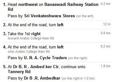
Have you ever been lost? Perhaps you missed a turn because a street sign was poorly labeled, hard to see in the dark, or just not where it should have been? These are problems we've all faced, but they're especially complicated in India, where street names are not commonly known and the typical wayfinding strategy is to ask someone on the street. Without road names, it's difficult to produce a set of directions that makes sense. Just take a look at this screenshot of Google Maps directions in India in 2008 and you'll get the picture:

To solve this problem, this week we launched an improvement to Google Maps India that describes routes in terms of easy-to-follow landmarks and businesses that are visible along the way. We gathered feedback from users around the world to spark this improvement to our technology, and we thought we'd give you a glimpse at our thinking behind this launch.
We knew from previous studies in several countries that most people rely on landmarks — visual cues along the way — for successful navigation. But we needed to understand how people use those visual cues, and what makes a good landmark, in order to make our instructions more human and improve route descriptions. To get answers to these questions, we ran a user research study that focused specifically on how people give and get directions. We called businesses and asked how to get to their store; we recruited people to keep track of directions they gave or received and later interviewed them about their experiences; we asked people to draw us diagrams of routes to places unfamiliar to us; we even followed people around as they tried to find their way.
 We found that using landmarks in directions helps for two simple reasons: they are easier to see than street signs and they are easier to remember than street names. Spotting a pink building on a corner or remembering to turn after a gas station is much easier than trying to recall an unfamiliar street name. Sometimes there are simply too many signs to look at, and the street sign drowns in the visual noise. A good landmark always stands out.
We also discovered that there are three situations in which people resort to landmarks.
The first is when people need to orient themselves — for instance, they just exited a subway station and are not sure which way to go. Google Maps would say: "Head southeast for 0.2 miles." A person would say: "Start walking away from the McDonald's."
The second situation is when people use a landmark to describe a turn: "Turn right after the Starbucks."
The third use, however, is the most interesting. We discovered that often people simply want to confirm that they are still on the right track and haven't missed their turn.
Giving people this sense of confidence while they explore an unfamiliar territory became one of the goals of our redesign. Over the course of several months, the team brainstormed various ways of presenting the information contained in Google Maps in a way that would be useful for people. We then settled on a design that added some landmarks to describe the turns and confirm the route.

The next step was to put this design to a test with drivers in Bangalore, India. The results were eye-opening. While we were on the right track with introducing landmarks, we still relied on street names too heavily. Drivers wanted more confirmation. They wanted to compare what they saw on Google Maps with what they saw from the driver's seat, every step of the way.
We added more landmarks along routes and reduced the visual prominence of street names, and the result was our final design:

Now Google Maps India gives you directions like a local would. Happy wayfinding!

To solve this problem, this week we launched an improvement to Google Maps India that describes routes in terms of easy-to-follow landmarks and businesses that are visible along the way. We gathered feedback from users around the world to spark this improvement to our technology, and we thought we'd give you a glimpse at our thinking behind this launch.
We knew from previous studies in several countries that most people rely on landmarks — visual cues along the way — for successful navigation. But we needed to understand how people use those visual cues, and what makes a good landmark, in order to make our instructions more human and improve route descriptions. To get answers to these questions, we ran a user research study that focused specifically on how people give and get directions. We called businesses and asked how to get to their store; we recruited people to keep track of directions they gave or received and later interviewed them about their experiences; we asked people to draw us diagrams of routes to places unfamiliar to us; we even followed people around as they tried to find their way.
 We found that using landmarks in directions helps for two simple reasons: they are easier to see than street signs and they are easier to remember than street names. Spotting a pink building on a corner or remembering to turn after a gas station is much easier than trying to recall an unfamiliar street name. Sometimes there are simply too many signs to look at, and the street sign drowns in the visual noise. A good landmark always stands out.
We also discovered that there are three situations in which people resort to landmarks.
The first is when people need to orient themselves — for instance, they just exited a subway station and are not sure which way to go. Google Maps would say: "Head southeast for 0.2 miles." A person would say: "Start walking away from the McDonald's."
The second situation is when people use a landmark to describe a turn: "Turn right after the Starbucks."
The third use, however, is the most interesting. We discovered that often people simply want to confirm that they are still on the right track and haven't missed their turn.
Giving people this sense of confidence while they explore an unfamiliar territory became one of the goals of our redesign. Over the course of several months, the team brainstormed various ways of presenting the information contained in Google Maps in a way that would be useful for people. We then settled on a design that added some landmarks to describe the turns and confirm the route.

The next step was to put this design to a test with drivers in Bangalore, India. The results were eye-opening. While we were on the right track with introducing landmarks, we still relied on street names too heavily. Drivers wanted more confirmation. They wanted to compare what they saw on Google Maps with what they saw from the driver's seat, every step of the way.
We added more landmarks along routes and reduced the visual prominence of street names, and the result was our final design:

Now Google Maps India gives you directions like a local would. Happy wayfinding!