Evolving the Google design and experience
June 28th, 2011 | Published in Google Blog
Starting today, you might begin noticing that things look a little different across Google products. We’re working on a project to bring you a new and improved Google experience, and over the next few months, you’ll continue to see more updates to our look and feel. Even our classic homepage is getting a bit of a makeover:

The way people use and experience the web is evolving, and our goal is to give you a more seamless and consistent online experience—one that works no matter which Google product you’re using or what device you’re using it on. The new Google experience that we’ve begun working toward is founded on three key design principles: focus, elasticity and effortlessness.

Starting today and over the course of the next few months, look for a series of design improvements across all our products, including Google Search, Google Maps and Gmail.

New Google homepage with a smaller logo and links moved to the top and bottom edges of the browser for a cleaner look
The way people use and experience the web is evolving, and our goal is to give you a more seamless and consistent online experience—one that works no matter which Google product you’re using or what device you’re using it on. The new Google experience that we’ve begun working toward is founded on three key design principles: focus, elasticity and effortlessness.
- Focus: Whether you’re searching, emailing or looking for a map, the only thing you should be concerned about is getting what you want. Our job is to provide the tools and features that will get you there quickly and easily. With the design changes in the coming weeks and months, we’re bringing forward the stuff that matters to you and getting all the other clutter out of your way. Even simple changes, like using bolder colors for actionable buttons or hiding navigation buttons until they’re actually needed, can help you better focus on only what you need at the moment.
- Elasticity: In the early days, there was pretty much just one way to use Google: on a desktop computer with an average-sized monitor. Over a decade later, all it takes is a look around one’s home or office at the various mobile devices, tablets, high-resolution monitors and TVs to see a plethora of ways to access the web. The new design will soon allow you to seamlessly transition from one device to another and have a consistent visual experience. We aim to bring you this flexibility without sacrificing style or usefulness.
- Effortlessness: Our design philosophy is to combine power with simplicity. We want to keep our look simple and clean, but behind the seemingly simple design, use new technologies like HTML5, WebGL and the latest, fastest browsers to make sure you have all the power of the web behind you.

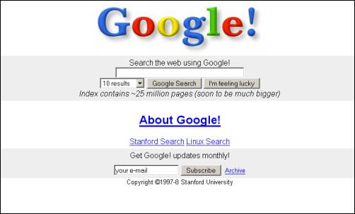
Original Google homepage in 1997
Starting today and over the course of the next few months, look for a series of design improvements across all our products, including Google Search, Google Maps and Gmail.