A new, unified experience coming to Google products
November 7th, 2014 | Published in Google Apps
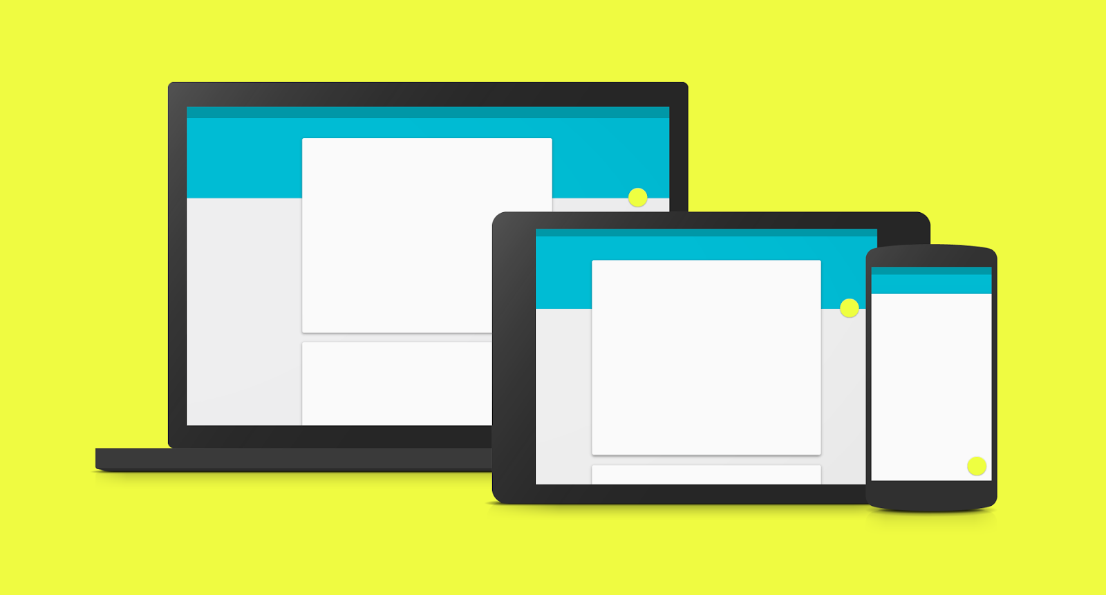
At Google I/O in June, we introduced material design, a single underlying design system that allows for a unified experience across platforms and device sizes. It features smooth animations and transitions between screens, a multi-layered interface with quick access to the elements that you need most often, and a colorful UI with diverse fonts and styles.

Material design principles have begun to appear in recent Google product launches, including Google Classroom, the Docs, Sheets, and Slides home screens and mobile apps, the Drive Android app, Android 5.0 Lollipop and the new Gmail and Calendar Android apps. You’ll continue to see more Google products adopting these new design principles across platforms in the coming months
To help with this transition, we’ve created a few resources for Google Apps customers. First, a special segment of The Apps Show featuring an interview with Lucas Pettinati, UX Lead for Google Apps. Lucas explains Google’s approach to applying material design to Apps products and what to expect moving forward. Second, an instructional guide [pdf] outlining the functional elements of material design and a deep dive [pdf] into how these elements surface in the new Gmail Android app. Check out these resources and share them with your organization.
Note: all launches are applicable to all Google Apps editions unless otherwise noted
whatsnew.googleapps.com
Get these product update alerts by email
Subscribe to the RSS feed of these updates