Material Design on Android Checklist
October 28th, 2014 | Published in Google Android
By Roman Nurik, Design Advocate
Android 5.0 brings in material design as the new design system for the platform and system apps. Consumers will soon start getting Android 5.0 and they’re already seeing glimpses of material design with apps like Google Play Newsstand, Inbox by Gmail and Tumblr. Meanwhile, developers now have the Android 5.0 SDK, along with AppCompat for backward compatibility. And designers now have access to Photoshop, Illustrator and Sketch templates. All this means that now—yes now!—is the time to start implementing material design in your Android apps. Today, let’s talk about what implementing material design really boils down to.
Below, you’ll find a material design checklist that you can use to mark progress as you implement the new design system. The checklist is divided into 4 key sections based on the 4 key aspects of material design.
If you include a good chunk of the items in the checklist below, especially the ones indicated as signature elements, and follow traditional Android design best practices (i.e. these, these, and things we discussed on ADiA), you’ll be well on your way to material design awesomeness!
Tangible Surfaces
 UIs consist of surfaces (pieces of “digital paper”) arranged at varying elevations, casting shadows on surfaces behind them.
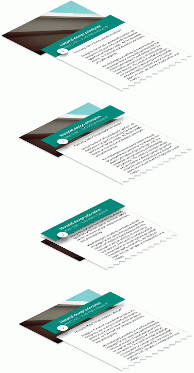
Figure 1. Surfaces and layering.
-
Signature element: Shadows are used to communicate which surfaces are in front of others, helping focus attention and establish hierarchy. Read more on depth and layering in UIs.
In code: This is the
android:elevationandandroid:translationZattribute in Android 5.0. On earlier versions, shadows are normally provided as PNG assets. - Shadows and surfaces are used in a consistent and structured way. Each shadow indicates a new surface. Surfaces are created thoughtfully and carefully.
- There are generally between 2 and 10 surfaces on the screen at once; avoid too much layering/nesting of surfaces.
- Scrollable content either scrolls to the edges of the screen or behind another surface that casts a shadow over the content’s surface. Never clip an element against an invisible edge—elements don’t just scroll off into nowhere. Put another way, you rarely scroll the ink on a surface; you scroll the surface itself.
In code:
android:clipToPadding=falseoften helps with this when usingListViewandScrollView. - Surfaces have simple, single-color backgrounds.
A Bold, Print-Like Aesthetic
 The “digital ink” you draw on those pieces of digital paper is informed by classic print design, with an emphasis on bold use of color and type, contextual imagery, and structured whitespace.
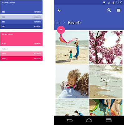
Figure 2. Primary and accent colors.
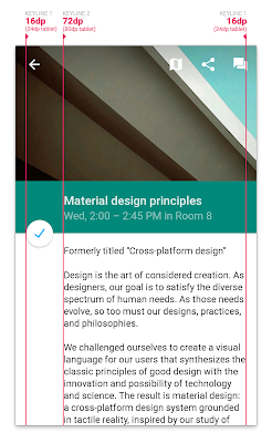
Figure 3. Keylines.
-
Signature element: Apps use a primary color and an accent color (Figure 2) to color surface backgrounds and key UI widgets such as text fields and checkboxes. The accent color contrasts very well with the primary color (for example an app can use a dark blue primary color and a neon pink accent color). The accent color is high-contrast and is used to call attention to key UI elements, like a circular floating action button, selected tab strips, or form fields.
In code: Set the
android:colorPrimaryandandroid:colorAccentattributes in your theme (drop theandroidprefix if using AppCompat). AppCompat automatically colors text fields, checkboxes, and more on pre-L devices. -
Signature element: On Android 5.0, the status bar is colored to match the app’s primary color, or the current screen’s content. For full-bleed imagery, the status bar can be translucent.
In code: Set the
android:colorPrimaryDarkorandroid:statusBarColorattribute in your theme (drop theandroidprefix if using AppCompat) or callWindow.setStatusBarColor. - Icons, photos/images, text, and other foreground elements are colored “ink” on their surfaces. They don’t have shadows and don’t use gradients.
- Colors extracted from images can be used to color adjacent UI elements or surfaces.
In code: This can be done using the Palette support library.
- Signature element: Icons in the app follow the system icon guidelines, and standard icons use the material design icon set.
- Photos are generally immersive and full-bleed. For example, for detail screens, run edge-to-edge and can even appear behind the app bar or status bar.
In code: The new
Toolbarwidget (and its AppCompat equivalent) can be transparent and placed directly in your layout. For the status bar, check this Stack Overflow post. - Signature element: Where appropriate, elements like body text, thumbnails, app bar titles, etc. are aligned to 3 keylines (Figure 3). On phones, those keylines are 16dp and 72dp from the left edge and 16dp from the right edge of the screen. On tablets those values are 24dp and 80dp.
- UI elements are aligned to and sized according to an 8dp baseline grid. For example, app bars are 56dp tall on phones and 64dp tall on tablets. Padding and margins can take on values like 8dp, 16dp, 24dp, etc. More precise text positioning uses a 4dp grid.
Authentic Motion
 Motion helps communicate what’s happening in the UI, providing visual continuity across app contexts and states. Motion also adds delight using smaller-scale transitions. Motion isn’t employed simply for motion’s sake.
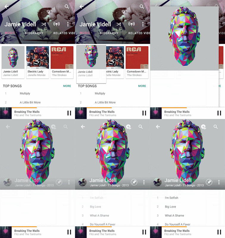
Figure 4. "Hero" transitions.
- In general, UI and content elements don’t just appear or disappear—they animate into place, either together as a unit, or individually.
-
Signature element: When touching an item to see its details, there’s a “hero” transition (Figure 4) that moves and scales the item between its position in the browsing screen and its position in the detail screen.
In code: These are called “shared element transitions” in the SDK. The support version of
FragmentTransactionalso includes some shared element support. -
Signature element: Ripple effects originating from where you touched the screen are used to show touch feedback on an item.
In code: The default
android:selectableItemBackgroundandandroid:selectableItemBackgroundBorderlesshave this, or you can useRippleDrawable(android:selectableItemBackgroundbehavior. -
Signature element: UI elements can appear using a circular “reveal” animation.
In code: See this doc or the
ViewAnimationUtilsclass for more. -
Signature element: Animations are used in more subtle, delightful ways, such as to convey the transition between icon states or text states. For example, a “+” icon can morph into an “x” symbol, or an outlined heart icon can be filled using a paint-bucket fill effect.
In code: Icon transitions can be implemented using
AnimatedStateListDrawableand its XML counterpart. An example can be found in the Google I/O app source. There’s also support for animated vector icons. - Animations and transitions are fast—generally under 300ms.
- Crossfades are often replaced by translate/slide transitions: vertical slides for descendant navigation and horizontal slides for lateral navigation. For slide transitions, prefer quick acceleration and gentle ease-in deceleration over simple linear moves. See the material design spec on motion for more.
Adaptive Design (and UI Patterns)
 Tangible surfaces, bold graphic design, and meaningful motion work together to bring a consistent experience across any screen, be it phones, tablets, laptops, desktops, TVs, wearables, or even cars. Additionally, the key UI patterns below help establish a consistent character for the app across devices.
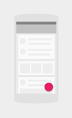
Figure 5. The floating action button.
- The app uses responsive design best practices to ensure screens lay themselves out appropriately on any screen size, in any orientation. See the Tablet App Quality Checklist for a list of ways to optimize for tablets, and this blog post for high-level tablet optimization tips.
- In material design, detail screens are often presented as popups that appear using “hero” transitions (see above).
- In multi-pane layouts, the app can use multiple toolbars to place actions contextually next to their related content.
- Signature element: Where appropriate, the app promotes the key action on a screen using a circular floating action button (FAB). The FAB (Figure 5) is a circular surface, so it casts a shadow. It is colored with a bright, accent color (see above). It performs a primary action such as send, compose, create, add, or search. It floats in front of other surfaces, and is normally at an 8dp elevation. It frequently appears at the bottom right of the screen, or centered on an edge where two surfaces meet (a seam or a step).
App bar
-
Signature element: The app uses a standard Android app bar. The app bar doesn’t have an app icon. Color and typography are used for branding instead. The app bar casts a shadow (or has a shadow cast on it by a surface below and behind it). The app bar normally has a 4dp elevation.
In code: Use the new
Toolbarwidget in Android 5.0 that is placed directly into the activity’s view hierarchy. AppCompat also providesandroid.support.v7.widget.Toolbar, which supports all modern platform versions. - The app bar might be for example 2 or 3 times taller than the standard height; on scroll, the app bar can smoothly collapse into its normal height.
- The app bar might be completely transparent in some cases, with the text and actions overlaying an image behind it. For example, see the Google Play Newsstand app.
- App bar titles align to the 2nd keyline (see more info on keylines above)
In code: when using the
Toolbarwidget, use theandroid:contentInsetStartattribute. - Where appropriate, upon scrolling down, the app bar can scroll off the screen, leaving more vertical space for content. Upon scrolling back up, the app bar should be shown again.
Tabs
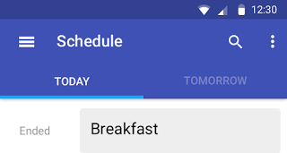
Figure 6. Tabs with material design.
-
Signature element: Tabs follow the newer material design interactions and styling (Figure 6). There are no vertical separators between tabs. If the app uses top-level tabs, tabs are visually a part of the app bar; tabs are a part of the app bar’s surface.
In code: See the SlidingTabsBasic sample code in the SDK or the Google I/O app source (particularly the "My Schedule" section for phones).
- Tabs should support a swipe gesture for moving between them.
In code: All tabs should be swipeable using the
ViewPagerwidget, which is available in the support library. - Selected tabs are indicated by a foreground color change and/or a small strip below the tab text (or icon) colored with an accent color. The tab strip should smoothly slide as you swipe between tabs.
Navigation drawer
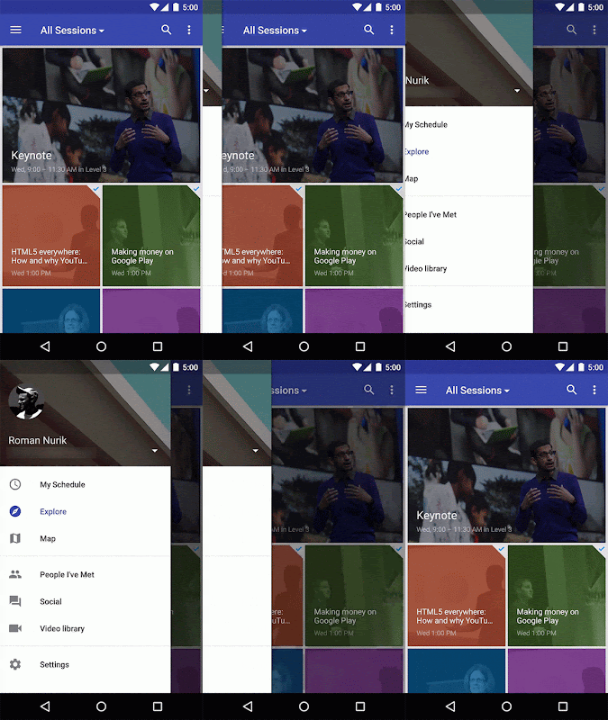
Figure 7. Navigation drawers
with material design.
-
Signature element: If the app uses a navigation drawer, it follows the newer material design interactions and styling (Figure 7). The drawer appears in front of the app bar. It also appears semitransparent behind the status bar.
In code: Implement drawers using the
DrawerLayoutwidget from the support library, along with the new Toolbar widget discussed above. See this Stack Overflow post for more. - Signature element: The leftmost icon in the app bar is a navigation drawer indicator; the app icon is not visible in the app bar. Optionally, on earlier versions of the platform, if the app has a drawer, the top-left icon can remain the app icon and narrower drawer indicator, as in Android 4.0.
- The drawer is a standard width: No wider than 320dp on phones and 400dp on tablets, but no narrower than the screen width minus the standard toolbar height (360dp - 56dp = 304dp on the Nexus 5)
- Item heights in the drawer follow the baseline grid: 48dp tall rows, 8dp above list sections and 8dp above and below dividers.
- Text and icons should follow the keylines discussed above.
More and more apps from Google and across the Google Play ecosystem will be updating with material design soon, so expect Winter 2014 to be a big quarter for design on Android. For more designer resources on material design, check out the DesignBytes series. For additional developer resources, check the Creating Apps with Material Design docs!
+Android Developers