An Android Wear Design Story
June 3rd, 2014 | Published in Google Android
A few weeks ago, Timothy and I were chatting about designing apps for wearables to validate some of the content we’re planning for Google I/O 20141. We talked a lot about how these devices require scrutiny to preserve user attention while exposing some unique new surface areas for developers. We also discussed user context and how the apps we make should be opportunistic, presenting themselves in contexts where they’re useful; it’s more important than ever to think of apps on wearable devices not as icons on a grid but rather as functional overlays on the operating system itself.
But while I’d designed a number of touch UIs for Android in the past and Timothy had a ton of experience with Glass, neither of us had really gone through the exercise of actually designing an app for Android Wear. So we set out to put our ideas in practice and see what designing for this new platform is like.
Before we got started, we needed an idea. Last year, I participated in an informal Glass design sprint in NYC run by Nadya Direkova, and my sprint team came up with a walking tour app. The idea was you’d choose from a set of nearby tours, walk between the stops, and at each stop on the tour, learn about the destination.
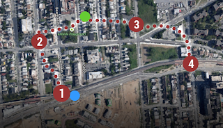
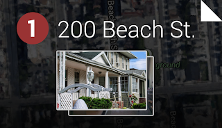
While the design sprint ended at rough mocks, the idea stuck around in my mind, and came up again during this exercise. It seemed like a perfect example of a contextually aware app that could enhance your Android Wear experience.
Designing a walking tour app for Android Wear
We started fleshing out the idea by thinking through the app’s entry points: how will users “launch” this app? While exposing a “start XYZ walking tours app” voice command is pretty standard, it’d be interesting to also suggest nearby walking tours as you go about your day by presenting notifications in the user’s context stream. These notifications would be “low priority,” so you’d only see them after addressing the more important stuff like text messages from friends. And with today’s geofencing and location functionality in Google Play services, this type of contextual awareness is possible in a battery-friendly way.
At this point we were pretty excited and decided to begin mocking up the UI. Rather than starting from scratch, we used Taylor Ling’s excellent Android Wear 0.1 design template as a baseline, which includes templates for both square and round devices. We started with square since we were most familiar with rectangle UI design:
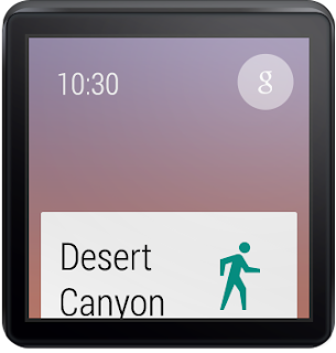
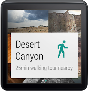
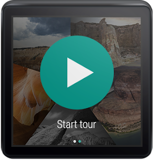
I’ve got to admit, it was pretty thrilling designing in such a constrained environment. 140x140 dp (280x280 px @ XHDPI) isn’t a lot of space to work with, so you need to make some tough choices about when and how to present information. But these are exactly the types of problems that make design really, really fun. You end up spending more time thinking and less time actually pushing pixels around in Photoshop or Sketch.
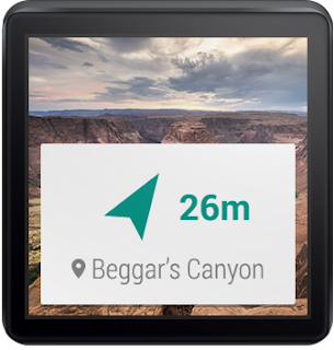
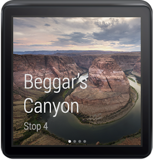
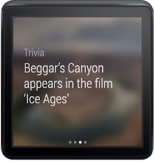
We pretty quickly fleshed out the rest of the app for square devices. They included just a handful of additional screens: a dynamic notification showing the distance to your next stop, and a 4-page detail screen when you arrive at the tour stop, where you can spend a few moments reading about where you’re standing.
Seeing our design in real life
Here’s the thing—there’s only so much you can do in Photoshop. To truly understand a platform as a designer, you really need to use (and ideally live with) a real device, and see your work on that device. Only then can you fully evaluate the complexity of your flows, the size of your touch targets, or the legibility of your text.
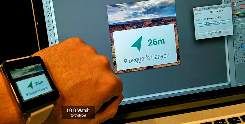
Luckily, Timothy and I both had test devices—I sported an LG G Watch prototype and Timothy carried a Moto 360 prototype. We then needed a way to quickly send screens to our devices so we could iterate on the design. A few years ago I’d published the Android Design Preview tool that lets you mirror a part of your screen to a connected Android device. Much to our delight, the tool worked great with Android Wear! After seeing our mocks show up on my LG G Watch, we made a few small tweaks and felt much more confident that the overall idea “felt right” on the wrist.
Designing for round devices
We’d never designed round UIs before, so we weren’t sure what this new adventure would be like. Quite frankly, it ended up being unbelievably easy: tweaking all 8 of our screen mocks for round took under an hour. When you’re only showing the most important 2 or 3 pieces of information on screen at a time, that’s only 2 or 3 pieces of information you need to optimize for round devices. All in all, there were only a few types of minor tweaks we made:
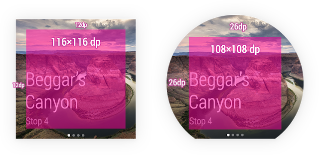
- Scaled up backgrounds to 160x160 dp (320x320 px @ XHDPI)
- Bumped up content margins from 12dp on square to 26dp on round; this means content was 116x116 dp on square and only a little smaller at 108x108 dp on round
- Pushed down circular actions like “Continue tour” to better vertically center with the watch frame
- Center-aligned certain short snippets of text on round devices as opposed to left-aligning on square
- Dropped the side padding for context stream cards (the platform automatically does this for notifications, so there isn’t any actual work to do here)
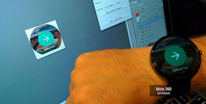
It’s hard to articulate the excitement we felt when we mirrored the mocks to Timothy’s Moto 360 prototype with Android Design Preview. To put it lightly, our minds were blown.
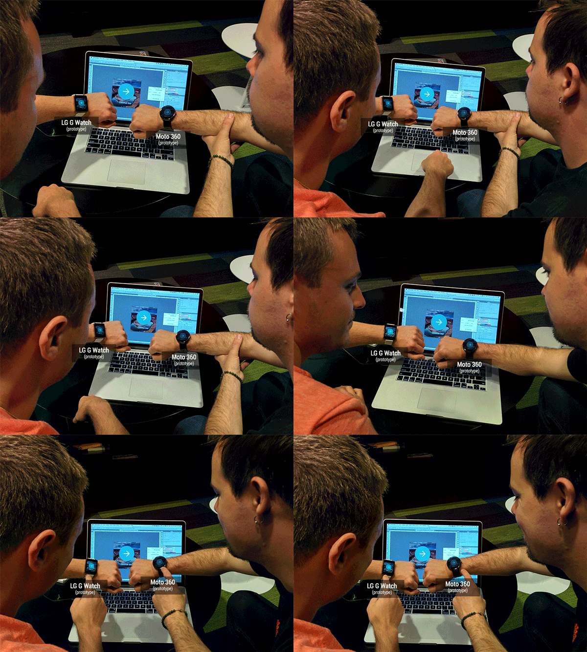
And that was it—with round and square mocks complete, and mirrored on our devices, we’d gotten our first glimpse at designing apps for this exciting new platform. Below are our completed mocks for the tour discovery and engagement flows, not a grid of app icons in sight. You can download the full PSDs here.

An eye-opening experience
Designing for Android Wear is pretty different from designing for the desktop, phones or tablets. Just like with Glass, you really need to think carefully about the information and actions you present to the user, and even more so about the contexts in which your app will come to the surface.
As a designer, that’s the fun part—working with constraints involving scarce resources like device size and user attention means it’s more important than ever to think deeply about your ideas and iterate on them early and often. The actual pixel-pushing part of the process is far, far easier.
So there we were, putting our ideas into practice, on real actual device prototypes that we could’ve only dreamed about only a few years ago. It was the most fun I’ve had designing UIs in a long time. Remember that feeling when you first dreamed up an app, mocked or even coded it up, and ran it on your Android phone? It was that same feeling all over again, but amplified, because you were actually wearing your app. I can’t wait for you all to experience it!
1 Have we mentioned #io14 will have tons of great content around both design and wearable computing? Make sure to tune in June 25th and 26th!
+Android Developers