Mastering Motion Charts – Trend Analysis
January 27th, 2009 | Published in Google Analytics
Motion Charts make it possible for you to perform both high-level analysis (such as identifing long-term trends) and targeted analysis (aimed at gauging the impact of a specific change or event).
In today's post, we'll focus on identifying trends. Here are some examples of high-level trends you might want to examine using motion charts:
 When to use a motion chart instead of just a graph
A standard graph shows data across two dimensions, (X-axis and Y-axis). On the other hand, Motion Charts let you look at data across up to five dimensions (X-axis, Y-axis, Color, Size and Time). If you're having flashbacks to high school math class, don't panic! Let's look at an example. We'll use Motion Charts to spot a trend of increasing visits from users of Internet Explorer on the Windows operating system.
Example: Spotting a trend in the Browser / OS Report
Start by navigating to the Browser and OS Report.
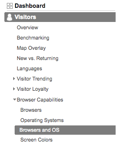
Next, click the "Visualize" button at the top of the report.
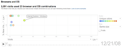
We'll select Visits for the X-axis, and % New Visits for the Y-axis. The chart loads a view of the data for the first day of the period. Notice that the bubble for Internet Explorer/Windows starts well on the left side of the chart:
After clicking play, the chart begins to change. Midway through the period, the "Internet Explorer / Windows" bubble has moved and now hovers near the middle of the chart. The other bubbles stay to the left, showing that the increase is not a trend across all the browser/OS combinations.
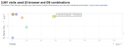
By the last days of the period being charted, the Internet Explorer / Windows bubble has moved to hover in the far right corner, representing a substantial increase in both Visits and % New Visits.

Thanks to the Motion Chart, this trend was easy to spot. Here's the real question though, what do you do with an observation like this?


In today's post, we'll focus on identifying trends. Here are some examples of high-level trends you might want to examine using motion charts:
- How the value of a keyword changes over time
- How targeting traffic from a channel improves (or decreases) the quality of your visitors over time
- How landing page optimization affects visitor behavior
- How engagement metrics relate to your conversion rate
- How your visitor profile changes over time

A standard graph shows data across two dimensions, (X-axis and Y-axis). On the other hand, Motion Charts let you look at data across up to five dimensions (X-axis, Y-axis, Color, Size and Time). If you're having flashbacks to high school math class, don't panic! Let's look at an example. We'll use Motion Charts to spot a trend of increasing visits from users of Internet Explorer on the Windows operating system.
Example: Spotting a trend in the Browser / OS Report
Start by navigating to the Browser and OS Report.

Next, click the "Visualize" button at the top of the report.
We'll select Visits for the X-axis, and % New Visits for the Y-axis. The chart loads a view of the data for the first day of the period. Notice that the bubble for Internet Explorer/Windows starts well on the left side of the chart:

After clicking play, the chart begins to change. Midway through the period, the "Internet Explorer / Windows" bubble has moved and now hovers near the middle of the chart. The other bubbles stay to the left, showing that the increase is not a trend across all the browser/OS combinations.

By the last days of the period being charted, the Internet Explorer / Windows bubble has moved to hover in the far right corner, representing a substantial increase in both Visits and % New Visits.

Thanks to the Motion Chart, this trend was easy to spot. Here's the real question though, what do you do with an observation like this?
- The project manager may budget additional time for quality testing in Internet Explorer vs other browsers due to the change.
- The marketing manager may use the insight to refine his or her understanding of the audience for the site, adjusting the sales copy to match known preferences of Windows users.
- The advertising manager may conclude that the company's new Mac-focused campaign was actually reaching the wrong audience and adjust accordingly.
- Focus on those bubbles that move more gradually. Often these are the bubbles based on the largest amount of data and are less likely to be thrown off by random, one-time occurrences.
- Use the trails feature to visualize a bubble's path across time steps. You can turn on trails by hitting the "Trails" checkbox shown below.


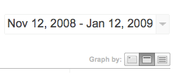
- Change your timescale from days to weeks when looking for longer-term trends. To change the time-scale on your motion chart, navigate back to the report you want to visualize, select the middle button next to the “Graph by” label on the upper-right hand corner of the graph and then click "Visualize" to return to the motion chart.

- Focus on trends that let you take action. If you're easily able to make adjustments to your advertising mix but not your sales copy, then you may want to start your analysis by looking at keyword trends and campaign performance rather than landing page optimization.
- Check out some of the other resources on Motion Charts to sharpen your skills:
-
- Motion charts video tutorial
- Motion charts help center summary
- Motion charts video tutorial
What do you use motion charts for?
Have you ever used motion charts to spot a keyword or site usage trend? Add a comment and tell us about it!
Have you ever used motion charts to spot a keyword or site usage trend? Add a comment and tell us about it!