Improve your web-forms and increase conversions
February 8th, 2010 | Published in Google Analytics, Google Conversions
As a follow up to our previous post "Is your website easy to buy from?", we're now going to take a deeper look at web-forms. Web-forms are often the only communication point your website visitors have with your business, yet unfortunately they are often a neglected after thought for many websites.
Imagine for a moment that your forms are a set of hurdles. Potential customers have to jump over multiple sets of hurdles to reach your conversion point. The easier the web-form, the lower the hurdles. The more difficult, ambiguous or complex the web-form, the higher the hurdles.
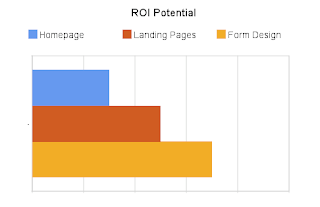
If you are considering making changes to your website design, take a moment to consider the potential revenue impact of your redesign. The graph below shows a theoretical overview of the ROI impact of various parts of your website.
 The good news is, you can make almost any form a better experience by following a few simple guidelines.
But first...
For example:

Users are often in a rush to complete their task and reach their goal. By removing obstacles and making the web-form easier to complete, we increase the likelihood of visitors reaching your conversion page.
So how can we increase the likelihood that visitors will reach your goal page and find your web-forms easier?
When designing web-forms here are some things you might want to try:
1. Place form labels to the left hand side
2. Use a single column form
3. Align fields to a grid
Example of a grid layout using the blueprint css framework
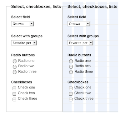
The right hand side shows the grid lines on, all elements align to the vertical grid.
4. Use an easy to read screen font (sans-serif) such as Verdana
5. Use appropriate negative (white) space to separate form fields
6. Use high contrast text and backgrounds (colour wheels can help)
7. Make it pretty, visitors trust pretty websites more
8. Use semantic markup to assist users with accessibility issues
Provide clear form instructions
Lets say for example our e-commerce website checkout form asks the following question:

I just want to order some books, why do I need to specify all this personal information?
If you must collect this information:
In the form above, there may be valid reasons for needing this information, but without an explanation as to why you need this information, it seems awfully personal and inappropriate.
Tips for form questions:
Show your website is credible and will treat information submitted with respect.
The problem with this process is that visitors have to correct their error(s), hope they have done what is instructed of them, click submit again and wait for feedback. Each additional time this happens the visitor becomes increasingly annoyed.
Inline errors provide an instant feedback mechanism that allow visitors to complete forms with less fuss and more accuracy.
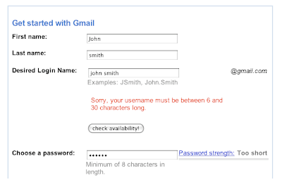
Gmail gives users a button that helps them check if a username is available, and it provides feedback on the password field as you type into the box.
Inline error guidelines
3. Use a graphical icon such as a tick to indicate if the field is correct versus incorrect
4. Highlight the problem area with a red border or text
5. Try suggesting what the problem might be or how to correct the error
In order for visitors to successfully complete your web-form, you will need to ensure:
If your form is sufficiently long, such as an airline booking form, you might want to consider breaking your web-form into multiple parts.
 Flight booking progress indicator has a nice little plane icon, I can easily see I'm at stage 3 of 5
The advantage of adding a multistep web-form to your website is that you can use Google Analytics Goal and Funnel reports to help determine which step is causing the most friction.
Tips for multistep forms:
Form redesign example:
Lets take a look at a real world example. The following form is the 3rd step in a 4 step process for booking a holiday. At least one contact number is required, along with the other details indicated below. The form also gives visitors the opportunity to specify if they would like to receive future newsletters and how they heard about the company.
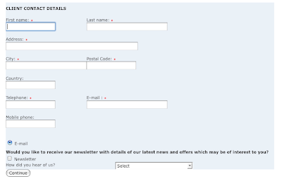
The form could be vastly improved by making small changes to the layout, alignment, form options and wording.
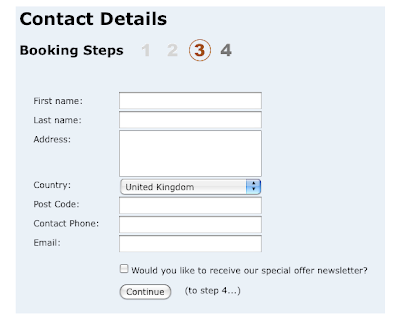
For those of you wondering how to achieve this kind of form layout there is an excellent write up on A List Apart.
What changed?
Taking it a step further, you may also want to carry out in-house user based testing to see how people interact with your website forms. This could provide even more valuable insight into potential problems visitors have when trying to complete your forms.
Imagine for a moment that your forms are a set of hurdles. Potential customers have to jump over multiple sets of hurdles to reach your conversion point. The easier the web-form, the lower the hurdles. The more difficult, ambiguous or complex the web-form, the higher the hurdles.
If you are considering making changes to your website design, take a moment to consider the potential revenue impact of your redesign. The graph below shows a theoretical overview of the ROI impact of various parts of your website.
 The good news is, you can make almost any form a better experience by following a few simple guidelines.
But first...
Why do users fill in forms?
If you ask someone if they enjoy filling out forms, you are more than likely going to find that forms are not viewed as an enjoyable experience. Users are likely to complete a form if they feel it helps them accomplish a task and / or there is a personal benefit / incentive for them to complete it.For example:

Users are often in a rush to complete their task and reach their goal. By removing obstacles and making the web-form easier to complete, we increase the likelihood of visitors reaching your conversion page.
So how can we increase the likelihood that visitors will reach your goal page and find your web-forms easier?
Form layout and design
Eye tracking and usability studies reveal that many visitors scan form fields with a left to right eye movement, often ignoring instructions. Items on the far right of the form may not be seen, or may not get the visitors attention.When designing web-forms here are some things you might want to try:
1. Place form labels to the left hand side
2. Use a single column form
3. Align fields to a grid
Example of a grid layout using the blueprint css framework

The right hand side shows the grid lines on, all elements align to the vertical grid.
4. Use an easy to read screen font (sans-serif) such as Verdana
5. Use appropriate negative (white) space to separate form fields
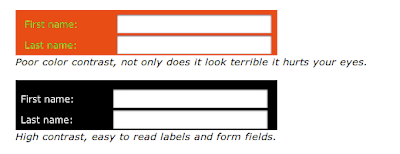
6. Use high contrast text and backgrounds (colour wheels can help)
7. Make it pretty, visitors trust pretty websites more
8. Use semantic markup to assist users with accessibility issues

Provide clear form instructions
- Remove large blocks of instructive text, visitors probably won't read them. Think of Jeremy Clarkson assembling a Caterham
- Use clear headings eg: "Home Loan Application" not "Application Form"
- Avoid acronyms (if you do use them, provide their full meaning next to it) eg: ABN = Australian Business Number & PPS = Personal Public Service Number (Ireland)
- Use plain English
- Always be polite when asking for information, never demand it and be extra nice with error messages
- If visitors will require specific information to complete the form, mention this at the beginning of the web-form
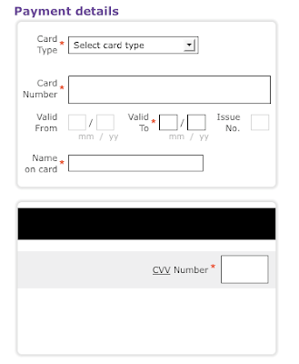
- Use a graphical representation to aid visitors

If you read our last post this will look familiar, but we felt it was so important we had to show it again. This graphical representation helps visitors identify the information you need them to provide.
8. Choose the appropriate form control for the information you want Example of a slider that allows visitors to select a range of values with ease. The Jquery slider is just one example.
9. Group form field questions into groups based on theme or topic8. Choose the appropriate form control for the information you want
 Example of a slider that allows visitors to select a range of values with ease. The Jquery slider is just one example.
Ask appropriate questions
When requesting information from visitors via a form it's important to consider the relationship your business has with the visitor being asked to complete the form. If you don't have an established relationship with the visitor yet, don't ask detailed personal questions. Chances are the visitor will abandon your form and conversion process.Lets say for example our e-commerce website checkout form asks the following question:

I just want to order some books, why do I need to specify all this personal information?
If you must collect this information:
In the form above, there may be valid reasons for needing this information, but without an explanation as to why you need this information, it seems awfully personal and inappropriate.
Tips for form questions:
- Start a form with less personal details
- Remove fields that are not required to complete the task
- Break long or complex forms into multiple step forms
- Don't force visitors to respond to marketing questions - visitors will probably just 'fudge the answer' to get past any validation you put in place
Provide a reason to trust you
Show your website is credible and will treat information submitted with respect.
- Use security badges / certificates for payment gateway
- Link to privacy policy that details how you handle submitted user information
- Tell me why you need information if it's personal
- If I give you this information what will happen?
- Requesting email? Will I get your marketing emails?
- Requesting phone number, should I expect your call?
Use inline errors (with care)
When completing web-forms, traditionally, the process has been to complete a set of fields, then hit the submit button. The information is then validated by the web server, and if an error occurs the visitor is provided with feedback after the page has refreshed.The problem with this process is that visitors have to correct their error(s), hope they have done what is instructed of them, click submit again and wait for feedback. Each additional time this happens the visitor becomes increasingly annoyed.
Inline errors provide an instant feedback mechanism that allow visitors to complete forms with less fuss and more accuracy.

Gmail gives users a button that helps them check if a username is available, and it provides feedback on the password field as you type into the box.
Inline error guidelines
- Validate data after the visitor has completed entry (onblur event for javascript techies)
- Only validate fields that visitors won't know are correct beforehand
- Minimum password length
- Password does not match
- Username is taken
- Credit card number is not long enough
3. Use a graphical icon such as a tick to indicate if the field is correct versus incorrect
4. Highlight the problem area with a red border or text
5. Try suggesting what the problem might be or how to correct the error
How long should my form be?
It depends on the task a visitor is being asked to complete. Most visitors would expect that booking a flight will be more time intensive and require more information than registering for your special offer newsletter.In order for visitors to successfully complete your web-form, you will need to ensure:
- You provide them with a reason to trust you with the information they supply
- The reward for completing the form outweighs the effort to complete it
- The time required to complete the form is appropriate for the task at hand
Should I have a multistep form?
If your form is sufficiently long, such as an airline booking form, you might want to consider breaking your web-form into multiple parts.
- Search
- Select flights
- Provide passenger details
- Provide payment information
- Confirm booking
 Flight booking progress indicator has a nice little plane icon, I can easily see I'm at stage 3 of 5
The advantage of adding a multistep web-form to your website is that you can use Google Analytics Goal and Funnel reports to help determine which step is causing the most friction.
Tips for multistep forms:
- Tell visitors what to expect next
- Don't hide a step in between indicators - visitors won't like it
- Make your progress indicator obvious (place it just above the form)
- Use a combination of graphics and text, don't blend it into the background or make it too small to see
Provide a small reward
Depending on the task at hand, you may find you need to provide an additional incentive to complete the requested form.- If you're trying to sell copies of a PDF booklet, give visitors a free sample chapter
- Providing an online training course? Give visitors 3 days free access to materials
- Membership based website? Give visitors reward points for filling in additional details
Form redesign example:
Lets take a look at a real world example. The following form is the 3rd step in a 4 step process for booking a holiday. At least one contact number is required, along with the other details indicated below. The form also gives visitors the opportunity to specify if they would like to receive future newsletters and how they heard about the company.

The form could be vastly improved by making small changes to the layout, alignment, form options and wording.

For those of you wondering how to achieve this kind of form layout there is an excellent write up on A List Apart.
What changed?
- Aligned the fields and labels to a grid
- Changed the form to single column
- Placed the progress indicator above the form
- (to step 4...) tells visitors what to expect next
- Changed country to a select / option field
-
Opt-in status for newsletter default to unchecked and reduced wording
- Removed how did you hear about us? See the previous post about this
- Removed optional phone field
Taking it a step further, you may also want to carry out in-house user based testing to see how people interact with your website forms. This could provide even more valuable insight into potential problems visitors have when trying to complete your forms.
Posted by Gavin Doolan, Google Analytics Team.