Google Data Studio for Ecommerce Businesses
July 27th, 2016 | Published in Google Analytics
Google Data Studio is a great tool to visualize datasets from multiple sources, such as Google Sheets, BigQuery, AdWords, and others. But being part of the Google Analytics 360 Suite, it is no surprise that it makes a perfect visualization tool for Google Analytics too! In the coming weeks and months we will showcase some best practices and sample reports in this blog, but we thought we would start with something you are acquainted with: Google Analytics.
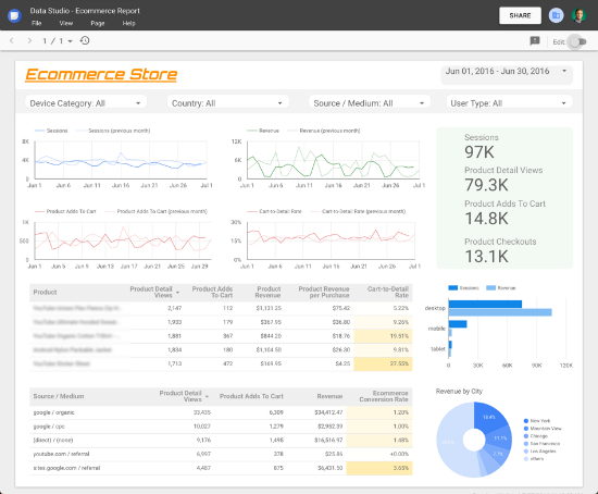
With that in mind, we decided to create a sample report that may give you some inspiration on how to build your next dashboard. The example below will provide some good ideas on which charts, dimensions and metrics to use to visualize your Ecommerce data. Please note that some of this data will be available only for accounts that have Enhanced Ecommerce implemented.

Report created using Google Analytics data on Google Data Studio
Let’s go over some of the elements you see in the screenshot above.
-
Header: it is always helpful to provide some info and controls in the top of the report. In this case you will see the website logo, a time range control and a series of four filter controls, with which you can segment your reports by Device, Country, Source or User Type.
-
Trend charts: the four line charts in the top left will show how the business is performing over time (also compared to the previous period). This is important to understand drops and spikes in the data.
-
Scorecards: the overall stats (green background) show in a glance how the business is doing, they provide a quick and effective way to understand the bottom line.
-
Detailed information: tables are the best way to represent data in a detailed way. As seen in the report, the tables provide more information about the products being sold and also the traffic sources bringing the most users.
-
Additional info: depending on your business, you might want to add special metrics and dimensions to enrich your report (e.g. custom dimensions & metrics). In the report above you will find some additional information on the bar and pie charts in the bottom right corner.
We hope that this sample report helps you get up and running. Feel free to share your own report in the comments, we would love to learn how you are using Data Studio to report and visualize your data!
This report was created using a Google Analytics data source, check this step-by-step guide for a detailed account on how to create Data Studio reports using Google Analytics. Learn more about Data Studio in the Help Centre: https://support.google.com/datastudio/
Posted by Daniel Waisberg, Analytics Advocate