Back to Basics: Using Motion Charts
April 27th, 2009 | Published in Google Analytics
The Motion Charts feature seems like an advanced tool, but it's actually designed for Analytics users at all levels. It's useful for spotting trends and relationships amongst individual variables when your visits may look flat as an aggregated set of data. Today, we'll illustrate how Motion Charts can graph and compare several keywords over time.
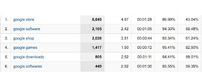
For example, let's say you want to graph traffic over time for each of the top keywords in the report below. You can easily do so by going to the Keywords report under the 'Traffic Sources' section.

Of course, you can click each keyword to see a graph over time, but this doesn't allow you to make comparisons.
.jpg)
However, Motion Charts allow you to graph and compare individual keyword performance over time. To access Motion Charts click the "Visualize" button at the top of most reports, such as the "Keyword" report located under "Traffic Sources."

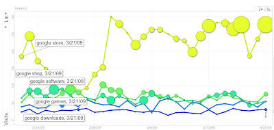
You can now see that, except for a dip in traffic between Mar 23 and Mar 30, "google store" sent more traffic every day than the other keywords. "google downloads" sent the least amount traffic each day.
But this graph also provides a bonus. If you set the size of the dots to represent revenue, you can identify the days during which traffic actually paid off in revenue. For example, "google store" doesn't generate revenue every day (even when it sends lots of traffic). "google shop" and "google software" frequently generate revenue, but not as much as "google store".
Generating this graph is easy. Just follow these steps:
After following these steps, a graph like the image above should appear. If you've selected a lot of keywords, your labels may bunch together, but you can drag and reposition the labels to see parts of the graph that are obscured.
Of course, you can use this technique on any report which has a 'Visualize' button. If you discover a new use for this technique, please post a comment and share your best practice with us.
But this graph also provides a bonus. If you set the size of the dots to represent revenue, you can identify the days during which traffic actually paid off in revenue. For example, "google store" doesn't generate revenue every day (even when it sends lots of traffic). "google shop" and "google software" frequently generate revenue, but not as much as "google store".
Generating this graph is easy. Just follow these steps:
- Go the Keywords report (or any other report with table data) and click 'Visualize.'
- Select "Time" for the X-axis and "Visits" on the Y-axis. For Size, select "Revenue" (or any other metric you want to track).
- Now, select the keywords you want to graph (use the 'Select' box below the 'Size' menu) and select Trails. Press 'Play' or drag the slider across to the end of the time period.
After following these steps, a graph like the image above should appear. If you've selected a lot of keywords, your labels may bunch together, but you can drag and reposition the labels to see parts of the graph that are obscured.
Of course, you can use this technique on any report which has a 'Visualize' button. If you discover a new use for this technique, please post a comment and share your best practice with us.