Back to Basics: Graph mode
May 18th, 2009 | Published in Google Analytics
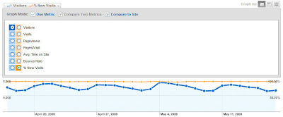
One way Google Analytics can help you quickly spot trends and anomalies is through the 'Graph mode' feature. This feature lets you compare multiple metrics on your graph to see if there are any obvious correlations. You can graph by one metric, compare one metric to another (e.g. visitors versus average time on site), or compare a metric to your site average. Once you graph your selected metrics, you can roll your mouse over the graph to see the actual values of the two metrics you're comparing.
For example, let's say your site saw a sudden surge in traffic from an search engine optimization effort. You can use the 'Graph mode' option to graph 'visits' and '% new visitors' on the same graph. This will show you whether the SEO campaign successfully reached new visitors or whether it was more successful in driving repeat visits.

To use graph mode, click the pulldown menu in the top left of the graph of a selected report. Then, select the graph view you'd like to see. To finish, click the pulldown menu tab one more time.
