With a refreshing makeover, MakeupAlley.com boosts interactions, clicks and revenue
March 18th, 2013 | Published in Google Adsense
When users of MakeupAlley.com, one of the web’s largest beauty communities, review any of the 130,000 products that appear on the site, community engagement motivates them to add reviews. Is the product easy to use? Is it visually appealing? Does the product compare well to other products in its category?
After mastering the art of product reviews, MakeupAlley.com conducted a review of its own site and implemented changes. In doing so, MakeupAlley.com achieved a 171% increase in on-site interactions, 21% more clicks to affiliate links, and a 50% uplift in AdSense revenue. A host of Google tools contributed to the overhaul, and to these compelling results.
Small changes, big impact
In all, the site hosts well over 2 million reviews. Aiming to improve user experience and increase engagement, MakeupAlley.com first made some simple changes to its product pages, home to the site’s latest reviews. Using Google’s tips and resources for publishers, MakeupAlley.com organized and streamlined content and design to make relevant information easier to find.
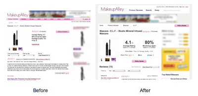
Product names and rating statistics were made more prominent to make it easier for users to gather product information at a glance. MakeupAlley.com also restructured the layout by separating review content from member profiles. To encourage deeper engagement, MakeupAlley.com grouped and clearly labeled related content. A final tweak saw an existing AdSense unit move to a more visible placement below the navigation, creating space on the page for an additional ad unit.
Tallying up through testing
To measure the effectiveness of the changes, the team set up Google Analytics Custom Variables to track and compare visitor activity, as well as Event Tracking to evaluate in-page interactions. MakeupAlley.com also created custom channels in AdSense to track the performance of ad units.
MakeupAlley.com ran a month-long A/B test, splitting traffic between the original and new landing pages. The new, user-friendly landing page demonstrated promising results. Featuring related content in a clear way helped grow on-site interactions, while organizing affiliate links in an easy-to-find “Where to buy” section encouraged clicks. And the new ad unit placements resulted in a notable upward surge in AdSense revenue.
A beautiful future
Considering that MakeupAlley.com’s revenue comes primarily from advertising and affiliates, the lessons learned are valuable to the brand. “We’re excited to continue improving the usability of our site using this methodology,” says one team member. Based on these successes, plans are already in the works to apply the same tactics to improving user experience and engagement throughout the site.
 Want to replicate this kind of success for your own brand?
● Read the full case study on MakeupAlley.com.
● Get tips and best practices for content and design from Google’s Webmaster Guidelines.
● Learn about measuring visitor activity, Custom Variables and Event Tracking with Google Analytics.
● Find out how to use Google AdSense custom channels to group and track ad units.
Posted by Ian Cohan-Shapiro - Inside AdSense Team
Was this blog post useful? Share your feedback with us.
After mastering the art of product reviews, MakeupAlley.com conducted a review of its own site and implemented changes. In doing so, MakeupAlley.com achieved a 171% increase in on-site interactions, 21% more clicks to affiliate links, and a 50% uplift in AdSense revenue. A host of Google tools contributed to the overhaul, and to these compelling results.
Small changes, big impact
In all, the site hosts well over 2 million reviews. Aiming to improve user experience and increase engagement, MakeupAlley.com first made some simple changes to its product pages, home to the site’s latest reviews. Using Google’s tips and resources for publishers, MakeupAlley.com organized and streamlined content and design to make relevant information easier to find.
Product names and rating statistics were made more prominent to make it easier for users to gather product information at a glance. MakeupAlley.com also restructured the layout by separating review content from member profiles. To encourage deeper engagement, MakeupAlley.com grouped and clearly labeled related content. A final tweak saw an existing AdSense unit move to a more visible placement below the navigation, creating space on the page for an additional ad unit.
Tallying up through testing
To measure the effectiveness of the changes, the team set up Google Analytics Custom Variables to track and compare visitor activity, as well as Event Tracking to evaluate in-page interactions. MakeupAlley.com also created custom channels in AdSense to track the performance of ad units.
MakeupAlley.com ran a month-long A/B test, splitting traffic between the original and new landing pages. The new, user-friendly landing page demonstrated promising results. Featuring related content in a clear way helped grow on-site interactions, while organizing affiliate links in an easy-to-find “Where to buy” section encouraged clicks. And the new ad unit placements resulted in a notable upward surge in AdSense revenue.
A beautiful future
Considering that MakeupAlley.com’s revenue comes primarily from advertising and affiliates, the lessons learned are valuable to the brand. “We’re excited to continue improving the usability of our site using this methodology,” says one team member. Based on these successes, plans are already in the works to apply the same tactics to improving user experience and engagement throughout the site.

● Read the full case study on MakeupAlley.com.
● Get tips and best practices for content and design from Google’s Webmaster Guidelines.
● Learn about measuring visitor activity, Custom Variables and Event Tracking with Google Analytics.
● Find out how to use Google AdSense custom channels to group and track ad units.
Posted by Ian Cohan-Shapiro - Inside AdSense Team
Was this blog post useful? Share your feedback with us.