Link unit, front and center
February 26th, 2007 | Published in Google Adsense
If you visit www.the-gadgeteer.com, you’re likely to find a review of the newest, hippest gadget. For nearly a decade, Julie Strietelmeier has taken her fascination with consumer electronics to the masses, offering her opinions on the latest gadget accessories for readers to enjoy.
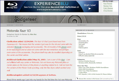
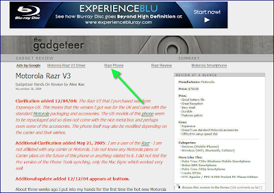
Recently, Julie experimented with optimizing her link unit ad placement. She removed the existing 120x90 link unit from the uppermost right corner of her pages, and instead placed a 468x15 link unit at the top of her articles. In doing so, Julie found a convenient, unobtrusive location and saw her readers naturally gravitating towards the link unit. Her efforts led to an immediate doubling of her revenue -- an increase that has been sustained since the move.
Before

After

With the nice bump in her earnings, Julie has found the extra pocket change handy. As she says, “Now I can go out and buy the newest gadgets and review them immediately” -- much to the relief of her gadget-happy audience.
Recently, Julie experimented with optimizing her link unit ad placement. She removed the existing 120x90 link unit from the uppermost right corner of her pages, and instead placed a 468x15 link unit at the top of her articles. In doing so, Julie found a convenient, unobtrusive location and saw her readers naturally gravitating towards the link unit. Her efforts led to an immediate doubling of her revenue -- an increase that has been sustained since the move.
Before
After
With the nice bump in her earnings, Julie has found the extra pocket change handy. As she says, “Now I can go out and buy the newest gadgets and review them immediately” -- much to the relief of her gadget-happy audience.