All the elements for a successful optimisation
October 17th, 2006 | Published in Google Adsense
Many of you might remember our April post featuring Ivan Heneghan, a member of the AdSense UK Optimisation Team. Ivan discussed a science website that was able to dramatically increase AdSense earnings through a few simple changes. Well, Ivan's back to share more details about that story with you:
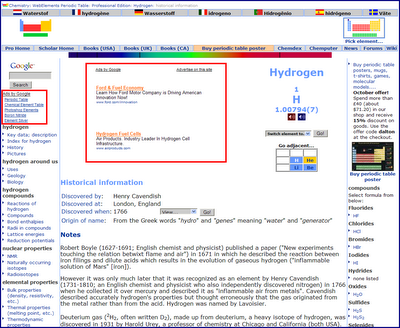
When UK-based WebElements.com started using AdSense in late 2003, their earnings averaged out at a low daily rate. In January 2005, WebElements began to focus on optimisation, experimenting with different ad colors, ad styles, and page locations. They found success by adding link units to each page of their site, placing Large Rectangles directly before and after their content, and adding a Wide Skycraper to their left sidebar.

In the week following the optimisation, WebElements saw revenue increase by 500%. They then made other small placement changes to the site, which resulted in a spike doubling the revenue yet again -- as a result, the site was earning over 1000% its original earnings for some of the year.
Today, this ad revenue enables WebElements to further develop their site. The company advises that "it is important to experiment with colors, ad sizes, and locations on the page, as the audience for one type of web site may well respond to ads differently to another. It is worth experimenting with colors that blend with site design and others that show some contrast. It is also a good idea to use Adsense channels to run different color schemes in different channels at the same time and to wait for a week or so before deciding which colors work best. And, of course, content is king."
When UK-based WebElements.com started using AdSense in late 2003, their earnings averaged out at a low daily rate. In January 2005, WebElements began to focus on optimisation, experimenting with different ad colors, ad styles, and page locations. They found success by adding link units to each page of their site, placing Large Rectangles directly before and after their content, and adding a Wide Skycraper to their left sidebar.

In the week following the optimisation, WebElements saw revenue increase by 500%. They then made other small placement changes to the site, which resulted in a spike doubling the revenue yet again -- as a result, the site was earning over 1000% its original earnings for some of the year.
Today, this ad revenue enables WebElements to further develop their site. The company advises that "it is important to experiment with colors, ad sizes, and locations on the page, as the audience for one type of web site may well respond to ads differently to another. It is worth experimenting with colors that blend with site design and others that show some contrast. It is also a good idea to use Adsense channels to run different color schemes in different channels at the same time and to wait for a week or so before deciding which colors work best. And, of course, content is king."