May 16th, 2011 | by Shane Cassells | published in Google Analytics, Google Conversions
There will be Google Analytics User Conferences on in Sweden, Denmark & the Netherlands over the coming days. Organised by our Google Analytics Certified Partners and sponsored by Google, please see the sites below if you’d like to attend.Sweden, S…
May 9th, 2011 | by Shane Cassells | published in Google Conversions
This is part of our series of posts highlighting the new Google Analytics. The new version of Google Analytics is currently available in beta to all Analytics users. And follow Google Analytics on Twitter for the latest updates. This week we’re sharing a new feature, the Site Speed report.
At Google, we are passionate about speed and making the web faster, and we are glad to see that many website owners share the same idea. A faster web is better for both users and businesses. A slow loading landing page not only impacts your conversion rate, but can also impact AdWords Landing Page Quality and ranking in Google search.
To improve the performance of your pages, you first need to measure and diagnose the speed of a page, which can be a difficult task. Furthermore, even with page speed measurements, it’s critical to look at page speed in context of other web analytics data.
Therefore, we are thrilled to announce the availability of the Site Speed report in the new Google Analytics platform. With the Site Speed report you can measure the page load time across your site.
Uses for the Site Speed Report
- Content: Which landing pages are slowest?
- Traffic sources: Which campaigns correspond to faster page loads overall?
- Visitor: How does page load time vary across geographies?
- Technology: Does your site load faster or slower for different browsers?
One effective use of the Site Speed report is to measure speed for your most critical pages. For example, you might learn that the target audience of your site is located in a geographic region that experiences slower page speed. Or, you might learn that certain pages on your site run slower in some browsers. In addition to the Site Speed report, we’ve created a custom report that you can use to help answer these questions: view the Site Speed custom report.
 Setting up the Site Speed Report
By default, page speed measurement is turned off, so you’ll only see 0’s in the Site Speed report until you’ve enabled it. To start measuring site speed, you need to make a small change to your Analytics tracking code. We have detailed instructions in the Site Speed article in the Analytics Help Center. Once you’ve updated your tracking code, a small sample of pageviews will be used to calculate the page load time.
We’re excited to bring this important metric into Google Analytics as part of the new Google Analytics platform. Please continue to send us feedback on Site Speed and the rest of the new Google Analytics.
- Zhiheng Wang, Phil Mui
on behalf of the Google Analytics team and the Make the Web Faster team.
Posted by Shane Cassells, Google Conversion Team
Part 2: Mobile Website Optimisation – How Effective Use of White Space Can Improve the Mobile Website Experience
May 6th, 2011 | by Shane Cassells | published in Google Conversions
This is the second post in a series on optimising mobile websites for conversions.
In Summary: Uncluttered mobile sites with minimal but meaningful information which is visible to users on the go is key to maximising conversions on mobile devices.
Mobile devices have small screens. The larger ones have about 640×960 pixel resolution (or 4in/10cm diameter). When you compare that with a desktop computer screen it’s not very big. So how do you ensure that a user on a small screen gets to see all of the things they would see on a desktop version of your site? You don’t. In this post we will be focusing on using white space as a means to making mobile websites feel intuitive and uncluttered.
Do Not Overcrowd the Screen: As covered in the last post on content prioritisation, a big part of mobile site building involves stripping out as much detail as possible. Mobile users are task oriented so they only need the details necessary to complete a task quickly. Speed is important and the way you present the information on your site will impact heavily on the speed with which a user can digest it. It might seem counter-intuitive when the screen is so small and you have so much to say but pushing lots of information and too many options at your users will push them away from a conversion. Prioritised content combined with effective use of white space leads to a better mobile experience.
Banners, Pictures & Videos: Desktop sites are generally overburdened with banners, pictures & videos but it’s easier to get away with that when you have a big screen and a fast broadband connection. Real estate is precious on a mobile device so only use small pictures – but pictures are still recommended. You can make it possible for a user to click on pictures to increase the size but it should be a user choice. Banners should be kept to an absolute minimum or even removed altogether. If you are using a banner it should only be a conversion reinforcement banner such as highlighting a delivery or returns policy. You can also use banner advertisements if that is the way you monetise your site. Videos can contribute effectively to a conversion, particularly a brand oriented one. However, where a video is not necessary and is even distracting, it should not be included. If you’re unsure, test it with a tool like Google Website Optimiser to see what impact video has for your mobile site.
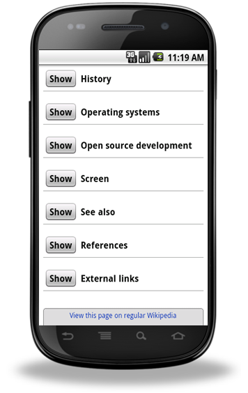
Bullet Points: Desktop users generally will not read lots of text. Mobile users are even less likely to. All paragraphs of text should be removed and replaced with clear concise bullet points. Mobile user’s often read at arms length so the text should also be large enough and clear enough to facilitate this. A great way of doing so is to ensure that there’s not a lot to read. Where bands of text are unavoidable, it should be possible for users to hide or expand the text or to get more information on tabs. Use headlines that summarise the text that follows so a user can still convert without reading everything.

The m.wikipedia.org. site allows users to choose what text they want to see
White Space is Light Space: Dark backgrounds are a bad experience even on a desktop but on a mobile site they can be devastating to conversions. Mobile users are on the go and when they are outside in daylight situations background colour is very important. Try using a projector in a bright room with the curtains drawn and the light splashing onto the screen. If your slides have a dark background you won’t see them. If they have a white background with black text, it won’t be a problem. That is the same experience on a macro level as a user trying to use a website with a dark background on a mobile device outside. It might look cool when you’re building it in a lab, but it’s not a great experience. Users can increase the brightness of their display but that will place greater strain on the battery.
White space (also called negative space) doesn’t have to be white but it should be pale so that high contrast text and images placed against it are visible even in poor light. Using a picture as a background is also not recommended. Again, remember that users are often on the go and reading at a distance.
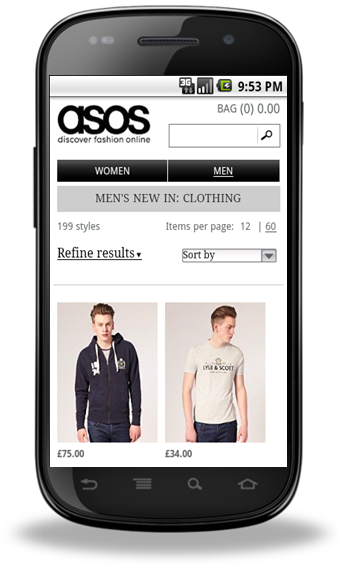
White space also helps when building sites to fit multiple devices of varying resolutions. The more white space, the less likely your site will look cramped or stretched on different devices. Of course, it’s also a good idea to design your site with multiple resolutions in mind.

This site uses a light background and uncluttered space to great effect.
To summarise, 4 points to keep in mind when creating a layout for your mobile site:
- Mobile sites should not be cluttered
- Remove unnecessary elements which take up space and data
- Use bullet points instead of paragraphs for text
-
Have a light background to your site
Mobile Website Testing Tip: When you are building your mobile site, test it in different light levels to best replicate the user experience.
The next post will be looking at how big buttons can make mobile website conversion a whole lot easier. If you have feedback, please leave a comment.
Posted by Shane Cassells, Google Conversion Team
Custom Reports in the new Google Analytics
May 5th, 2011 | by Shane Cassells | published in Google Conversions
This is part of our series of posts highlighting the new Google Analytics. The new version of Google Analytics is currently available in beta to all Analytics users. And follow Google Analytics on Twitter for the latest updates. We’ll be discussing how to use updated custom reports.
Every website is different, yet we focus much of our time on the standard reports in our web analytics tools. Custom reports have been an integral part of Google Analytics since 2008. With the new platform, we took a close look at how we could improve the custom reports to make them more usable and powerful.
The Custom Reports tab
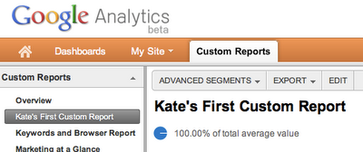
For starters, custom reports now live under their own tab, which you can find next to My Site in the main menu bar.

The overview shows a list of all the custom reports available for your profile. You can also view, edit, or share a custom report, and, of course, you can also build a new custom report.
Building a custom report
As with the previous version of Google Analytics, you build a custom report by picking the metrics and dimensions you want. For the new platform, we’ve made some enhancements. Let’s walk through the creation of a custom report for measuring the effectiveness of content on this blog (borrowing from one of Avinash’s awesome custom reports).
Getting the right data
We saw that custom reports were most useful when focused on subset of data. For my blog report, I’ve decided that I want to only focus on referral traffic. In the old version, I’d have to combine an advanced segment with my custom report to do this analysis. With the new platform, we’ve made it possible to make the filter part of your custom report.
 You can add multiple filters to the same report, and filter on dimensions other than those you’ve chosen to use in the report. Best of all, these filters are saved as part of your custom report. As soon as you (or your boss) opens the report, you’re looking at the data you need.
Organising your report
Like the current version, you can build multiple report tabs into your custom report. This is helpful to organise your report, or build different views for people across your organisation. In the new Google Analytics, you’re no longer restricted to using the same dimensions for each report tab, which allows you to truly get all of the data you care about in one custom report. There are two types of report tabs available: Flat Table and Explorer tabs.
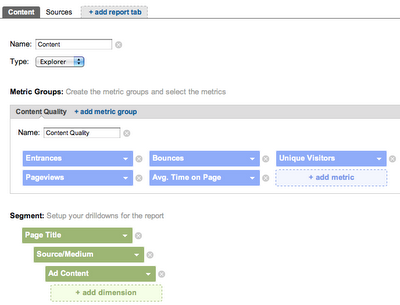
Explorer report tabs are similar to the report view that is used across Analytics. They allow you to drill down into data, as well as add a secondary dimension. When creating an Explorer tab, you can also create Metric Groups, which help further organise your report for easier analysis. For our example, I’ve built out an Explorer tab focused on content quality metrics with a drill down into where the traffic came from.

Flat Table report tabs allow you to look at two dimensions side by side, meaning you don’t have to click to drill down into your data. We’ve created this report view to make it easier to export the information you care about, email it to a colleague, or simply print it out. For the example report, I have a Flat Table tab focused on where the traffic came from and the quality of that traffic.
And here’s the finished report:
Sharing your custom reports
Once you’ve finished creating your report, you might want to share it with your team. One of the most widely used features of Custom Reports has been sharing, which allows you to share a link to your custom report configuration with others.
Like the current version, sharing a custom report in the new Google Analytics only shares the structure of the report, not the data from your account. There is one difference to keep in mind, when you share a custom report in the new version, the link will always reflect the state of the report when you first created the link. So, if you create a report, share it with your colleagues, and then make further changes, the link you shared will still point to the first version of the report. You can share your reports from the Custom Reports overview. Just click the share link:
 And here’s a link to the custom report example we’ve referenced throughout this post:http://goo.gl/McSBl.
Finding a home for your old custom reports
Did you spend a lot of time creating the perfect custom report in the old version? Not to fear: we’ve created a migration tool to help you migrate your reports from the old version to the new Google Analytics. From the Custom Reports Overview, you’ll see a section called Migrate Custom Reports. It will let you know if you have reports to be migrated. Keep in mind that migration only works one way. Once you move your reports over to the new version, you won’t be able to use them in the old version.
Using standard reports to analyse your website can only take you so far, which is why we’ve put so much effort in making custom reports more powerful and easier for Google Analytics v5. Please continue to give us your feedback on the new Google Analytics. Happy analysing!
Posted by Kate Cushing, Google Analytics team
New Analytics Help Center
April 18th, 2011 | by Shane Cassells | published in Google Analytics, Google Conversions
This is part of our series of posts highlighting the new Google Analytics. The new version of Google Analytics is currently available in beta to a number of Analytics users. We’ll be giving access to even more users soon. Sign up for early access. An…
April 7th, 2011 | by Shane Cassells | published in Google Analytics, Google Conversions
This is part of our series of posts highlighting the new Google Analytics. The new version of Google Analytics is currently available in beta to a number of Analytics users. We’ll be giving access to even more users soon. Sign up for early access. An…
March 31st, 2011 | by Shane Cassells | published in Google Conversions
This is part of our series of posts highlighting the new Google Analytics. The new version of Google Analytics is currently available in beta to a small number of Analytics users. We’ll be giving access to more users soon. Sign up for early access.Th…
March 28th, 2011 | by Shane Cassells | published in Google Conversions
Information architecture on the web involves organising and presenting information in a way that is easy for the visitor navigate, find and understand. Information architecture is to your website what blueprints are for a building. It forms the bas…
March 24th, 2011 | by Shane Cassells | published in Google Analytics, Google Conversions
This is the first in a series of posts highlighting the new Google Analytics. The new version of Google Analytics is currently available in beta to a small number of Analytics users. We’ll be giving access to more users soon. Sign up for early ac…
March 21st, 2011 | by Shane Cassells | published in Google Conversions
According to research firm International Data Corporation (IDC), the Western European mobile phone market grew 7.5% year on year to 50.7 million units in 3Q10. Shipments of smartphones increased to 19 million units, 109% higher than the previous year’s…
March 17th, 2011 | by Shane Cassells | published in Google Conversions, Uncategorized
Today at the Google Analytics User Conference in San Francisco, we shared a look at a new version of Google Analytics. We’ve also reached out to a small group of Analytics users to participate in the testing. If you’re part of this group you’ll s…
February 3rd, 2011 | by Shane Cassells | published in Google Conversions, Uncategorized
Sometimes really simple things can have a big impact on conversion rates. Conversion Rate Experts, one of our Website Optimiser Certified Partners, told us how they recently almost doubled sunshine.co.uk’s revenue, an increase of £14 million year-on…
February 3rd, 2011 | by Shane Cassells | published in Google Conversions
Sometimes really simple things can have a big impact on conversion rates. Conversion Rate Experts, one of our Website Optimiser Certified Partners, told us how they recently almost doubled sunshine.co.uk’s revenue, an increase of £14 million year-on…
February 1st, 2011 | by Alan Wrafter | published in Google Conversions, Uncategorized
This post was first published in German on the the German Conversionroom blogThe air travel portal TUIfly.com is part of TUI, the world’s largest tourism group. On TUIfly.com travellers can book flights to around 170 destinations in 42 countries. These…