SketchUp Pro 2013: A closer look at LayOut
LayOut in SketchUp Pro has always existed to help you quickly and easily turn SketchUp models into compelling, communicative drawings. When we first released LayOut several years ago, its features put it firmly in the “presentation drawings” category of tools; it was equal parts layout, illustration, and slide software. Our users liked it, but they wanted it to do more—they wanted it to replace their bloated, complicated CAD systems, too. The live link between SketchUp models and LayOut model viewports has always been perfect for developing construction drawings that can evolve along with your designs.
A couple of versions ago, we decided to fully commit to making LayOut into the application that so many of you have been asking for. We added dimensions, vector rendering, and the ability to snap to points in your model viewports. We added DWG and DXF export, and configurable dashed lines. We made LayOut even faster, made it easier to move elements around precisely, and made lines editable—our Line tool may be the most intuitive vector drawing instrument around. Some of our users began to use LayOut to do complete sets of construction drawings.
For SketchUp Pro 2013, the improvements we made fall into three categories: a big, new feature, annotation refinements, and usability upgrades that make LayOut faster, smoother and even more pleasurable to use. Let’s take a look at these in order:
Pattern Fill: Hatching for materials, poché and other applications
Glance at LayOut’s updated Shape Style panel and you’ll notice a major addition: Pattern Fill. In response to our pro users’ (vehement) requests for the ability to add areas of hatching to their plans, sections and elevations, we built a feature that does that—and more. Simply building a Hatch tool with a limited library of symbols would have satisfied the request, but it would have been a single-purpose answer to the problem.
 |
| This drawing is 100% LayOut in SketchUp Pro 2013. Notice the dot screen patterns used to indicate the ground cover and to poché the walls. |
Patterns in LayOut are simple raster images—usually PNGs—that can be any color, and can include an alpha channel for incorporating transparency. Most of the patterns we’ve included are single-colored lines with transparent backgrounds. This allows you to use any background color; just pick one from the Fill color well in the Shape Style panel. It’s a pretty flexible system that allows for an infinite number of combinations.
 |
| Almost all of the patterns we included in LayOut have transparent backgrounds. To add a solid color behind a patterned area, just click the Fill button in the Shape Style panel. |
The new Pattern Fill panel acts as a browser, but it also provides two other important pieces of functionality: Rotate and Scale. These are pretty self-explanatory, but they mean you can orient and size any pattern to whatever is appropriate for your drawing.
LayOut in SketchUp Pro 2013 ships with over a hundred example patterns, but adding your own tileable images (or ones you find online) is dead easy. You can create a pattern tile in any other graphics program. We used a combination of LayOut and Photoshop to create ours. Making patterns that tile seamlessly can be a little tricky, but we’ll be posting a tutorial in the next few weeks.
 |
| A sampler of patterns in the new LayOut. You can also add patterns you make yourself or find elsewhere. |
Patterns are stored in folders on your system, just like materials, components, styles and plugins are in SketchUp. We organized the ones we made for this release into four main categories:
Material Symbols represent common graphic notations for construction materials; they’re what most people mean when they refer to “hatches”. We built two dozen of the most common ones for this version, including old favorites like Steel, Cast-in-place Concrete, and my personal favorite, Earth Compacted Fill.
Geometric Tiles include rectangles, circles, hexagons and other shapes, arranged in common patterns like running bond, herringbone and checkerboard. We imagine that these can be used to represent anything from brick, to paving, to kitchen and bathroom tile, but of course you can also use them more abstractly if you like.
Site Patterns is a category we created to include the kinds of things you might use in a site drawing: Trees arranged into rows, in plan and in elevation. Parking spaces, both at 90 and 60 degree angles. And, as a bit of a joke, something Aidan calls “Mown Lawn,” in four attractive shades of green.
Tonal Patterns are things like dot screens, parallel lines, and sketchy edges. If you’re old enough to remember the beautiful drawings architects and illustrators were able to make with Zip-A-Tone and other, similar products, you can imagine the potential for these. Tonal patterns work alongside linework in drawings in ways that fields of solid color can’t. Your pochéd sections cuts will never look the same.
Better annotations make better drawings
LayOut’s Label tool lets you quickly and easily create a note with a leader line that automatically sticks to whatever it’s pointing to. It’s a simple concept, but there were a few things we did to make ours work a whole lot better:
Curved Leader Lines: It was recently pointed out to me that the reason architects use curved callouts is so that they can be easily differentiated from the straight linework in the rest of their drawings. That makes a ton of sense, so we set about making it easier to create curved leader lines in LayOut. The old way involved no fewer than five clicks. The new way takes only two. If you want the line to curve, just click-drag when you’re creating it.
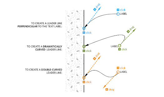 |
| Creating a callout with curved leader lines is simple. Just remember to click-drag your mouse button when you’re placing an endpoint. Double-clicking an existing leader line with the Select tool lets you edit it at any time. |
Improved Arrowheads: Most of the time, your leader lines terminate in an arrowhead. And most of the time, that arrowhead is a solid, black triangle. And in previous versions of LayOut, the only black arrowhead looked like it had eaten too many pastries. By astoundingly popular demand, we’ve added a slimmer, trimmer option, available in classic black and more discrete white. We also improved the alignment of arrowheads to make them look better when their leader lines are angled or curved.
Dashes in Dimensions: In the new version of LayOut, you have the option to add a dash to your non-metric dimensions. The difference between 8’ 6” and 8’ – 6” on a small printout with tiny type is anything but trivial.
Usability Improvements: Faster, smoother, and more efficient
There’s a lot to be said for making software more usable. This is less about features and more about tweaking, fixing and otherwise improving little things that add up to making LayOut a better application:
Copy Array lets you use keyboard modifiers to easily make multiple copies of entities, all at once, just like you can in SketchUp. Since our developers coded this feature into our test versions a few months ago, I’ve used it almost every day.
Speedier Vector Rendering means significantly less time waiting for LayOut to vector-render the contents of a model viewport. You should consider using vector rendering whenever you’re dealing with crisp linework in a document that will be printed or exported at a large physical size.
Better Zoom is probably the thing you’ll notice first. We increased LayOut’s maximum zoom level by a factor of ten, from 1000% to 10,000%. When you’ve got a lot on your page, and things are small and close together, being able to zoom in farther is a godsend. You’ll see.
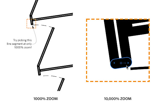 |
| We increased LayOut’s maximum zoom by a factor of 10. Now you can zoom in far enough to select and edit the smallest entities on your page. |
Numbered Pages in the Pages Panel is a handy tweak that makes it easier to print or export specific pages in your LayOut document. No more counting down from the top of your Pages panel to figure out it’s page 43 that you want to export to PDF.
Faster Screen Redraw should make LayOut feel snappier, especially as your document gets more complex. Every time you zoom, pan or move an entity on the page, the tiny elves in your computer have to re-draw the picture on your screen. For 2013, our engineers optimized the code that controls how fast this happens.
Posted by Sandra Winstead, LayOut Product Manager





.jpg)


