App Engine 1.5.0 Release
May 10th, 2011 | by The App Engine Team | published in Google App Engine, Uncategorized
The App Engine team has been working furiously in preparation for Google I/O time and today, we are excited to announce the release of App Engine 1.5.0, complete with a bunch of new features. This release brings a whole new dimension to App Engine App…
Our Senate testimony on protecting Android users’ privacy
May 10th, 2011 | by Google Public Policy Blog | published in Google Public Policy
Posted by Alan Davidson, Director of Public Policy, AmericasThis morning I’ll be testifying before the Senate Judiciary Committee about the important issue of mobile privacy. You can read my full testimony here or watch a webcast of the hearing here …
May 10th, 2011 | by The App Engine Team | published in Google App Engine, Uncategorized
This post is part of Who’s at Google I/O, a series of guest blog posts written by developers who are appearing in the Developer Sandbox at Google I/O. It’s also cross-posted to the Google Code blog which has similar posts for all sorts of Google develo…
May 9th, 2011 | by Jessica | published in Google Student Blog
Congratulations to the following students who have been selected as this year’s Google Hispanic College Fund scholars:Jorge Schwarzhaupt, University Of California-San DiegoEdna Ramirez, Arizona State University-Main CampusYsais …
May 9th, 2011 | by Trevor Claiborne | published in Google Analytics
Late last night we discovered an issue in Google Analytics that caused reports with data from April 2011 using custom reports, advanced segments, or secondary dimensions to return 0 visits. Our team has been hard at work since then, and have found the …
Travel Game: Google Earth is your gameboard
May 9th, 2011 | by Mano Marks | published in Google Earth, Google Maps
By John Taylor, Lead Game Designer, Travel Game
This post is part of Who’s at Google I/O, a series of guest blog posts written by developers who are appearing in the Developer Sandbox at Google I/O.
Travel Game is the first online social game power…
May 9th, 2011 | by Inside Google Book Search | published in Google Books
From time to time we invite guests to post about topics of interest and we’re pleased to have Don Muller join us from Old Harbor Books. Don is a co-founder of Old Harbor Books, an independent bookstore where he has worked for 35 years in Sitka, Alas…
Accessing Gmail accounts from App Engine with Context.IO
May 9th, 2011 | by The App Engine Team | published in Google App Engine, Uncategorized
This is part of our on going series of blog posts from guest authors highlighting success stories from applications and services built on or targeting App Engine developers. Today, we have a post from Bruno Morency of Context.IO. Bruno has been involv…
May 9th, 2011 | by The Gmail Team | published in Gmail (Google Mail)
Posted by Michelle Chen, Software Engineer If your calendar ends up full of many different types of events (film nights, lunch dates, and doctor appointments, for example), there’s now an easy way to categorize them using colors. Only you and anyone …
May 9th, 2011 | by Picasa Team | published in Google Photos (Picasa)
Posted by Brian Rose, Community Manager
Traveling is one of the most exciting things you can do, so a camera is a must-have on your packing list. Part of the fun of capturing your trip is to share it with others and relive the experience yourself years later. So in honor of U.S. National Travel & Tourism week, we’d like to invite everyone to visit Panoramio and take a virtual trip to Las Vegas, Zurich, or Hawaii; upload your latest trip to Picasa Web Albums; or edit with Picnik to highlight just how magnificent that blue sky was, and share with your friends and family.
We hope you enjoy some of the Photos team’s favorite photos from our travels. To create your own photo collage with Picasa, follow these steps.
So whether you’re about to leave on a trip, just returned or inspired by Travel & Tourism week to set out on an adventure, don’t forget your camera. Whether you’re off to some exotic destination or even your hometown, remember to share with the world the photos you’ve taken. Happy travels!
Fancier graphics, safer downloads, and more privacy controls
May 9th, 2011 | by Google Chrome Blog | published in Google Chrome
Today’s beta channel release includes a number of additions, as well as one subtraction!First, we’ve made Chrome’s graphics snazzier. We’ve finished implementing support for hardware-accelerated 3D CSS, which allows web developers to apply slic…
May 9th, 2011 | by Shane Cassells | published in Google Conversions
This is part of our series of posts highlighting the new Google Analytics. The new version of Google Analytics is currently available in beta to all Analytics users. And follow Google Analytics on Twitter for the latest updates. This week we’re sharing a new feature, the Site Speed report.
At Google, we are passionate about speed and making the web faster, and we are glad to see that many website owners share the same idea. A faster web is better for both users and businesses. A slow loading landing page not only impacts your conversion rate, but can also impact AdWords Landing Page Quality and ranking in Google search.
To improve the performance of your pages, you first need to measure and diagnose the speed of a page, which can be a difficult task. Furthermore, even with page speed measurements, it’s critical to look at page speed in context of other web analytics data.
Therefore, we are thrilled to announce the availability of the Site Speed report in the new Google Analytics platform. With the Site Speed report you can measure the page load time across your site.
Uses for the Site Speed Report
- Content: Which landing pages are slowest?
- Traffic sources: Which campaigns correspond to faster page loads overall?
- Visitor: How does page load time vary across geographies?
- Technology: Does your site load faster or slower for different browsers?
One effective use of the Site Speed report is to measure speed for your most critical pages. For example, you might learn that the target audience of your site is located in a geographic region that experiences slower page speed. Or, you might learn that certain pages on your site run slower in some browsers. In addition to the Site Speed report, we’ve created a custom report that you can use to help answer these questions: view the Site Speed custom report.
 Setting up the Site Speed Report
By default, page speed measurement is turned off, so you’ll only see 0’s in the Site Speed report until you’ve enabled it. To start measuring site speed, you need to make a small change to your Analytics tracking code. We have detailed instructions in the Site Speed article in the Analytics Help Center. Once you’ve updated your tracking code, a small sample of pageviews will be used to calculate the page load time.
We’re excited to bring this important metric into Google Analytics as part of the new Google Analytics platform. Please continue to send us feedback on Site Speed and the rest of the new Google Analytics.
- Zhiheng Wang, Phil Mui
on behalf of the Google Analytics team and the Make the Web Faster team.
Posted by Shane Cassells, Google Conversion Team
Setting up the Site Speed Report
By default, page speed measurement is turned off, so you’ll only see 0’s in the Site Speed report until you’ve enabled it. To start measuring site speed, you need to make a small change to your Analytics tracking code. We have detailed instructions in the Site Speed article in the Analytics Help Center. Once you’ve updated your tracking code, a small sample of pageviews will be used to calculate the page load time.
We’re excited to bring this important metric into Google Analytics as part of the new Google Analytics platform. Please continue to send us feedback on Site Speed and the rest of the new Google Analytics.
- Zhiheng Wang, Phil Mui
on behalf of the Google Analytics team and the Make the Web Faster team.
Posted by Shane Cassells, Google Conversion Team
May 6th, 2011 | by Google News Blog | published in Google News
Posted by Krishna Bharat, Founder and Head – Google NewsGoogle News was born in the aftermath of the tragic events of September 11, 2001. An unprecedented act of terrorism on U.S. soil, by a foreign militant group led by Osama Bin Laden, changed the c…
Part 2: Mobile Website Optimisation – How Effective Use of White Space Can Improve the Mobile Website Experience
May 6th, 2011 | by Shane Cassells | published in Google Conversions
This is the second post in a series on optimising mobile websites for conversions.
In Summary: Uncluttered mobile sites with minimal but meaningful information which is visible to users on the go is key to maximising conversions on mobile devices.
Mobile devices have small screens. The larger ones have about 640×960 pixel resolution (or 4in/10cm diameter). When you compare that with a desktop computer screen it’s not very big. So how do you ensure that a user on a small screen gets to see all of the things they would see on a desktop version of your site? You don’t. In this post we will be focusing on using white space as a means to making mobile websites feel intuitive and uncluttered.
Do Not Overcrowd the Screen: As covered in the last post on content prioritisation, a big part of mobile site building involves stripping out as much detail as possible. Mobile users are task oriented so they only need the details necessary to complete a task quickly. Speed is important and the way you present the information on your site will impact heavily on the speed with which a user can digest it. It might seem counter-intuitive when the screen is so small and you have so much to say but pushing lots of information and too many options at your users will push them away from a conversion. Prioritised content combined with effective use of white space leads to a better mobile experience.
Banners, Pictures & Videos: Desktop sites are generally overburdened with banners, pictures & videos but it’s easier to get away with that when you have a big screen and a fast broadband connection. Real estate is precious on a mobile device so only use small pictures – but pictures are still recommended. You can make it possible for a user to click on pictures to increase the size but it should be a user choice. Banners should be kept to an absolute minimum or even removed altogether. If you are using a banner it should only be a conversion reinforcement banner such as highlighting a delivery or returns policy. You can also use banner advertisements if that is the way you monetise your site. Videos can contribute effectively to a conversion, particularly a brand oriented one. However, where a video is not necessary and is even distracting, it should not be included. If you’re unsure, test it with a tool like Google Website Optimiser to see what impact video has for your mobile site.
Bullet Points: Desktop users generally will not read lots of text. Mobile users are even less likely to. All paragraphs of text should be removed and replaced with clear concise bullet points. Mobile user’s often read at arms length so the text should also be large enough and clear enough to facilitate this. A great way of doing so is to ensure that there’s not a lot to read. Where bands of text are unavoidable, it should be possible for users to hide or expand the text or to get more information on tabs. Use headlines that summarise the text that follows so a user can still convert without reading everything.
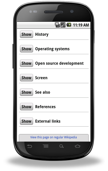
The m.wikipedia.org. site allows users to choose what text they want to see
White Space is Light Space: Dark backgrounds are a bad experience even on a desktop but on a mobile site they can be devastating to conversions. Mobile users are on the go and when they are outside in daylight situations background colour is very important. Try using a projector in a bright room with the curtains drawn and the light splashing onto the screen. If your slides have a dark background you won’t see them. If they have a white background with black text, it won’t be a problem. That is the same experience on a macro level as a user trying to use a website with a dark background on a mobile device outside. It might look cool when you’re building it in a lab, but it’s not a great experience. Users can increase the brightness of their display but that will place greater strain on the battery.
White space (also called negative space) doesn’t have to be white but it should be pale so that high contrast text and images placed against it are visible even in poor light. Using a picture as a background is also not recommended. Again, remember that users are often on the go and reading at a distance.
White space also helps when building sites to fit multiple devices of varying resolutions. The more white space, the less likely your site will look cramped or stretched on different devices. Of course, it’s also a good idea to design your site with multiple resolutions in mind.
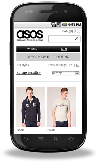
This site uses a light background and uncluttered space to great effect.
To summarise, 4 points to keep in mind when creating a layout for your mobile site:
- Mobile sites should not be cluttered
- Remove unnecessary elements which take up space and data
- Use bullet points instead of paragraphs for text
-
Have a light background to your site
Mobile Website Testing Tip: When you are building your mobile site, test it in different light levels to best replicate the user experience.
The next post will be looking at how big buttons can make mobile website conversion a whole lot easier. If you have feedback, please leave a comment.
Posted by Shane Cassells, Google Conversion Team
Royal Wedding Bells in the Cloud
May 6th, 2011 | by The App Engine Team | published in Google App Engine, Uncategorized
As the centuries pass, waves of change wash over us – the invention of the steam engine, photography, space travel, the Internet. We may think these inventions change everything. But some things stay the same. Like our world-wide romantic fascination …
